Using the built-in Styling settings in Website Builder, you can easily synchronize colors, fonts, and element appearance across all pages of your website. This article will give you an introduction to Website Builder's Styling settings and how to use it effectively.
In this article
A. Overview of Styling settings
B. Font settings
C. Color settings
D. Button settings
E. Scroll effects settings
A. Overview of Styling settings
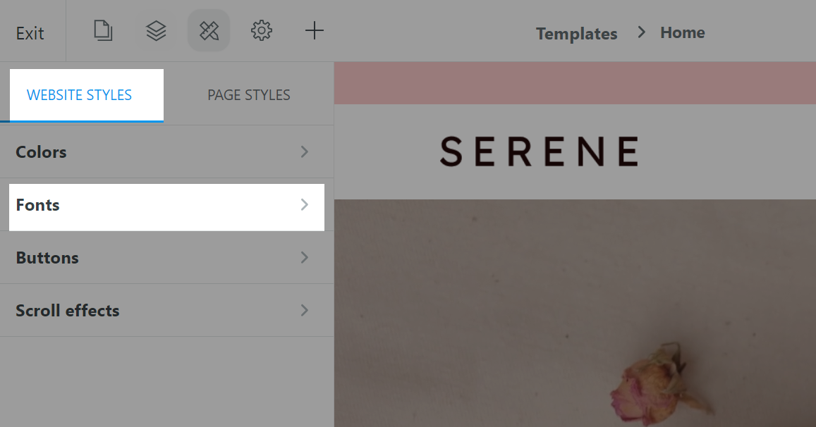
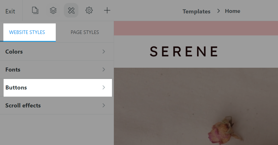
From the Website Builder, click on the Style icon to access the Styling settings. Here, you can make changes to the website's Colors, Fonts, Buttons and Scroll effects.
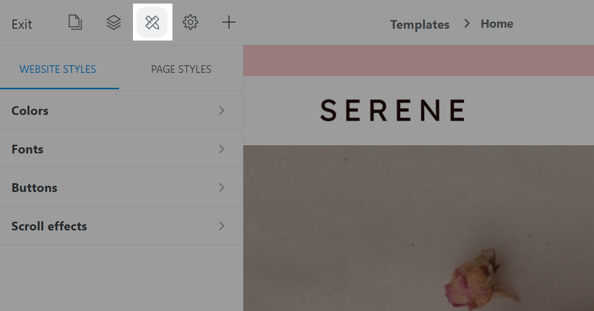
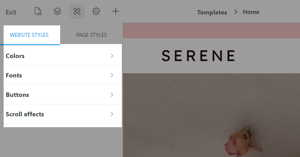
The Website styles tab contains all default styling settings for the whole website.
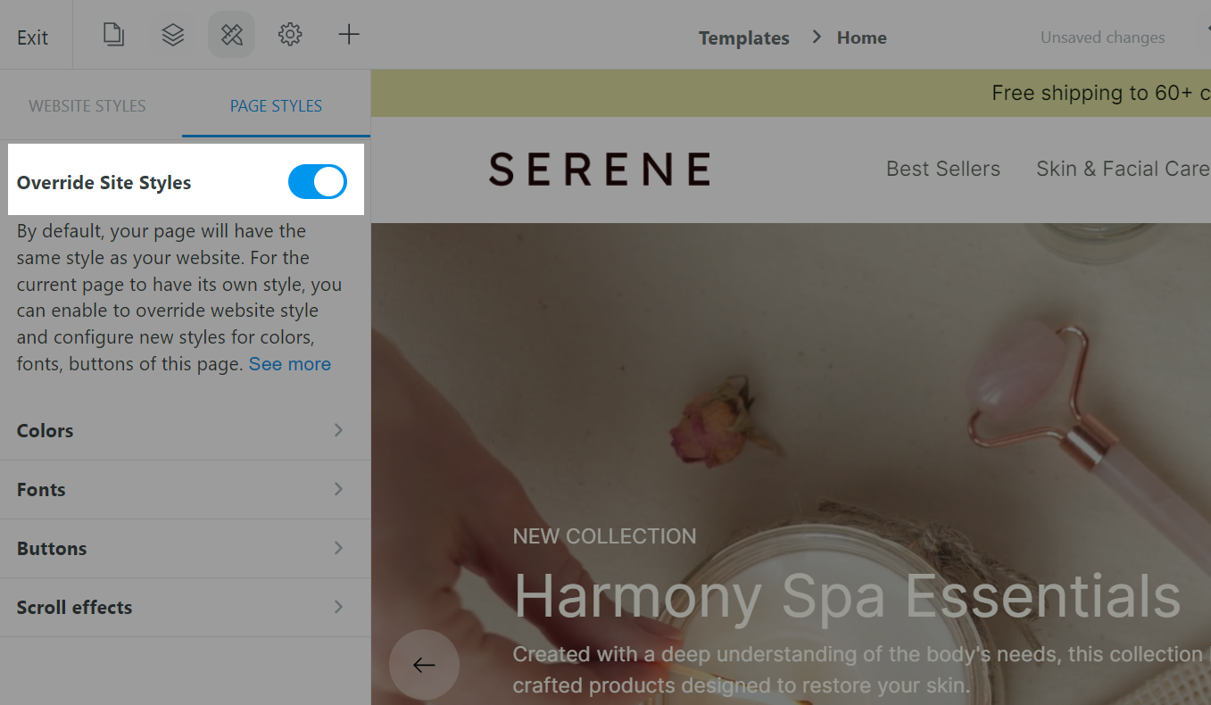
If you want to set up the styles for a specific web page only, switch to the Page styles tab.
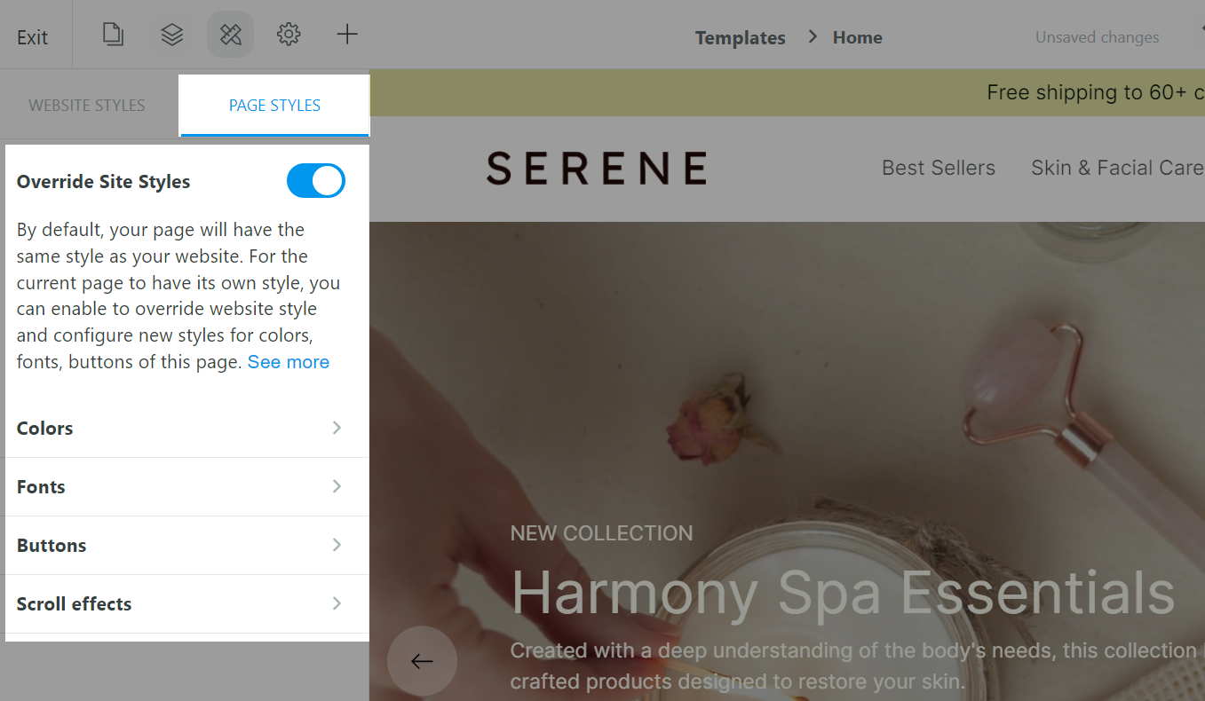
Here, you can enable Override Site Styles to set properties specific to the web page being designed without affecting the overall style of your website's web pages.
B. Font settings
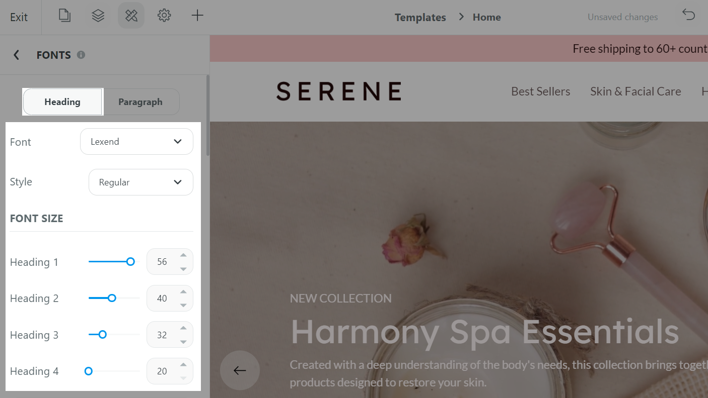
In the Website Builder, you can customize your default fonts and the general appearance of your headings and paragraph texts to look great on any device. The Font settings ensure that your brand and style are consistent across your page.
From the Website Builder, open Styling settings and select either Website styles or Page styles to make changes to your website or page as needed. Then, select Fonts.
To customize your headings, click on the Headings tab.
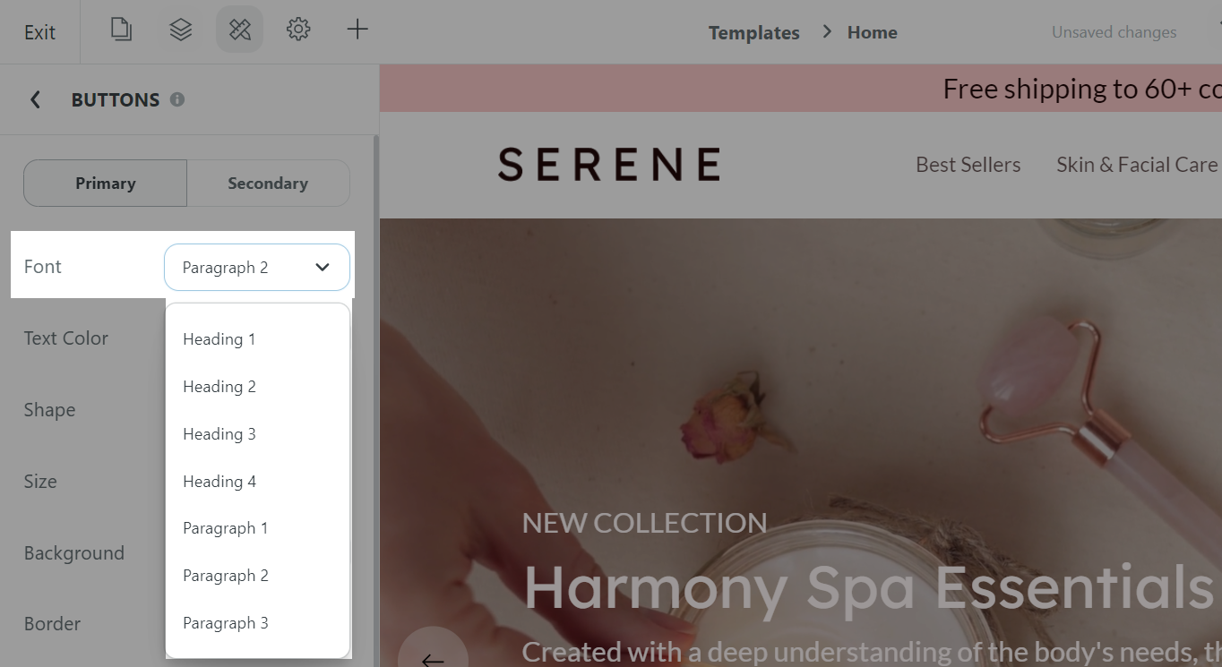
Font: Select a font from the dropdown menu.
Style: Select a font style from the dropdown menu. Each font family will have its own set of styles.
Use the slider to adjust the font sizes of the 4 types of headings.
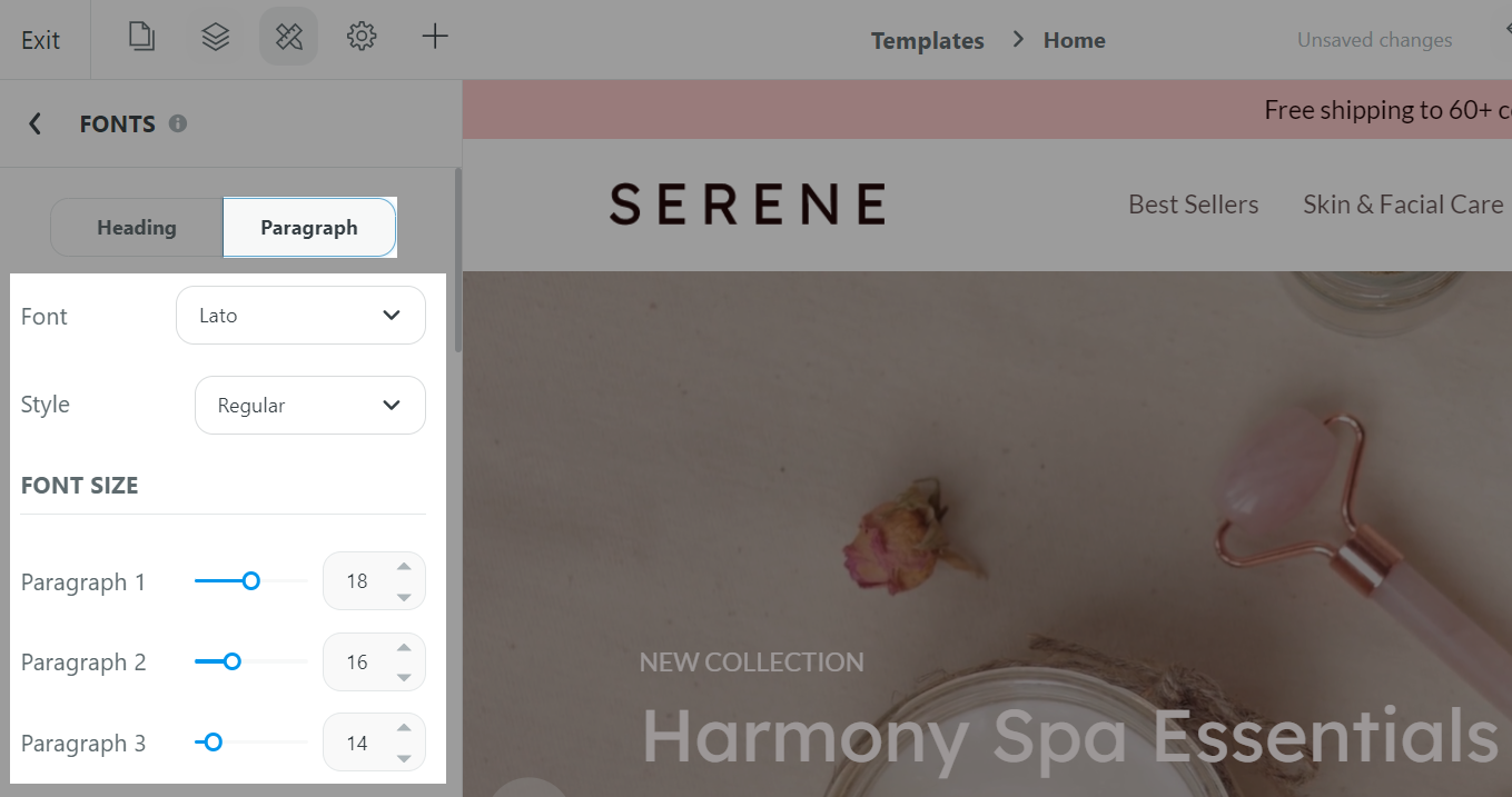
To customize your paragraph texts, click on the Paragraph tab.
Font: Select a font from the dropdown menu.
Style: Select a font style from the dropdown menu. Each font family will have its own set of styles.
Use the slider to adjust the font sizes of the 3 types of paragraph texts.
Click Save to library if you want to save your changes to a template for later uses.
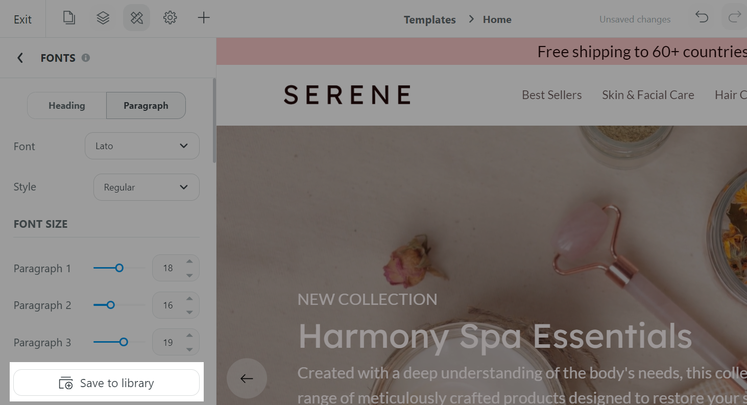
In Font library, you can preview each font before applying them on your page.
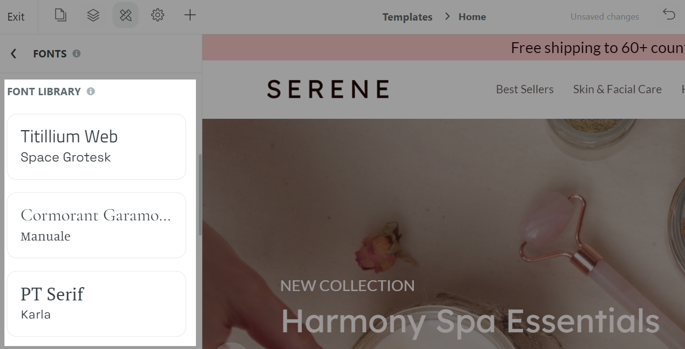
Once finished, click Save.
C. Color settings
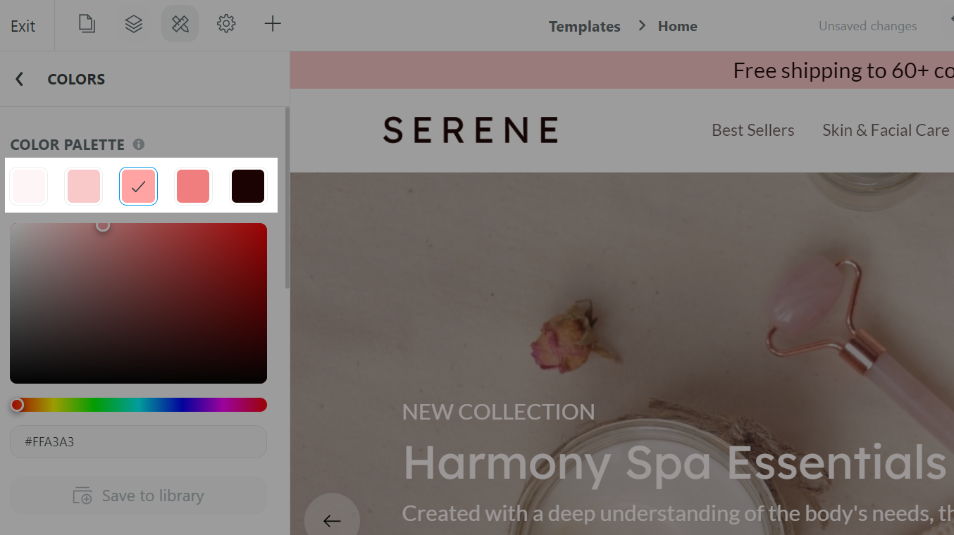
From the Website Builder, open Styling settings and select either Website styles or Page styles to make changes to your website or page as needed. Then, select Colors.

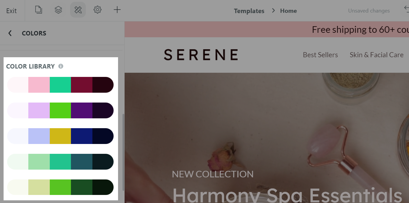
In the Colors panel, you can create a color palette for your site/page that includes 5 different colors for you to choose from when designing your website/page.
Please see our Color library for our library of color palettes that has been carefully selected and designed to fit the various purposes of your website/page.
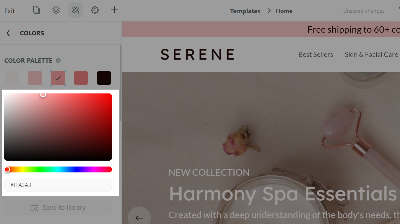
If you prefer to use a custom color, use the color picker to choose your colors, or enter the color code in the text box.
The color box allows you to adjust the brightness and saturation of your color.
The horizontal bar allows you to select the hue.
The text box allows you to enter your RGB color code.
The color palette for your website/page should be of the same hue and/or have good contrast, and keep in mind how your branding will be incorporated into your color scheme.
A good tip is to select colors ranging from light to dark tones for color values from 1 to 5.
Click Save once finished.
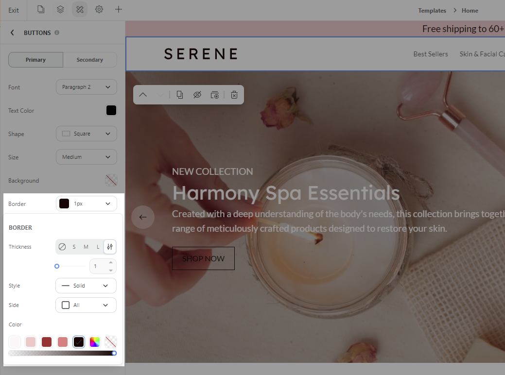
From the Website Builder, open Styling settings and select either Website styles or Page styles to make changes to your website or page as needed. Then, select Buttons.
You can select to customize the Primary and Secondary buttons for your website/page.
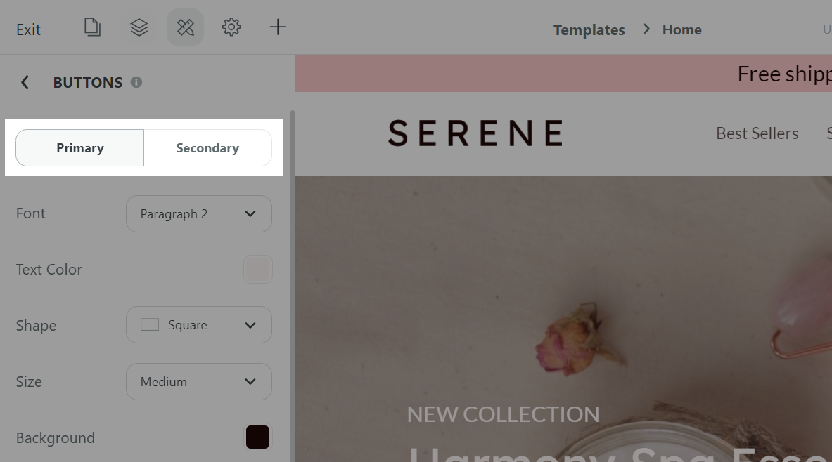
In Font, you can select a font for your button text. Here, you can select your button font to match one of the heading or paragraph font styles that are set up in the Fonts section.
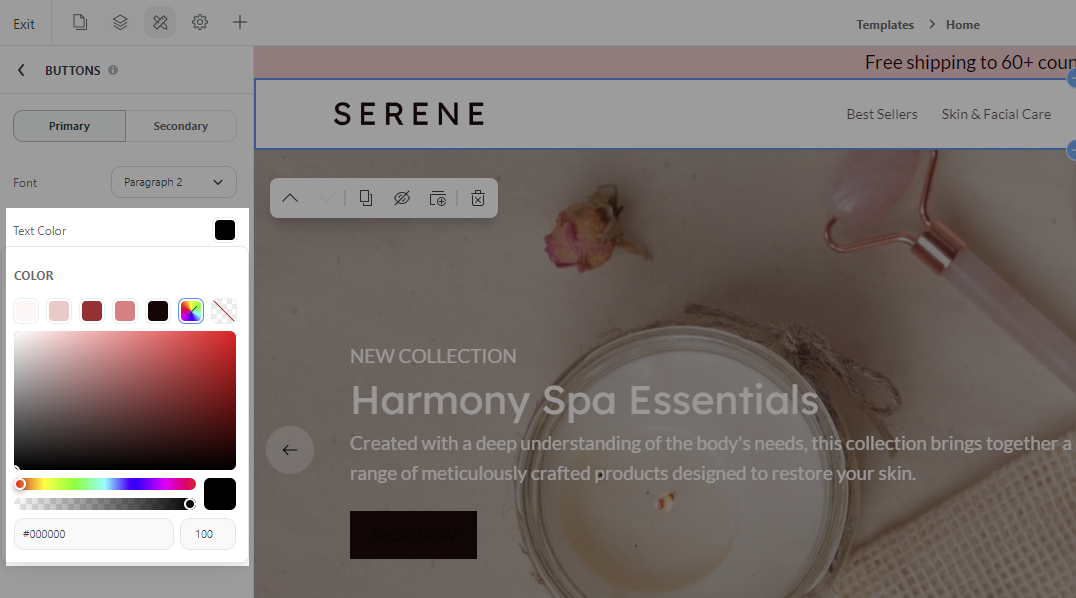
In Text color, select a color for the button text. You can choose a color from your website color palette.
If you prefer to use a custom color, click the color wheel and then either enter your RGB color code or use the sliders to choose your color.
The color box allows you to adjust the brightness and saturation of your color.
The first horizontal bar allows you to select the hue.
The second horizontal bar and the square text box allows you to adjust the transparency of your color.
The rectangle text box allows you to enter your RGB color code.
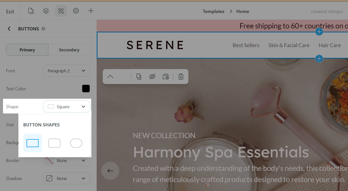
In Shape, select your button shape. On Website Builder, we offer you 3 types of button shapes, including: Square, Rounded, and Pill.
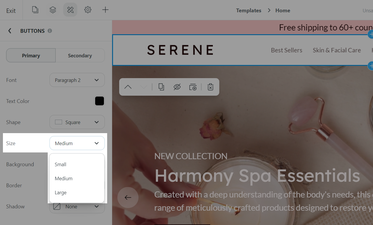
In Size, select a size for your button, among Small, Medium, and Large.
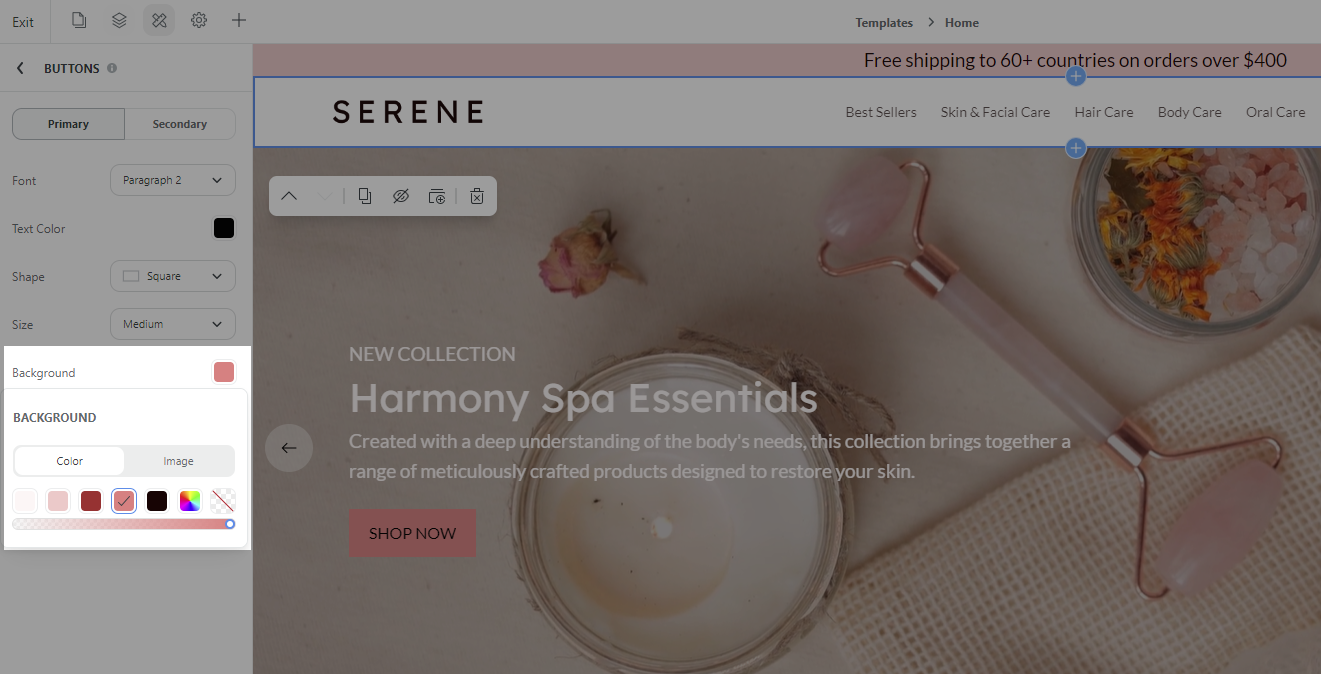
In Background, you can select a color from the color palette, or choose a custom color for your button.
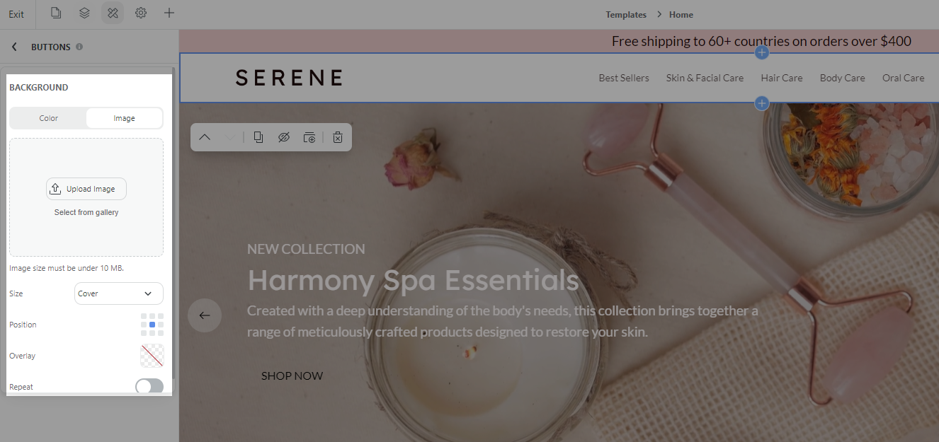
If you prefer to use an image for your button, change the color to Transparent and upload your image in the Image section. Then, you can customize its size, position, overlay, repeat to your preference.
In Border, you can customize the border of your button. Here, you can adjust the size, select a color from the color palette, or choose a custom color for your button's border. If you don't want a border around your button, set it to Transparent.
Click Save once finished.
From the Website Builder, open Styling settings and select either Website styles or Page styles to make changes to your website or page as needed. Then, select Scroll effects.

Related articles