The mobile-friendly version of your site is automatically created using the content from the desktop site. However, it is essential to be aware of the difference between desktop and mobile screen areas and ShopBase supports you to customize the design and content of the mobile elements if you wish. This won't effect the desktop layout. This article guides you how to create a distinct look for mobile view.
In this article
B. Customize the design for mobile
C. Customize the position of column or row for mobile
D. Create a distinct element on mobile-only
A. Access the mobile editor
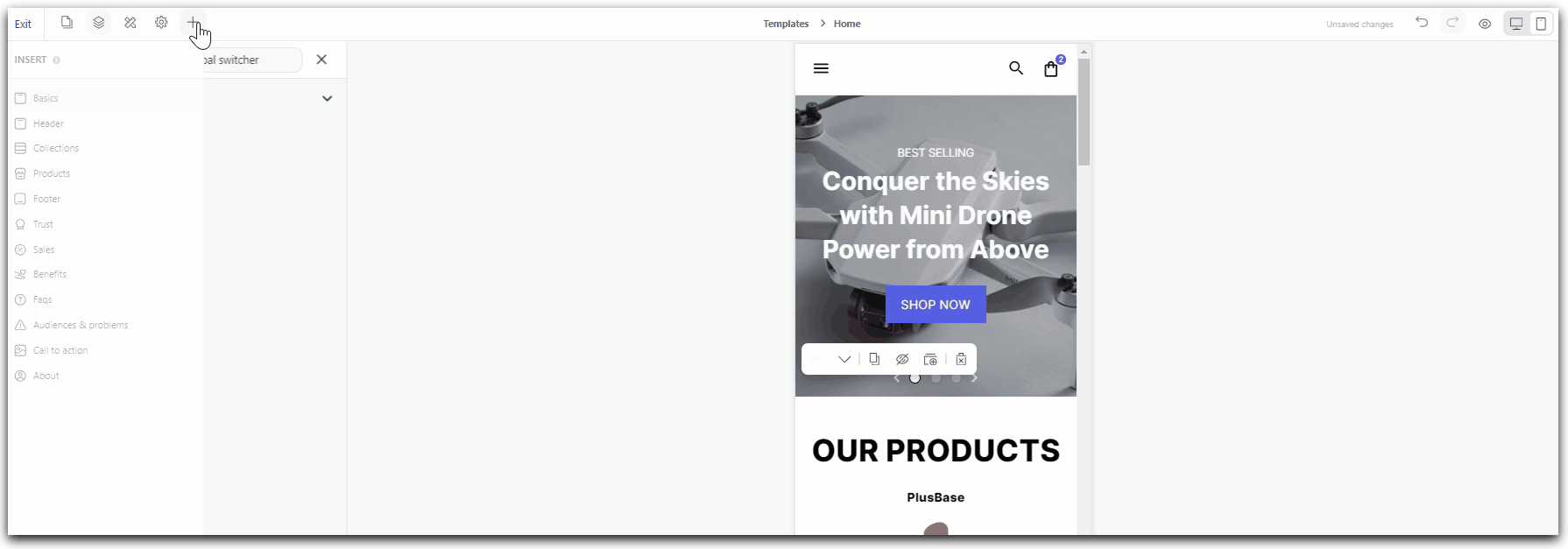
In Website Builder, click the Mobile icon on the top of the right corner to access its preview.
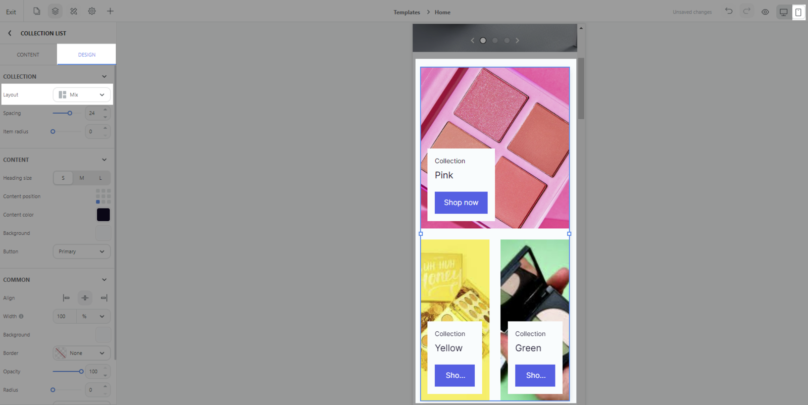
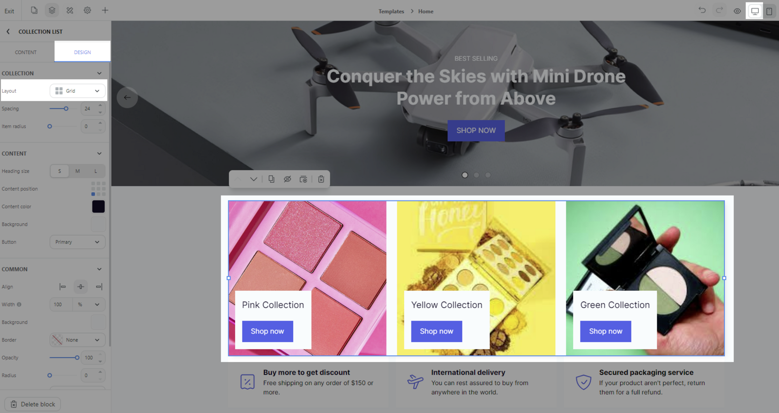
B. Customize the design for mobile
In Mobile editor, click the block you wish to change > tab Design > Change the desired elements.
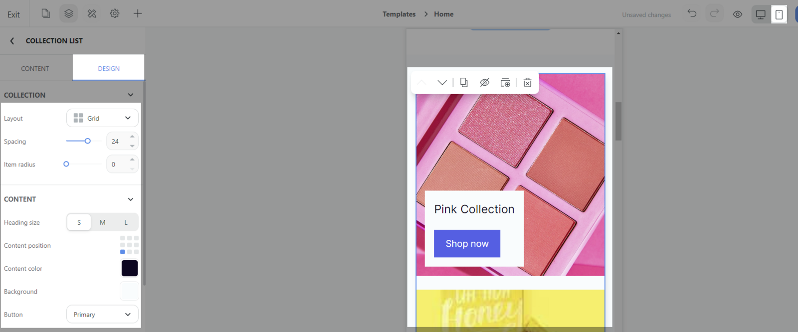
This change does not apply to the desktop version.
For example: In mobile version, the layout of the block Collection list can be set to Mix while in desktop version, it can be set differently to Grid.
C. Customize the position of column or row for mobile
You can customize the position of columns inside a row or rows inside a column to better suit the mobile experience.
This change does not apply to the desktop version.
In Mobile editor, click the row/column you wish to move > Click Move towards the direction you wish to change. The chosen row will be moved in its containing column and similarly, the chosen column will be moved within in its containing row.
D. Create a distinct element on mobile-only
In default, once you build any element on any device, this element will be shown in both desktop and mobile. If you wish to create a distinct element on mobile-only, you can create this block/section/column/row in mobile, then hide this element in the desktop or reserved.
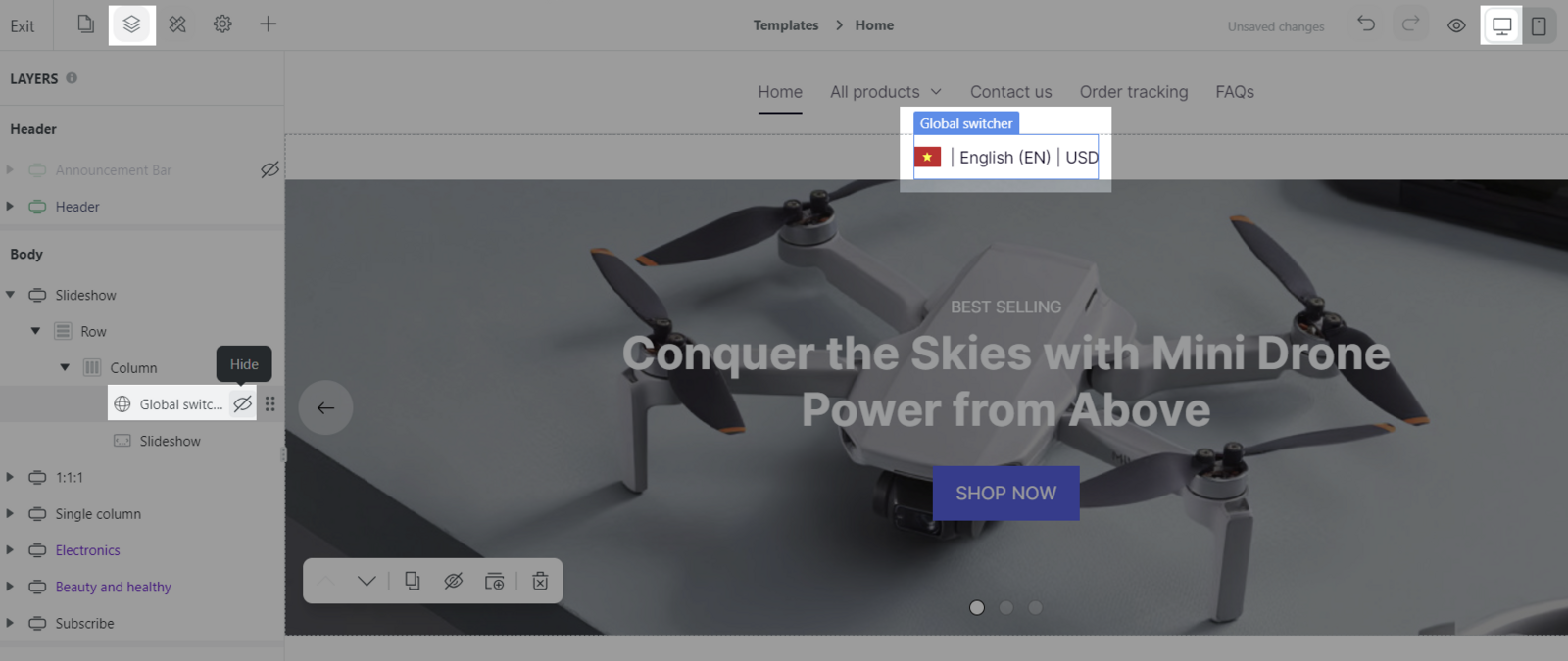
For example: The Global switcher is shown in Mobile view, but it is hidden in Desktop view.