The Collection List block in Website Builder is a powerful tool to showcase and organize your products or content. Optimize its settings to enhance your store's visual appeal and improve visitor navigation.
The collection list feature is suitable for streamlining product presentation and enhancing customer interaction on e-commerce sites. It's particularly beneficial for:
Merchandising: Displaying groups of related products together to encourage additional purchases.
Special promotions: Highlighting sales, seasonal collections, or limited edition items prominently.
Organizing content: Grouping items into categories or themes for easy navigation and discovery.
Aesthetic styling: Designing a cohesive visual layout that aligns with the brand’s identity.
In this article
A. Create a Collection list block
B. Customize the content tab of Collection list block
C. Customize the design tab of Collection list block
A. Create a Collection list block
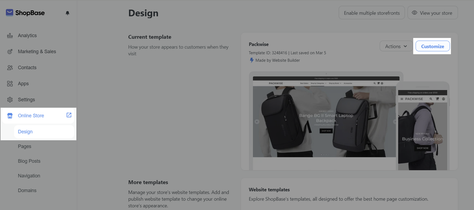
On admin dashboard, go to Online Store > Design > Customize.
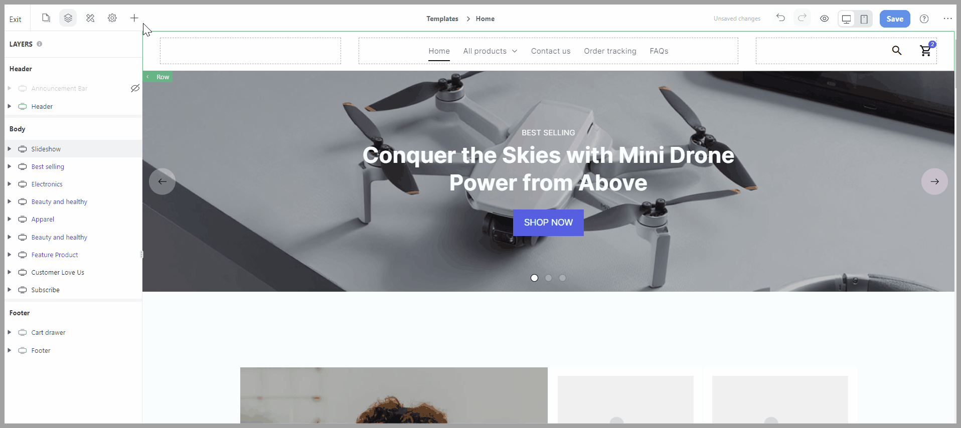
To add a new Collection list block to your web page, from the Website Builder, open the Insert panel and drag your block into the desired position. Then, you can freely customize the Content and Design of each block in Website Builder.
B. Customize the content tab of Collection list block
Select the Collection list block > Content tab.
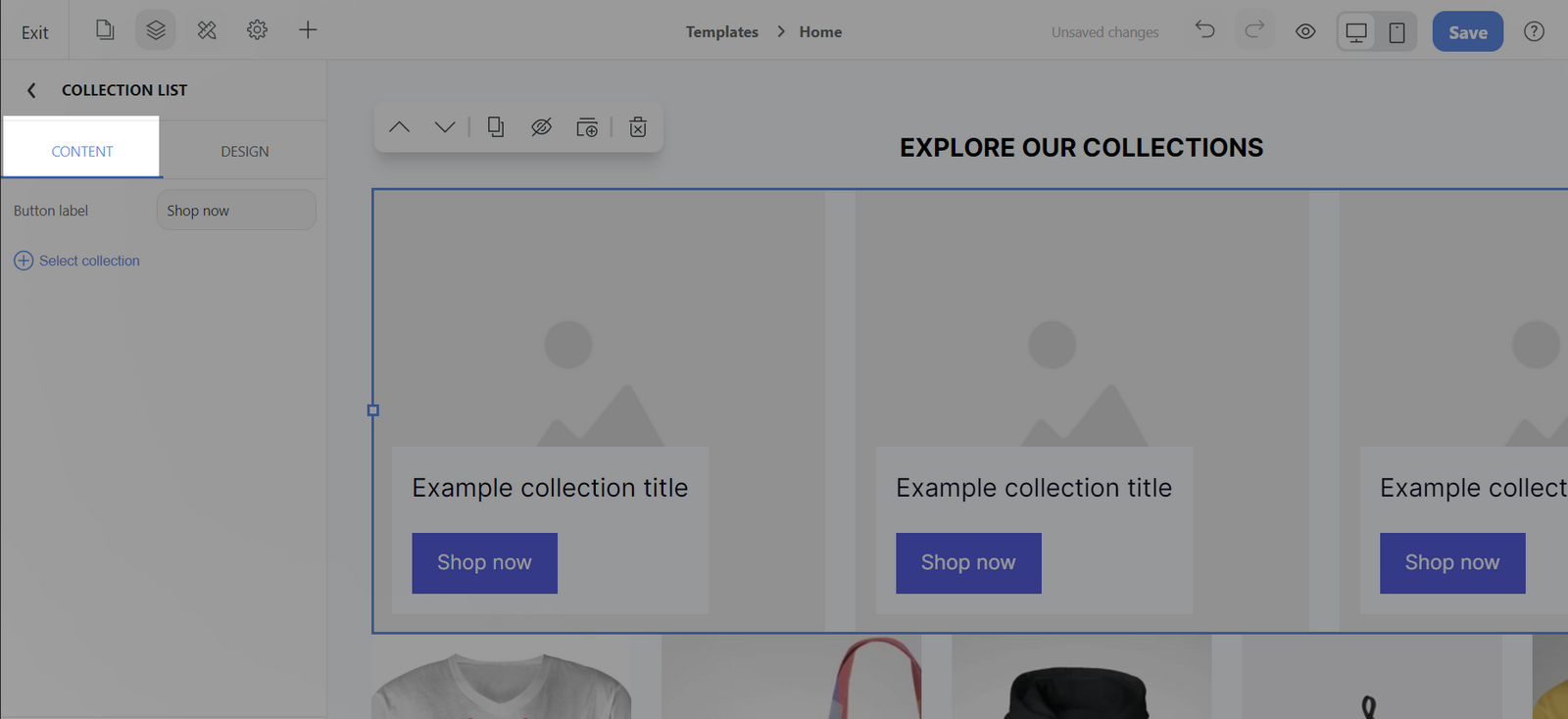
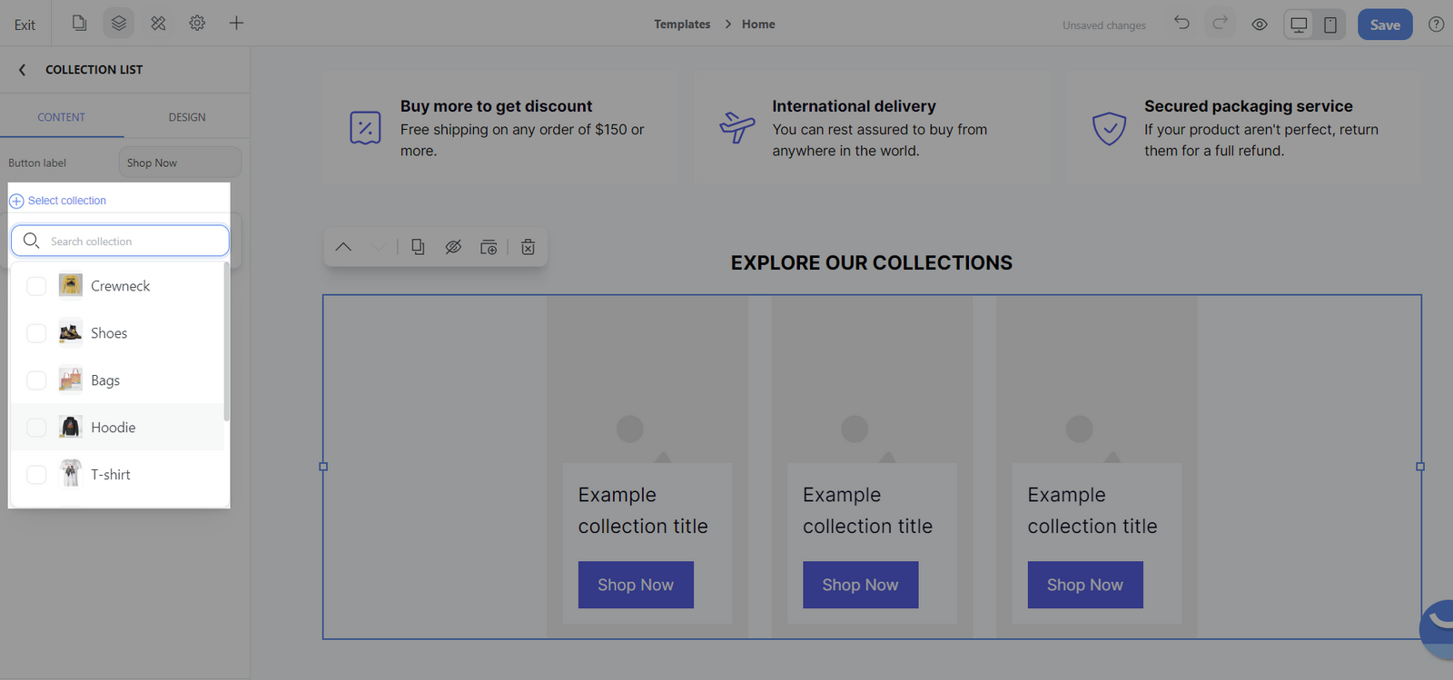
Click Select collection to select the collections you want to display.
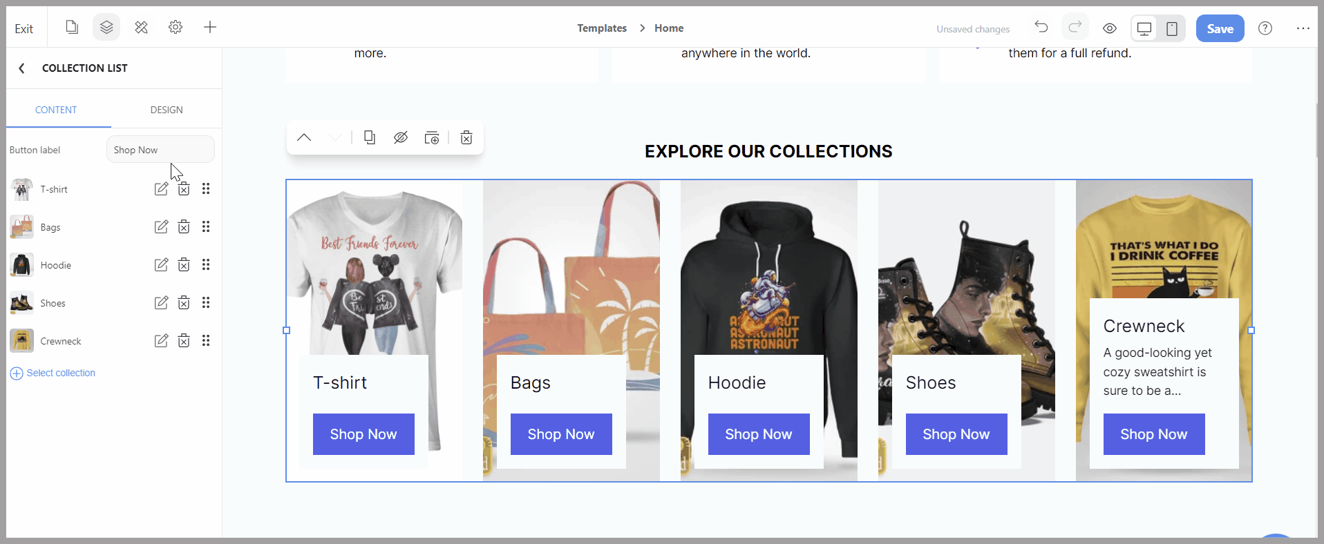
You can click and drag each element to rearrange the collection position.
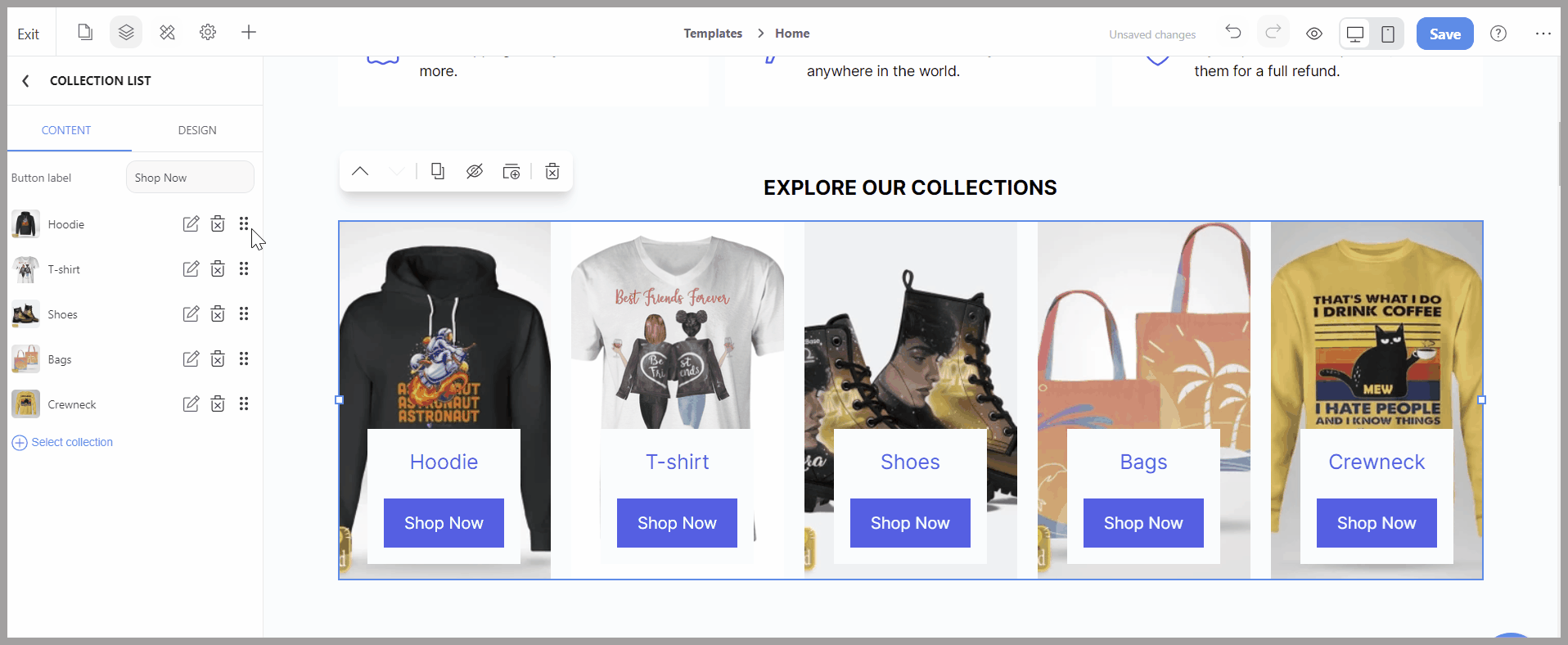
For the Button label, you can quickly modify the button's label by typing in new text or erasing it if you prefer the button to be unlabeled.
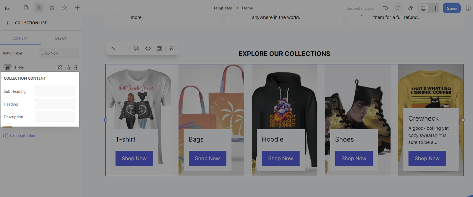
To edit the Collection's content, hover over each collection and click the edit icon. The preview menu will open up for you to view the changes.
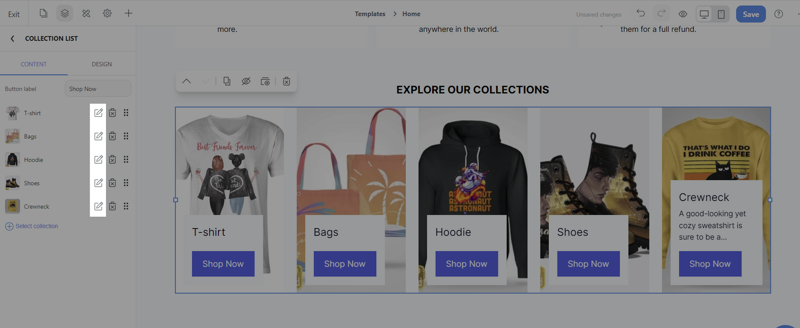
Within the preview menu, there are specific editable content:
Heading: Auto-filled with the collection title. However, you can change it by entering a new title in the blank accordingly.
Sub Heading: Additional text for context or important information under the main heading. You can add text in the blank
Description: Automatically pulls content from the admin page's Description section. This content can also be edited by entering text in the blank.
C. Customize the design tab of Collection list block
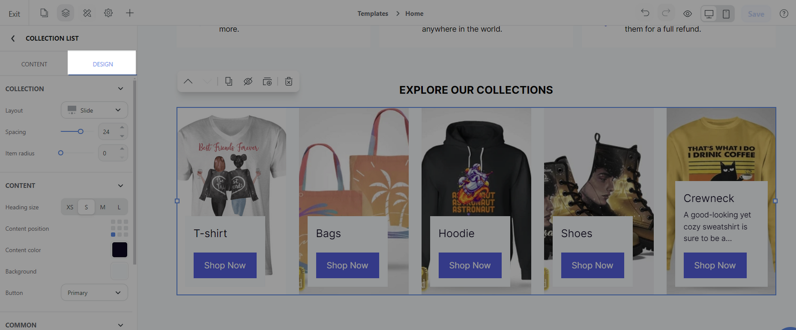
Select the Collection list block > Design tab. There are 3 sections: Collection, Content, and Common.
Collection section:
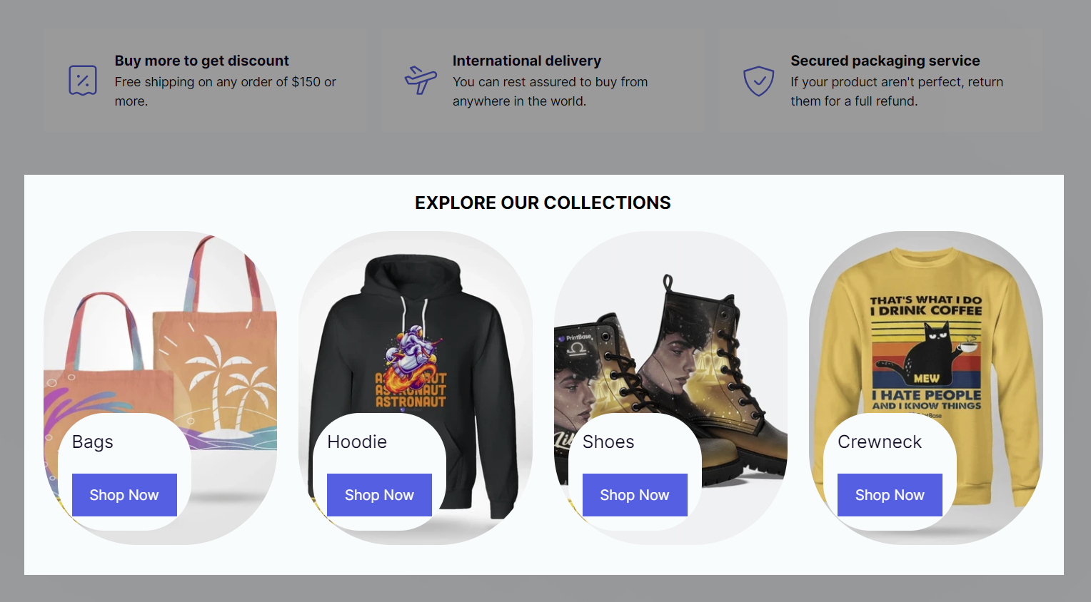
Layout: the various layouts available are Grid, Slide, Mix, Brick, Content outside, and Image & text.
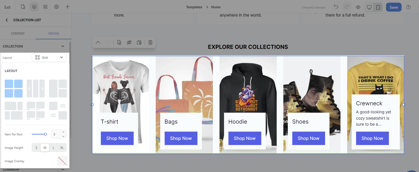
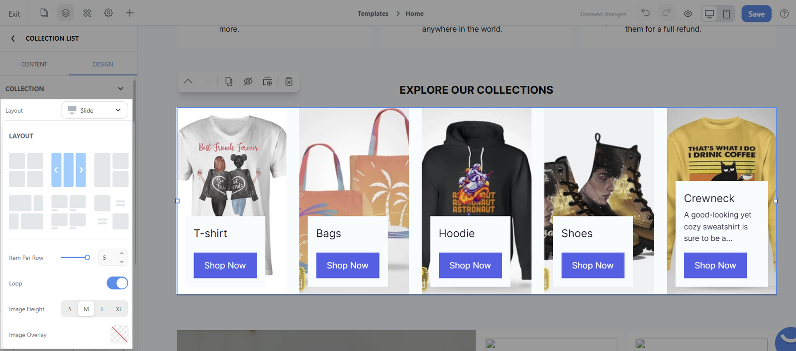
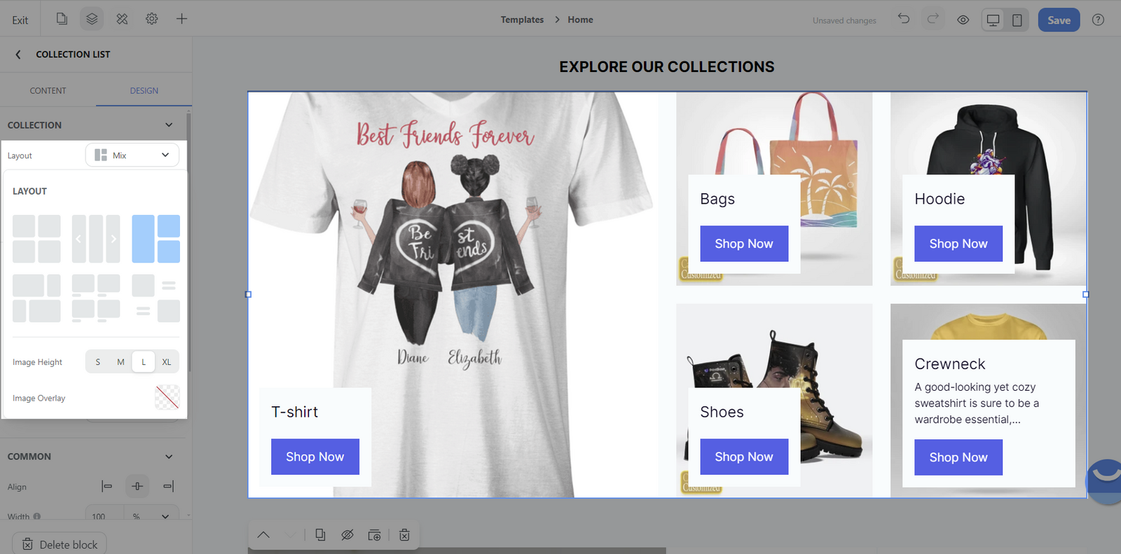
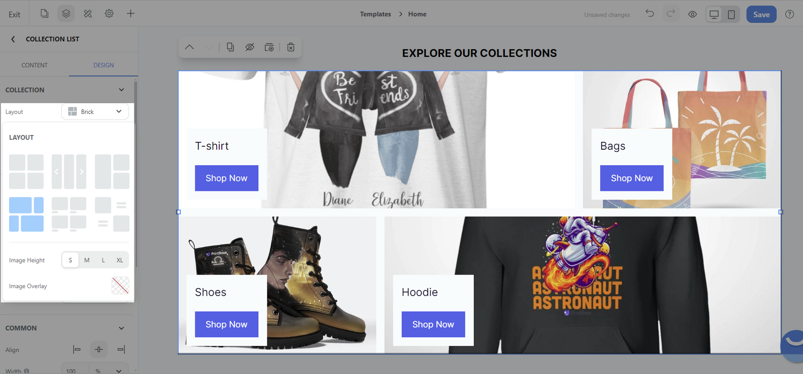
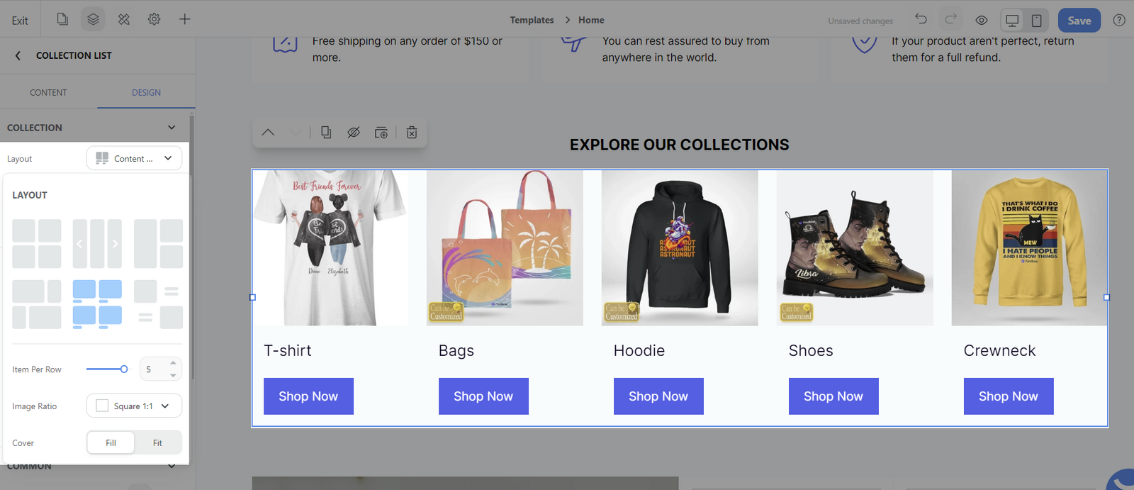
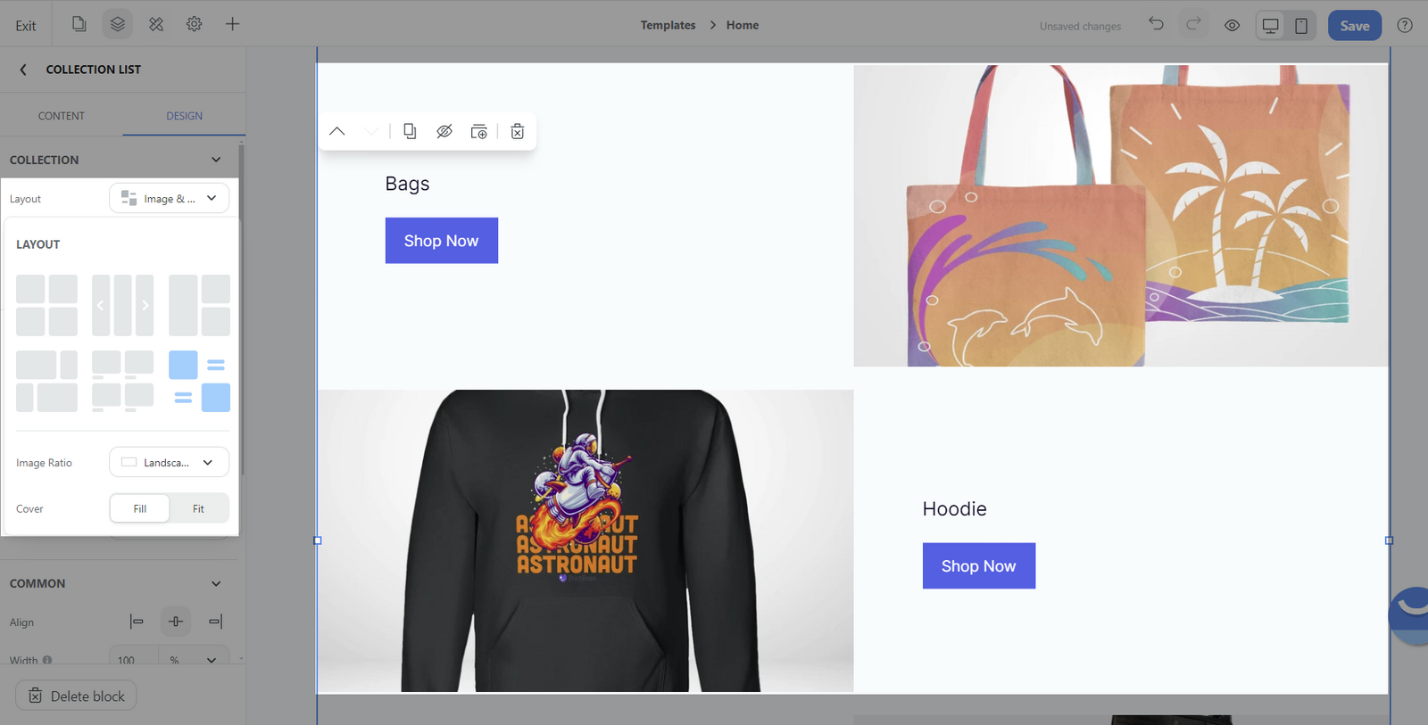
Each layout with its own unique style settings. Below is a brief explanation of the main settings.
Item per row: You can control how many items appear side by side in a single row (maximum 6 items on desktop view and 3 items on mobile view).
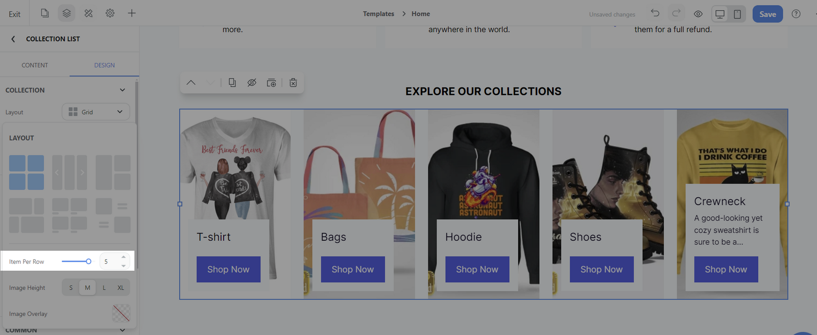
Image Height: Adjust the vertical size of the images in your grid. You can select from four predetermined sizes - S (small), M (medium), L (large), and XL (extra-large)—to ensure that the images align properly and look uniform.
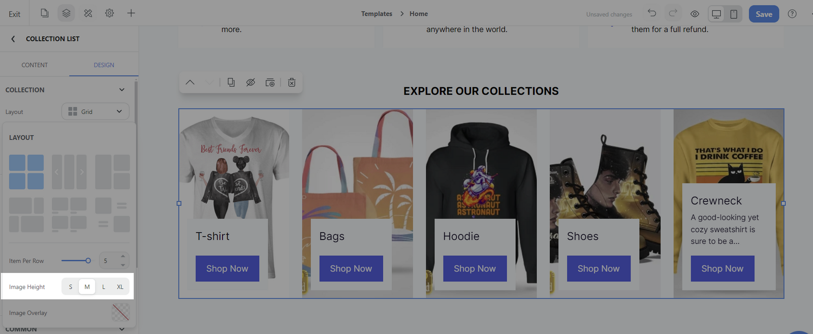
Image Overlay: You add a color overlay to your collection images, which can be used to create a visual theme or highlight text over the images.
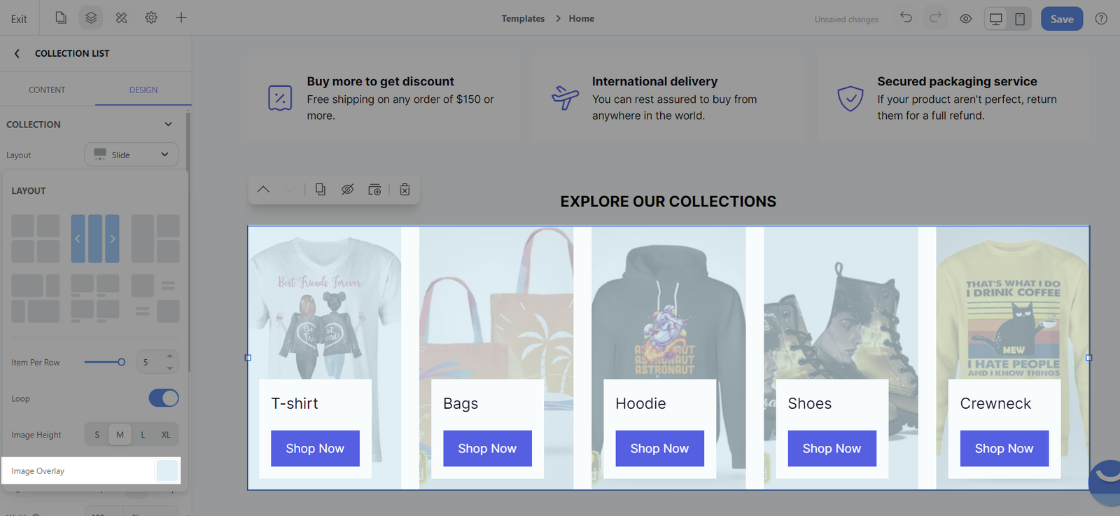
Loop: This feature enables the slide to continue in a loop, meaning that when it reaches the end of the slides, it seamlessly starts from the beginning again without reversing direction.
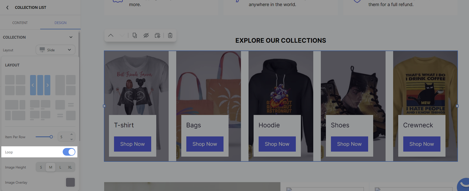
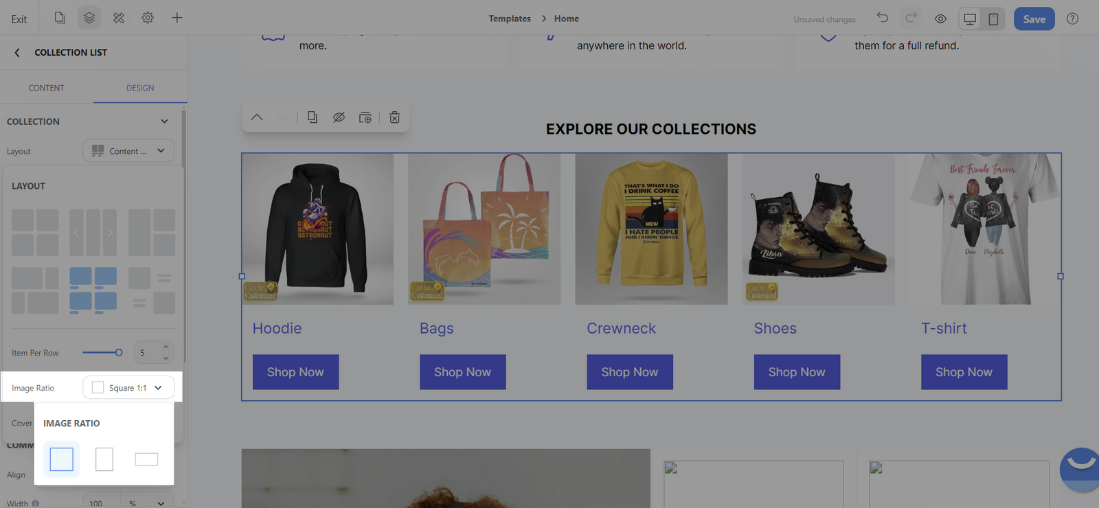
Image ratio: This affects the aspect ratio of the thumbnail images. You can choose between Square (1:1), Portrait (3:4), or Landscape (16:9).
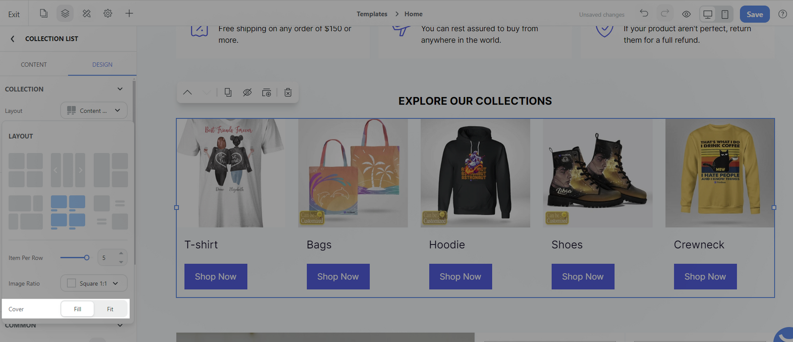
Cover: There are 2 options: Fill and Fit which determine whether the image should completely cover the area (with potential cropping) or fit inside the area (potentially leaving some space unfilled).
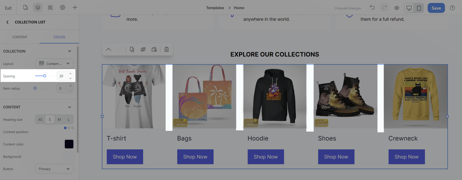
Spacing: Adjust the space of each image border
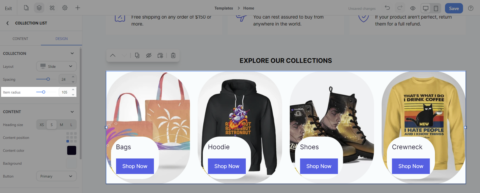
Item radius: Adjust the corner radius/roundness
Content section:
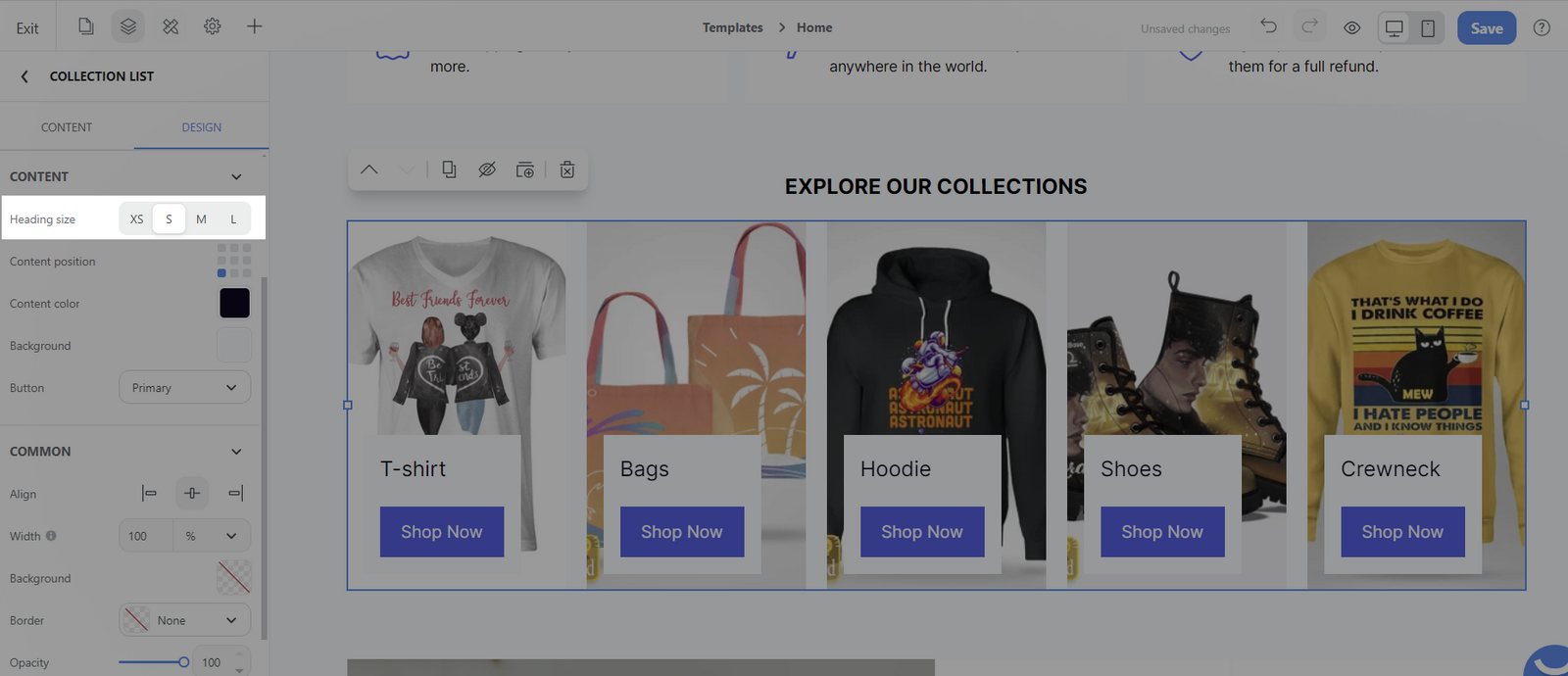
Heading size: This refers to the size of the heading text within the content section. The size options typically include XS (Extra Small), S (Small), M (Medium), and L (Large).
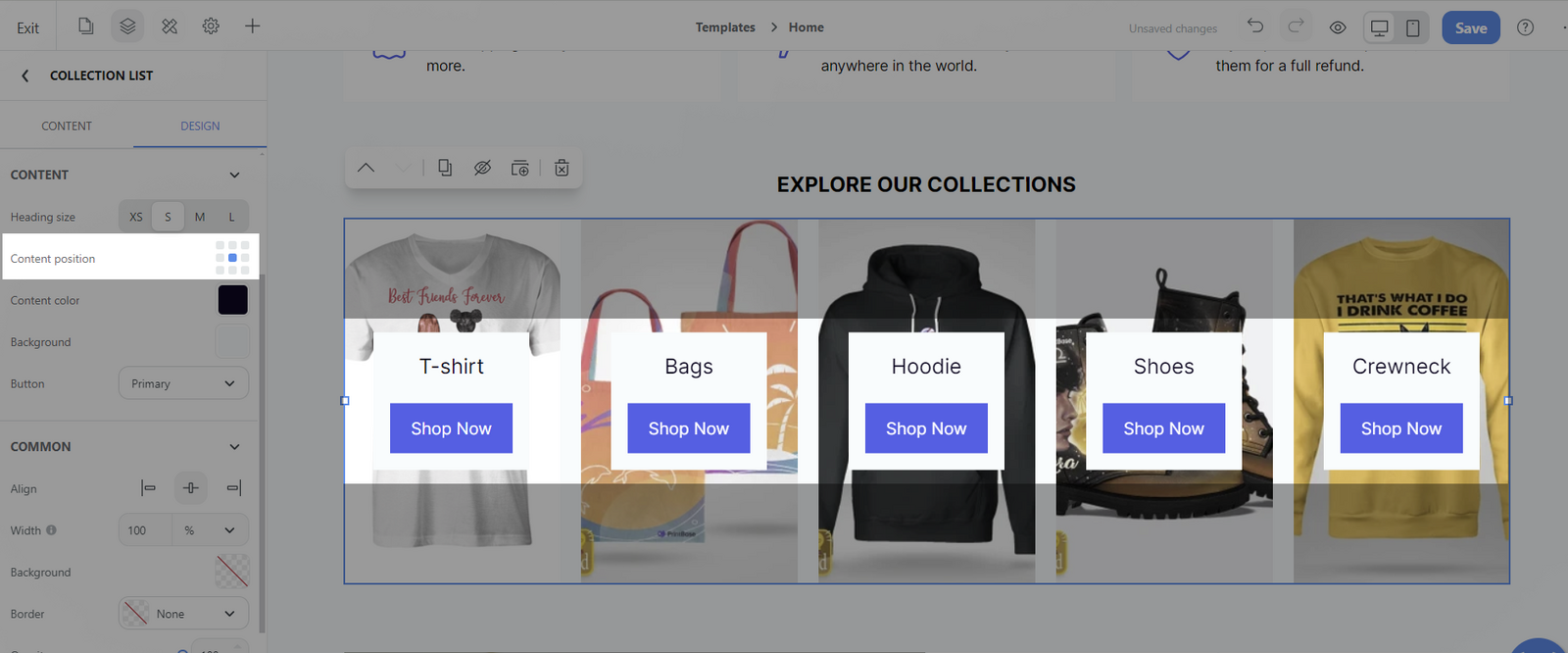
Content position: This setting refers to the alignment and placement of the content within the section.
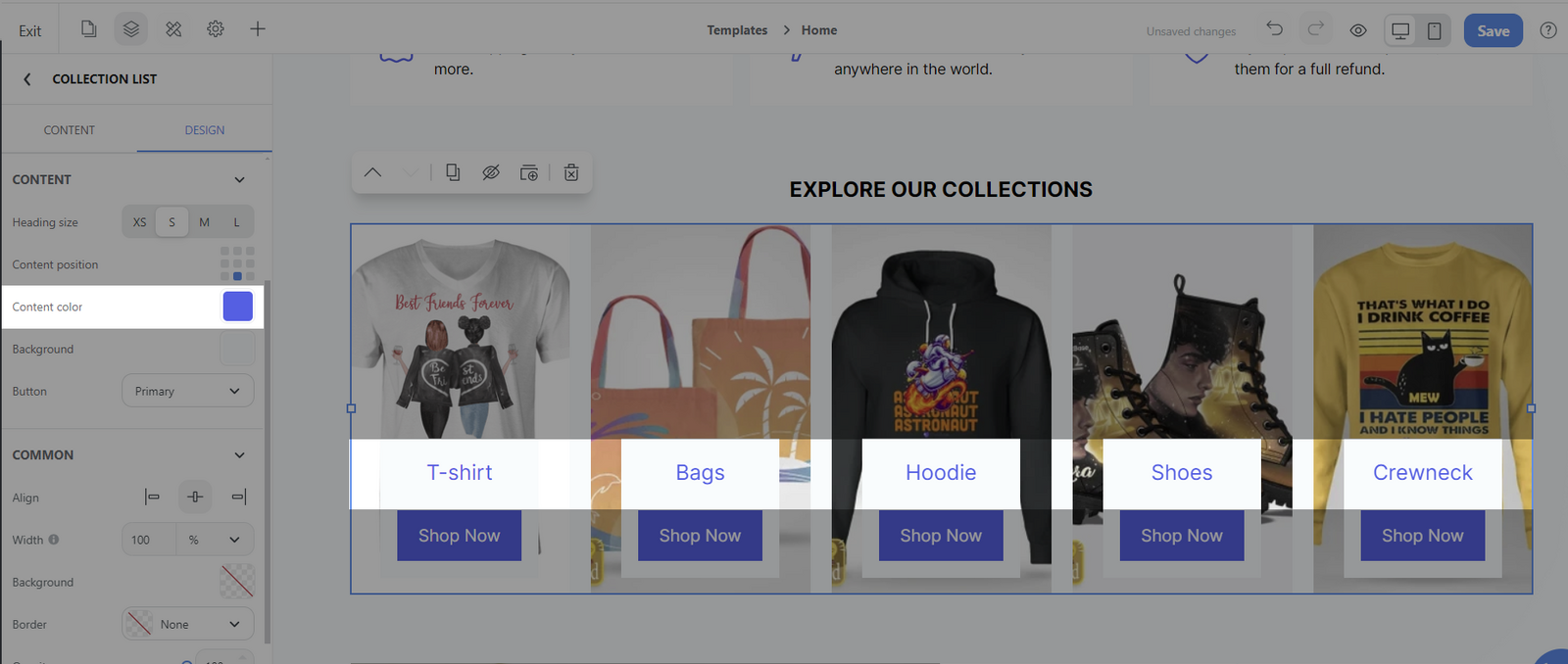
Content color: This option allows for customization of the text color within the content section.
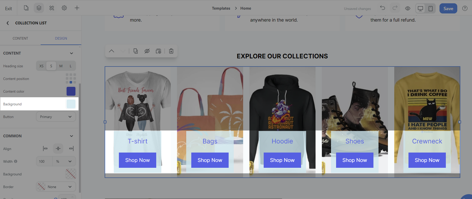
Background: This feature may let you choose a color that will serve as the backdrop for the content section.
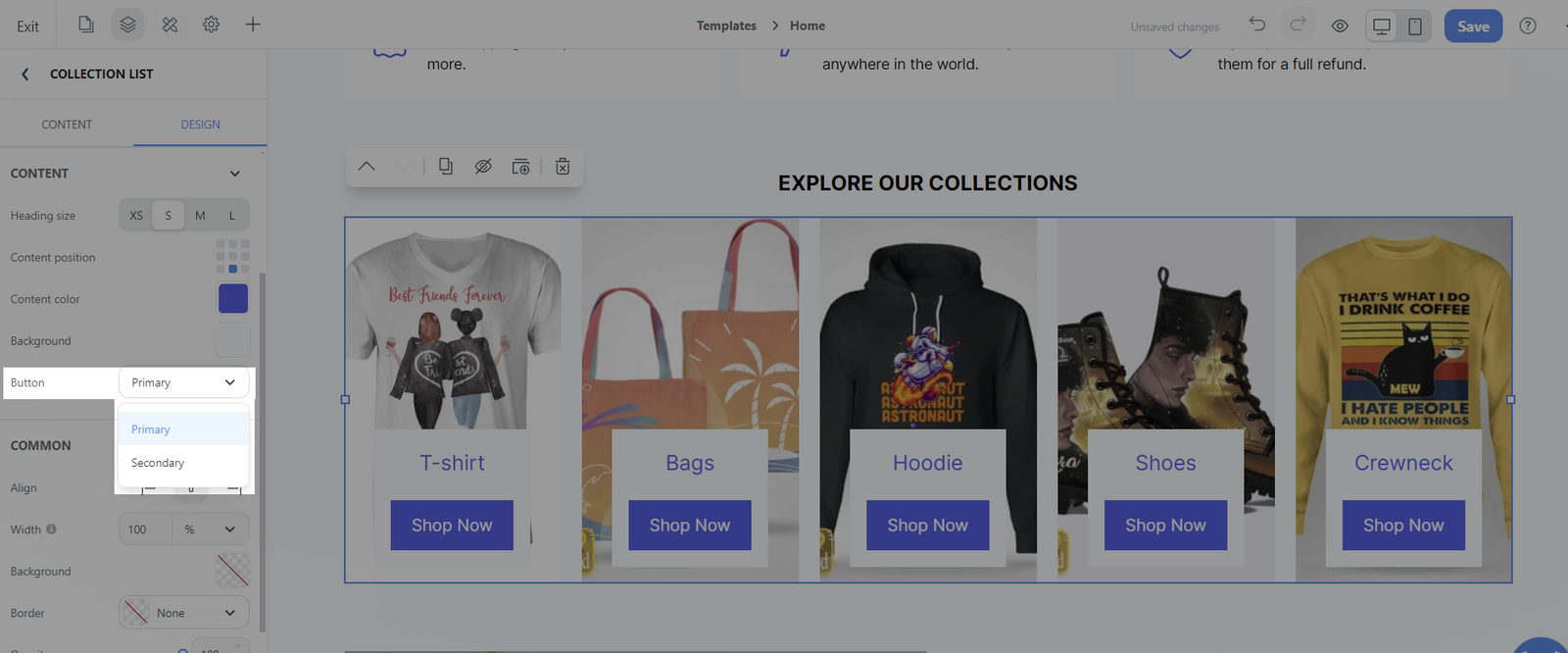
Button: You can select pre-designed buttons that were set up in the
Styling Setting section. You have options for a
Primary button and a
Secondary button.
Common section:
You can design general settings for the block. Please visit this article for more information.
Related articles