How to customize Variant picker block in Website Builder
The variant picker on an e-commerce website plays a key role in enhancing the customer shopping experience by allowing shoppers to seamlessly view and select different versions of a product, such as its size, color, material, or other attributes.
This article will show you how to customize the design of Variant Picker in Website Builder.
In this article
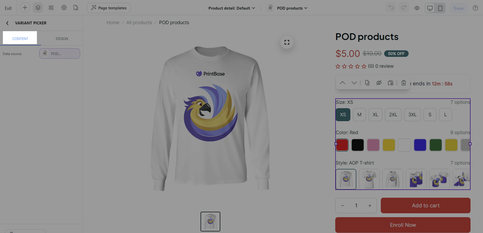
B. Customize the content tab of Variant picker block
C. Customize the design tab of Variant picker block
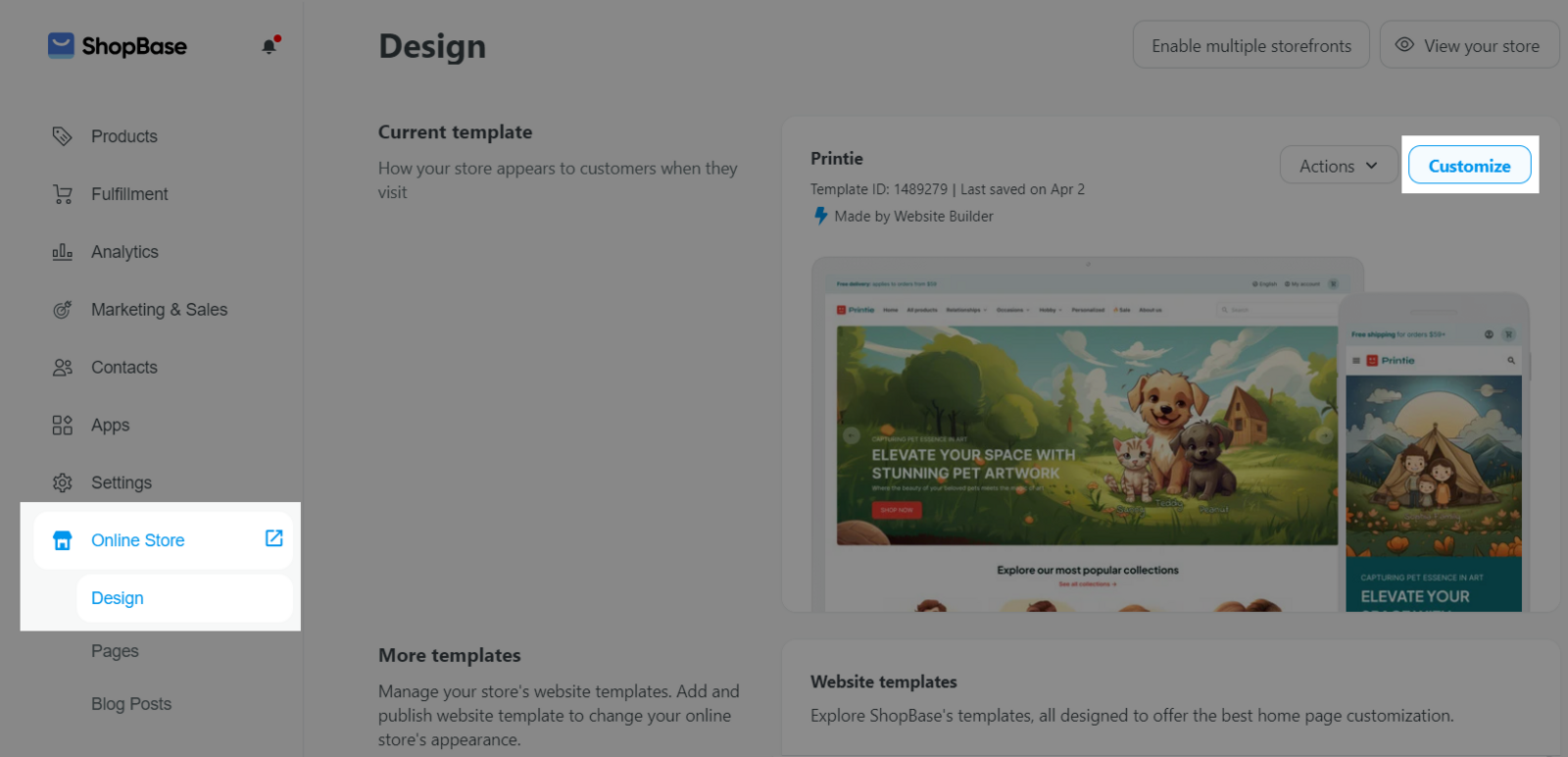
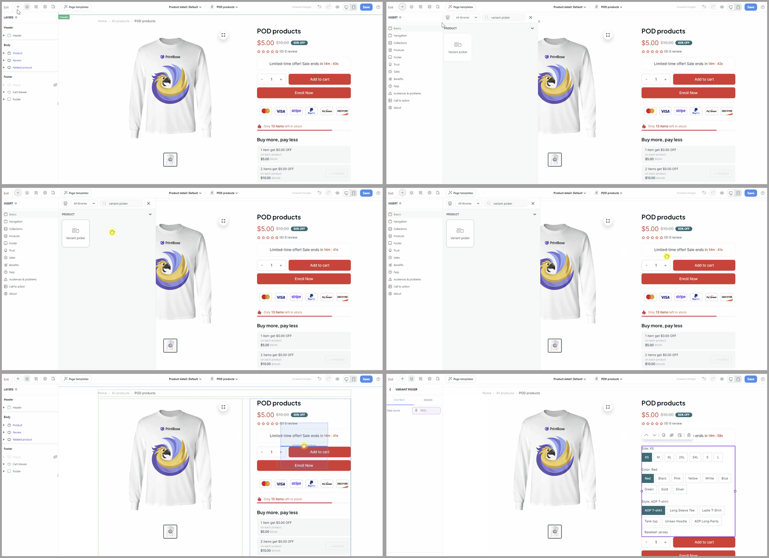
A. Add a Variant picker block
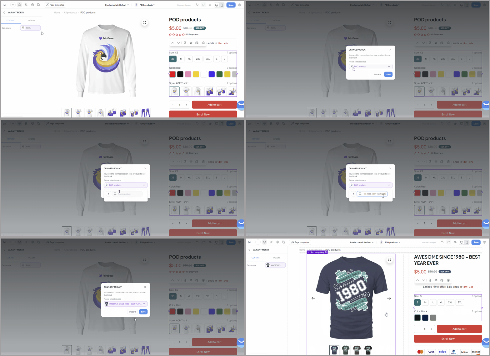
B. Customize the content tab of Variant picker block
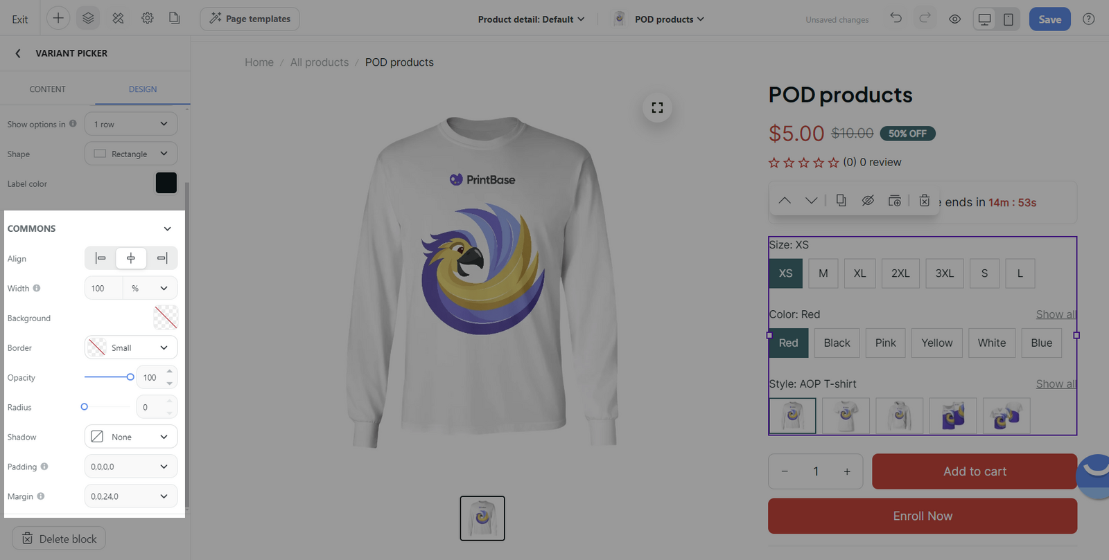
C. Customize the design tab of Variant picker block
Select the Variant picker block > Design tab.
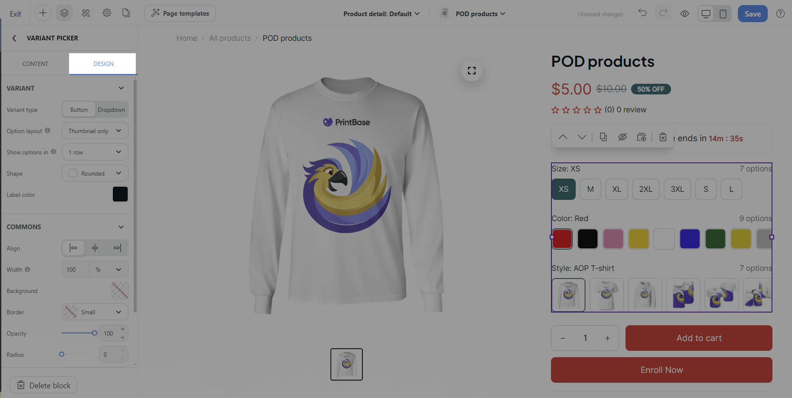
Variant section:
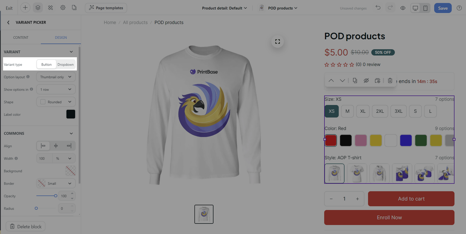
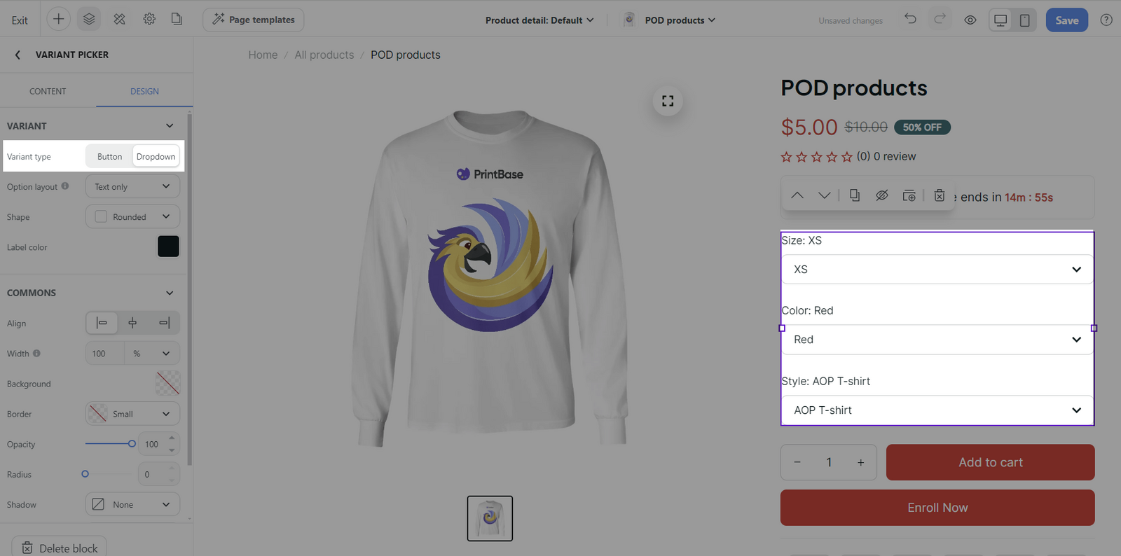
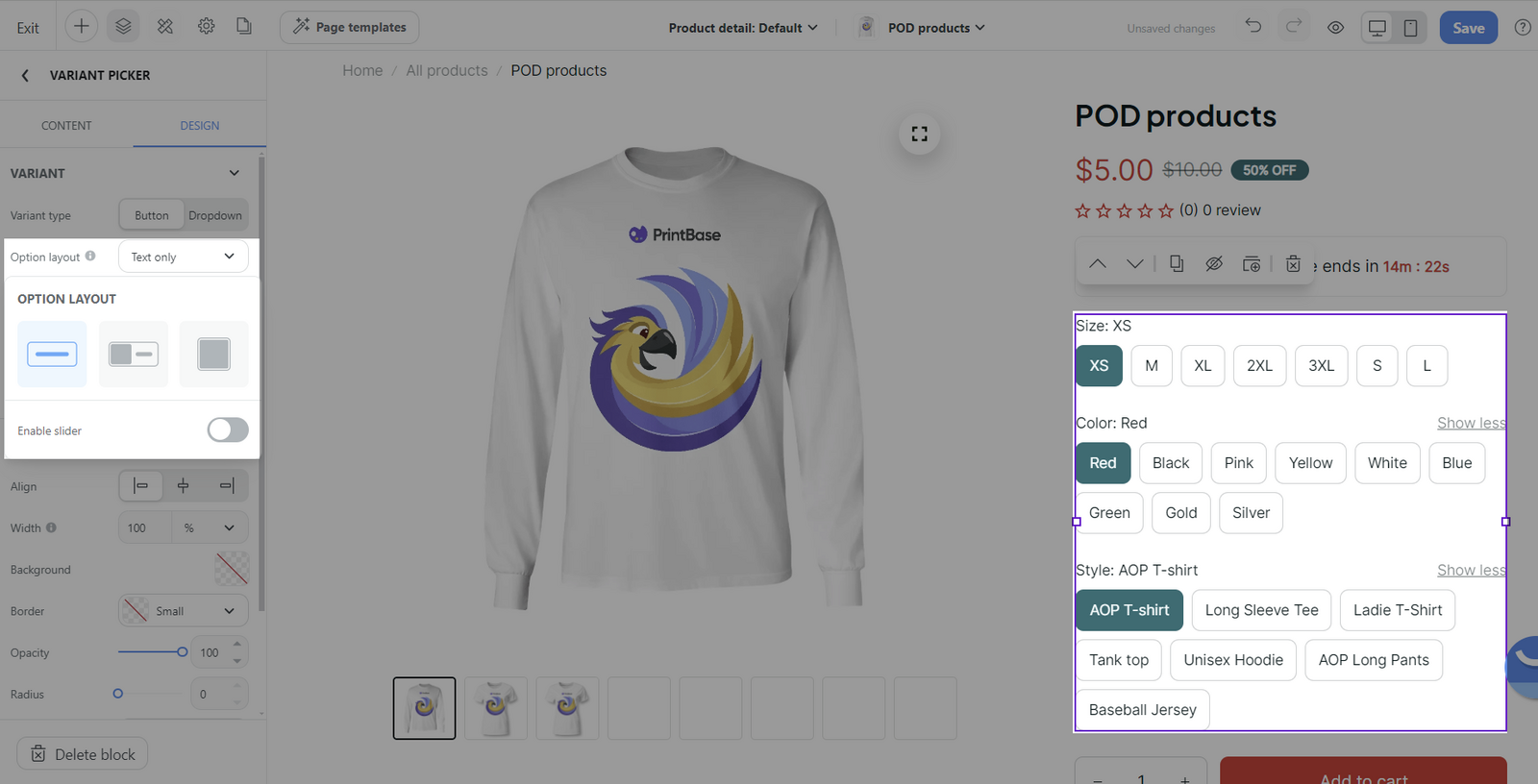
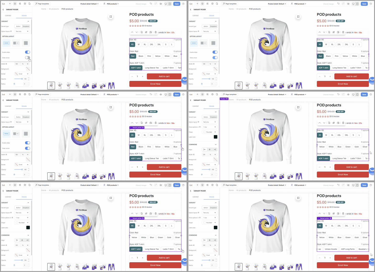
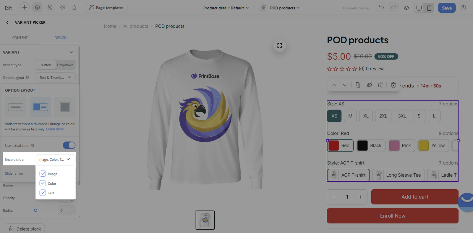
Enable slider: If you have numerous text-based options, you should activate a slider for smooth navigation.
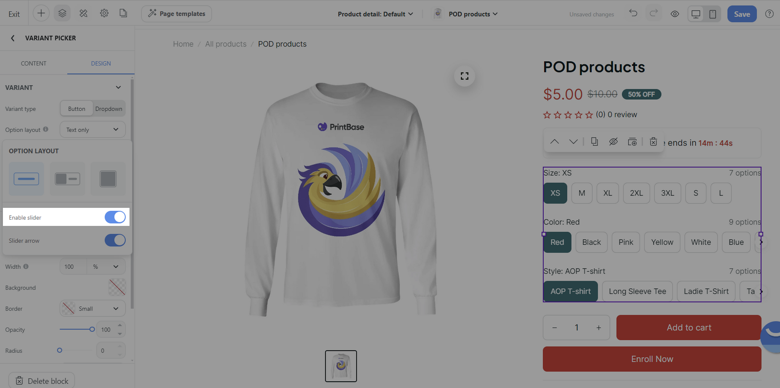
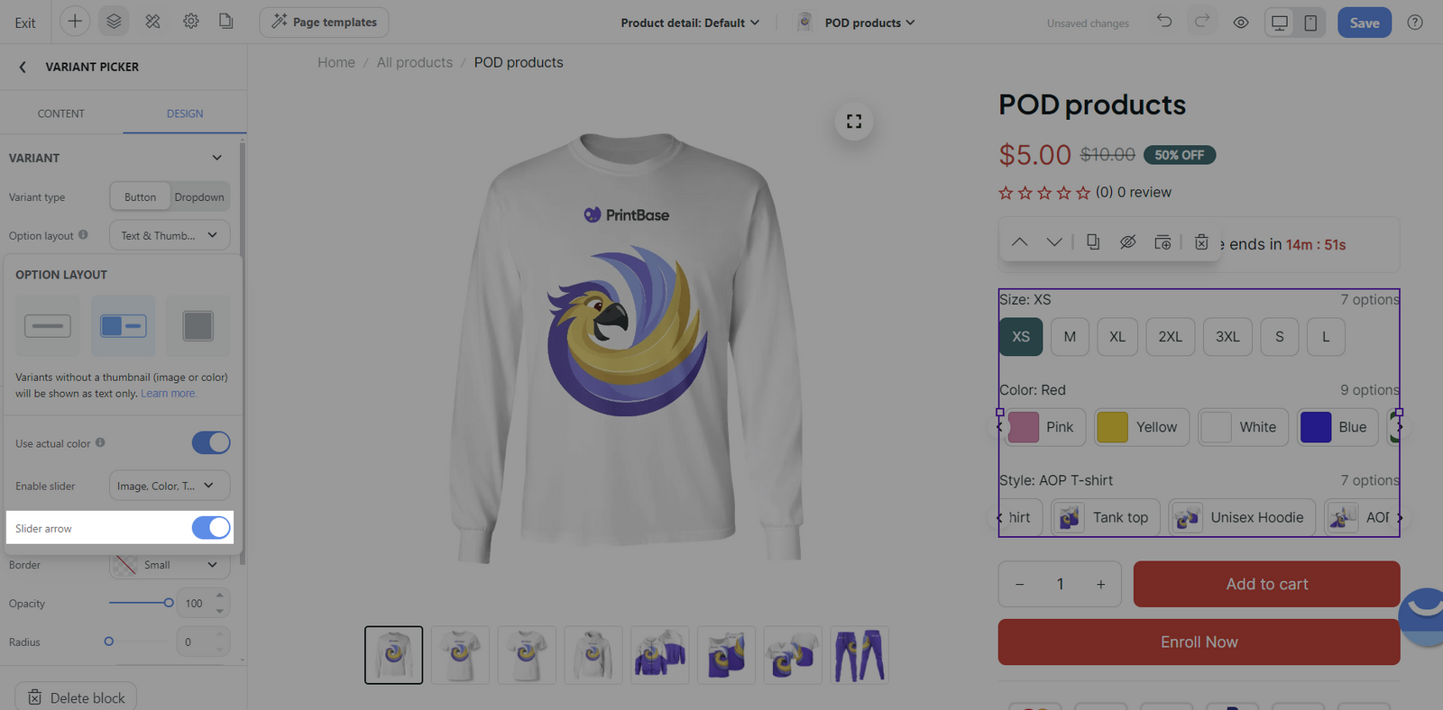
Slider arrow: Arrows can be added to navigate the slider if the Enable Slider option is active.
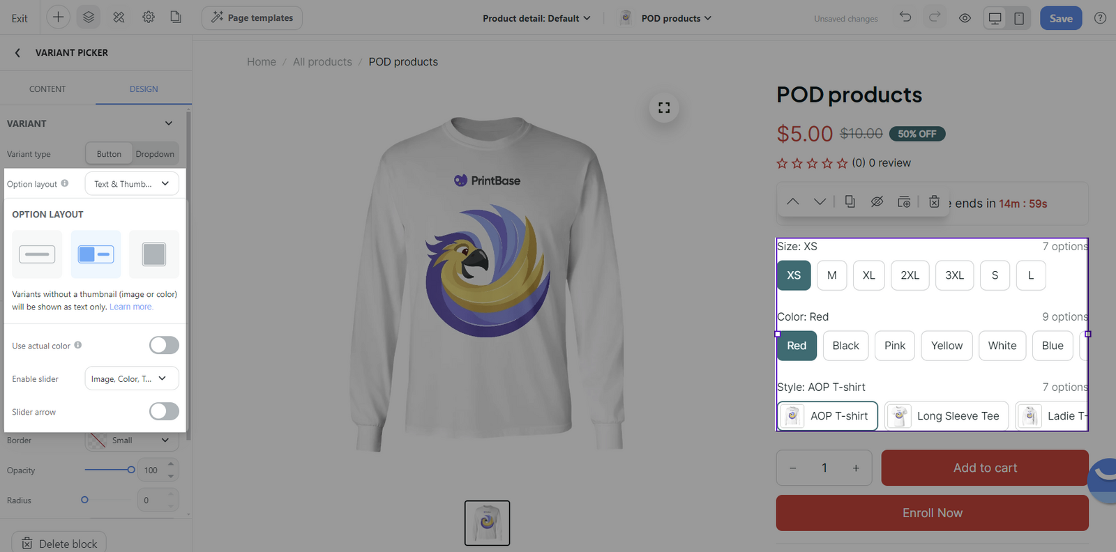
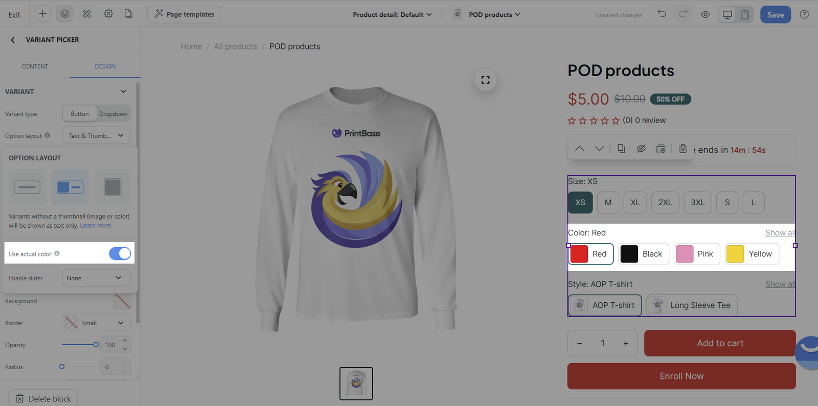
Use actual color: This allows you to preview the color variant options in their actual colors rather than just text or generic images.
When the Option's name includes any of these four words: Color, Colors, Colour, or Colours, the corresponding thumbnail will display the actual color if all color names are included in the color list.
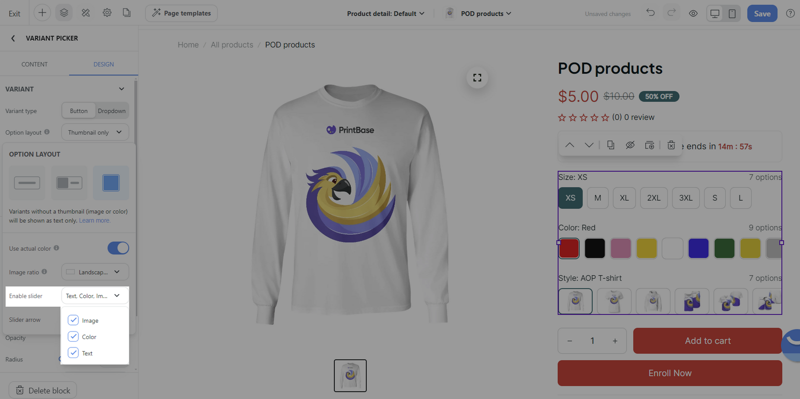
Enable slider: Choose whether the thumbnails Images, Colors, or Text will be displayed in a slider form for easier browsing.
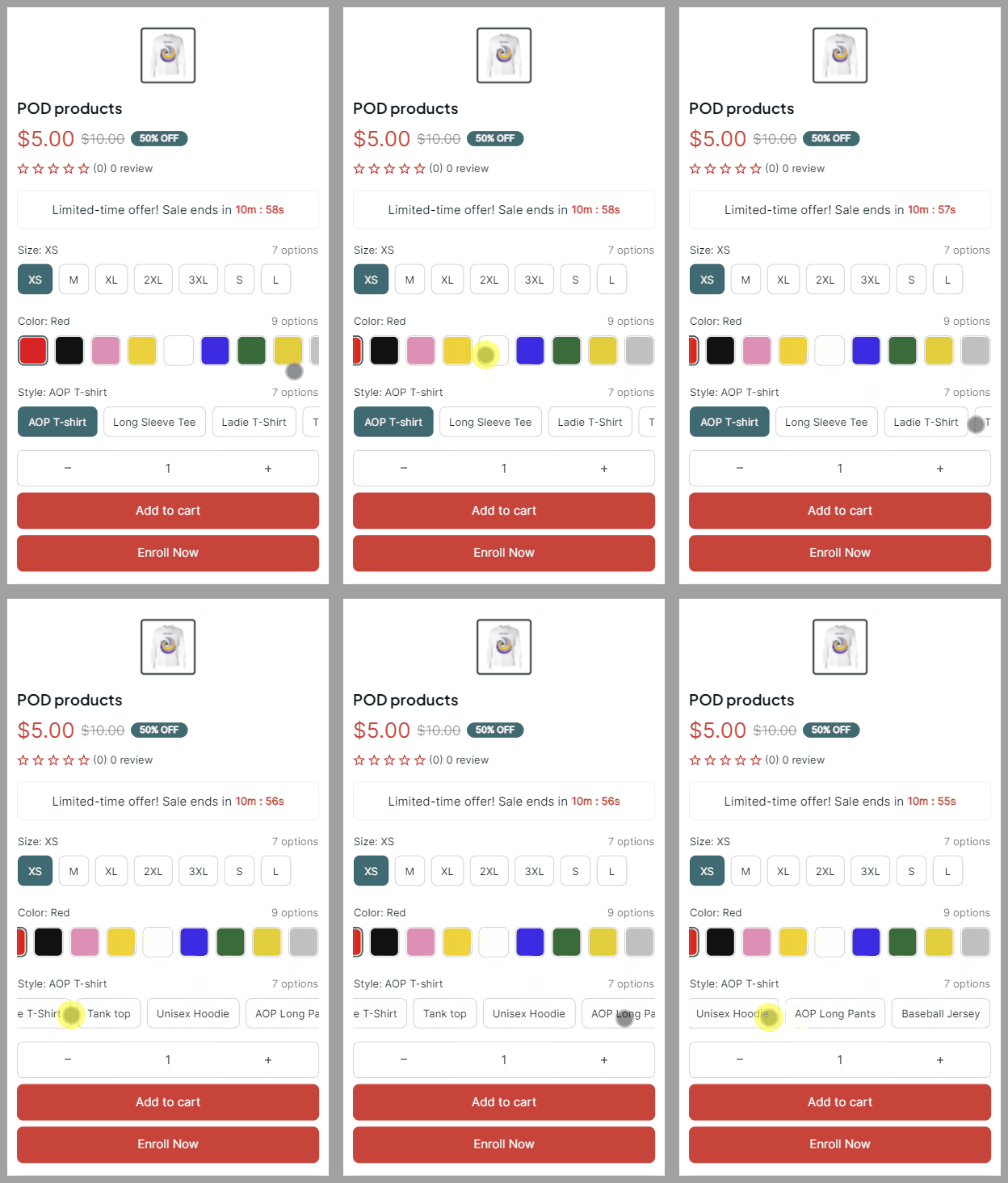
Slider arrow: Arrows for navigating the slider are applicable if enabled.
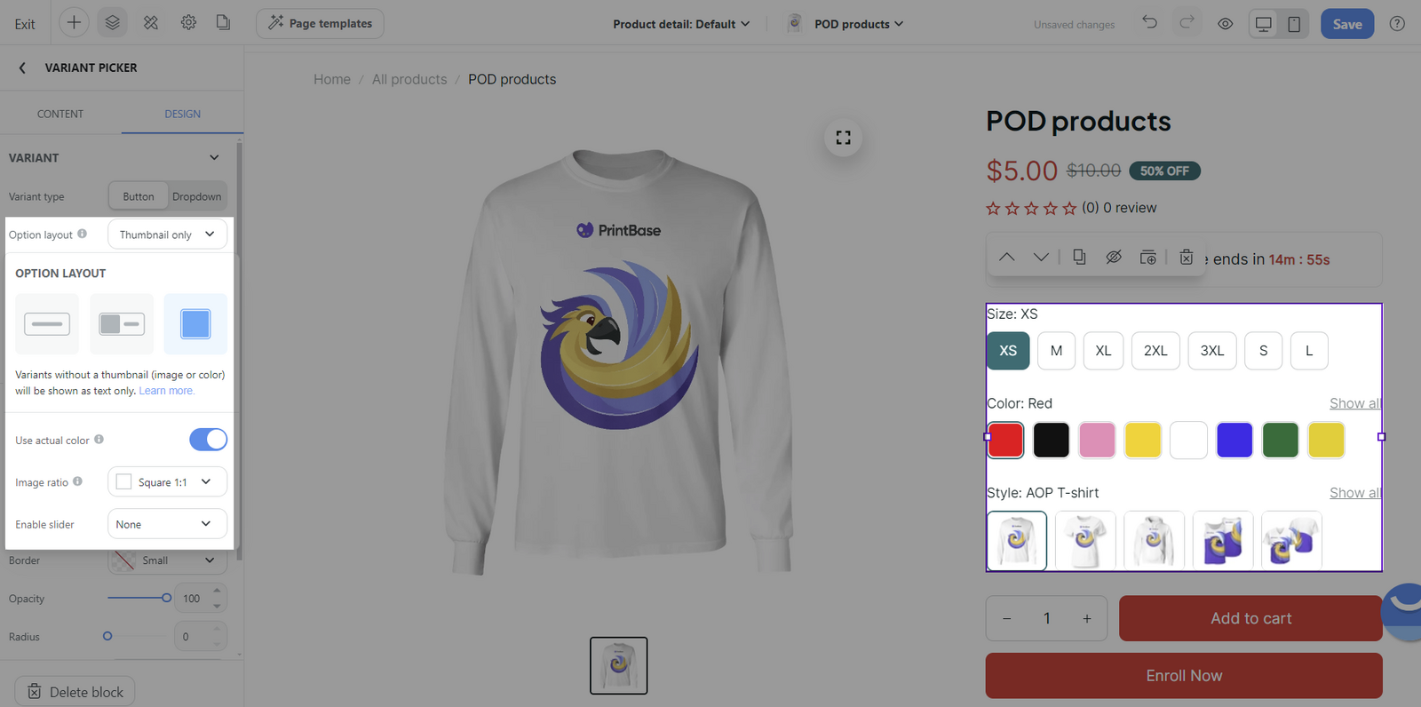
Use actual color: This allows for actual color representation in the thumbnails for color variants.
When the Option's name includes any of these four words: Color, Colors, Colour, or Colours, the corresponding thumbnail will display the actual color if all color names are included in the color list.
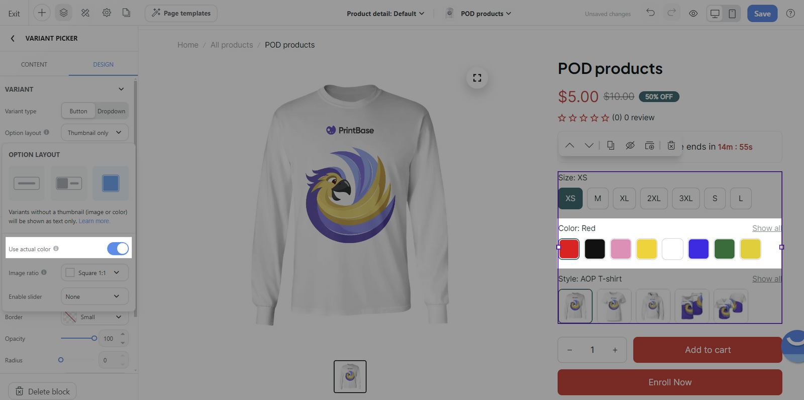
Image ratio: Set the image ratio of the thumbnails to Square (1:1), Portrait (3:4), or Landscape (16:9) according to the visual appeal or consistency you desire.
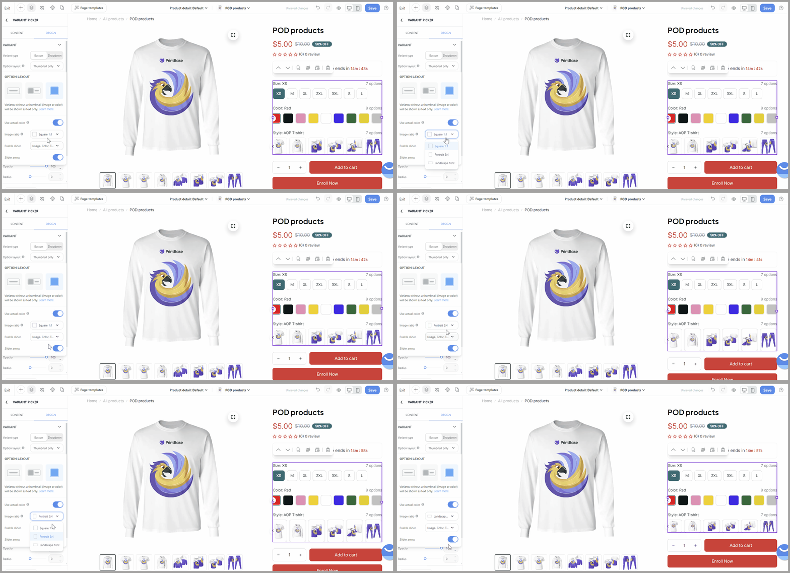
Enable slider: A slider can be implemented for Images, Colors or Text navigation if you have multiple thumbnails.
Slider arrow: The use of arrows for slider navigation is viable here as well.
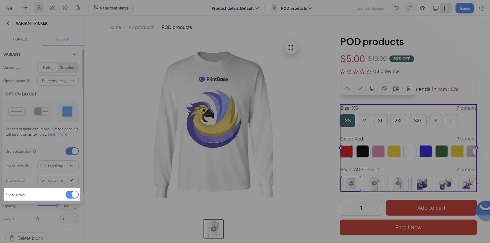
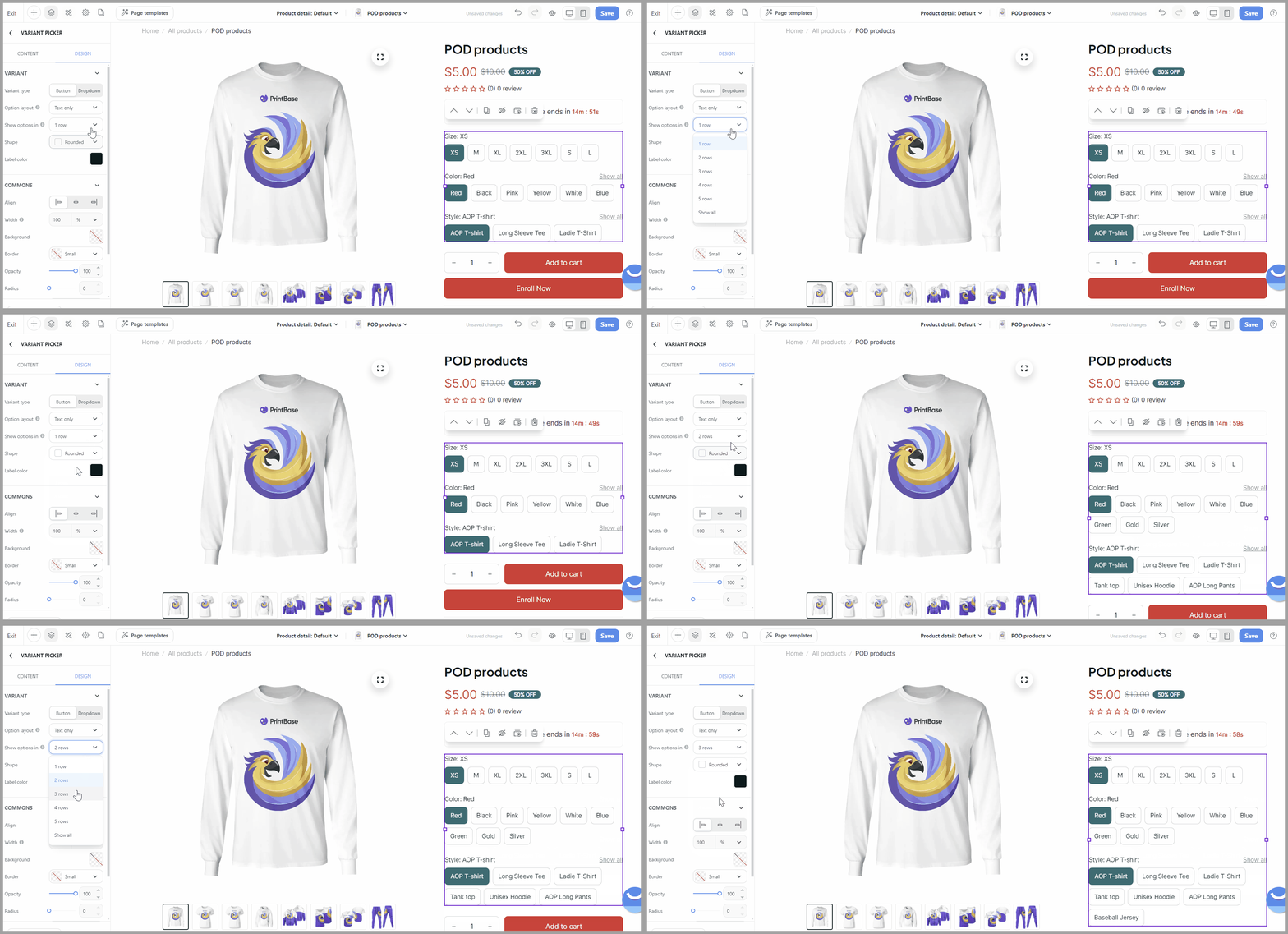
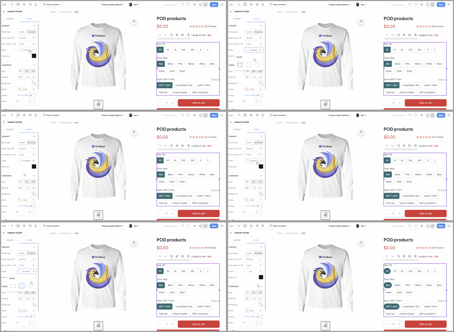
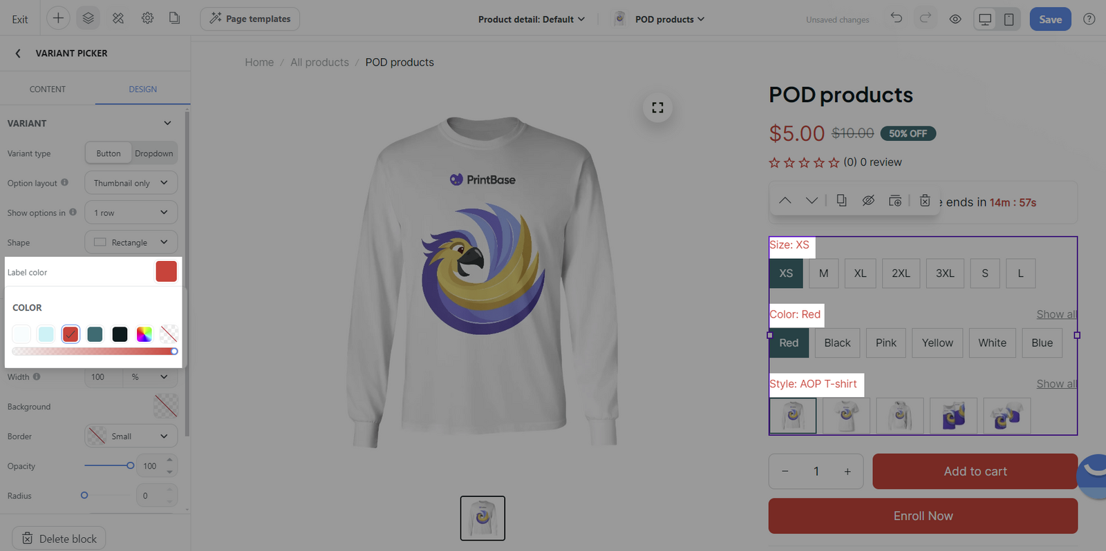
Image thumbnails will only display if all variants have images, and each variant in different groups must have a unique image. Only variants in the option which assigned to the group can display image thumbnails. To enable variant group swatches, you can refer to this article.
Common section:
You can customize other common settings. Please visit this article to learn more about how to customize common settings.
