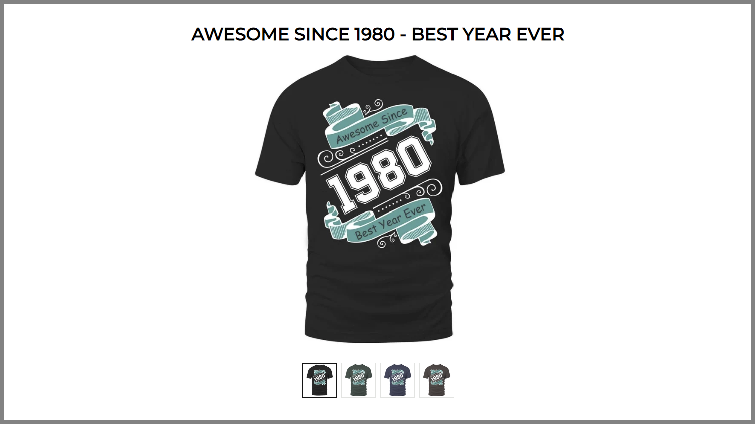
A product gallery on an e-commerce website is crucial due to its necessity in:
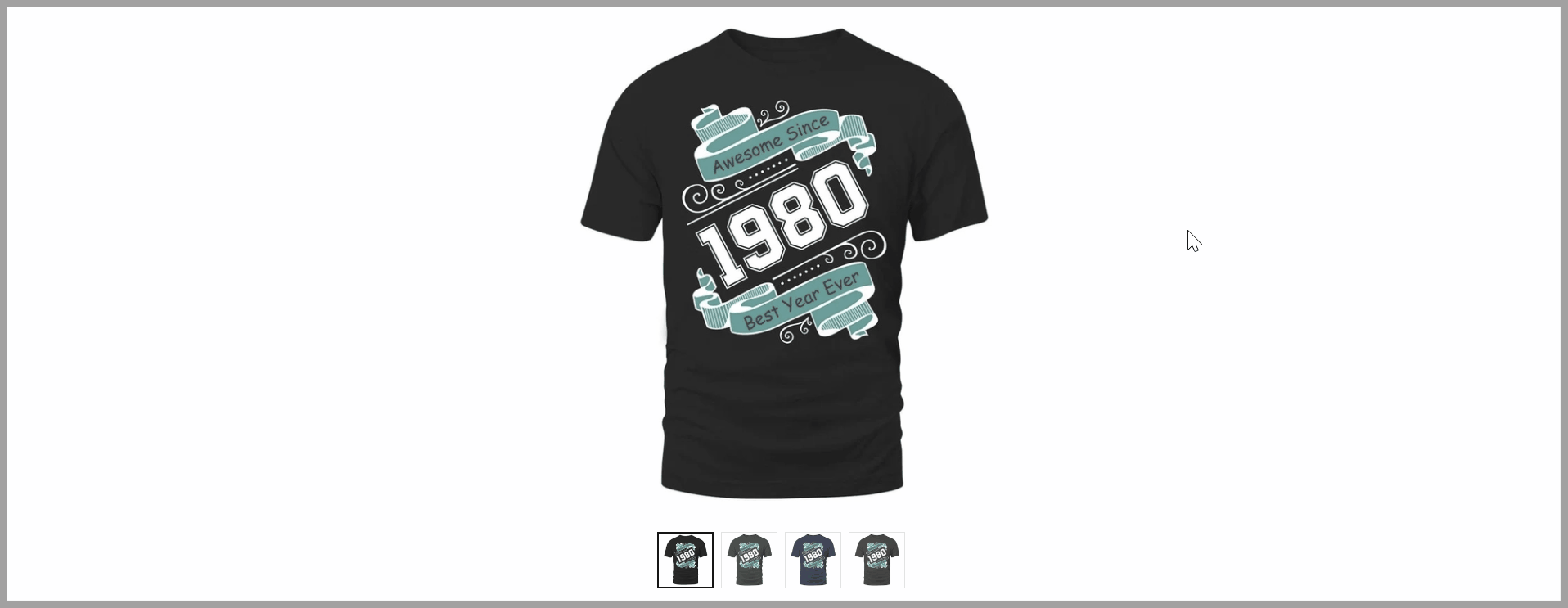
Providing visual representation for products, enhancing user experience.
Building trust by showing products from multiple angles.
Displaying product variations effectively.
In this article, we will show you the basics of how to customize Product gallery block in Website Builder.
In this article
A. Add a Product gallery block
B. Customize the content tab of Product gallery block
C. Customize the design tab of Product gallery block
D. Customize the effect tab of Product gallery block
A. Add a Product gallery block
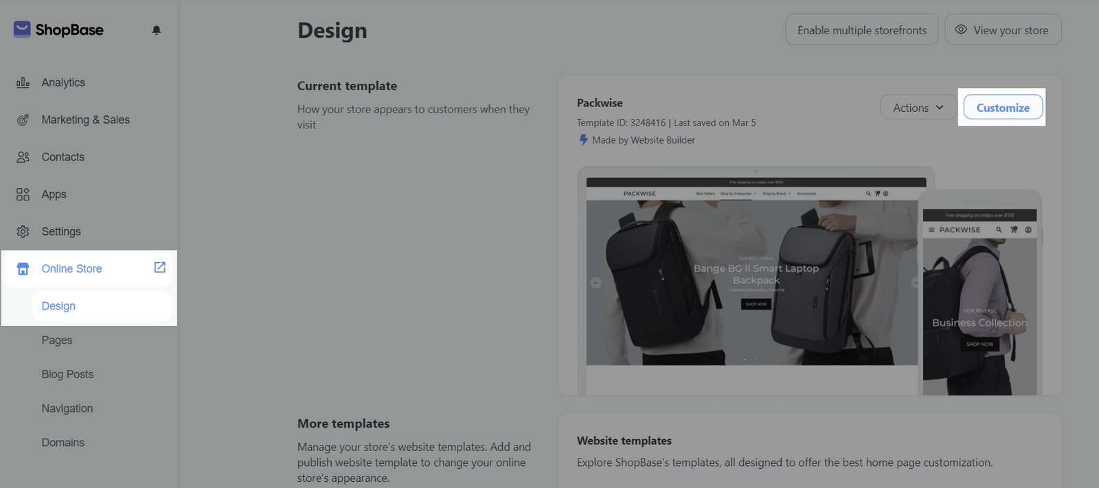
On admin dashboard, go to Online Store > Design > Customize.
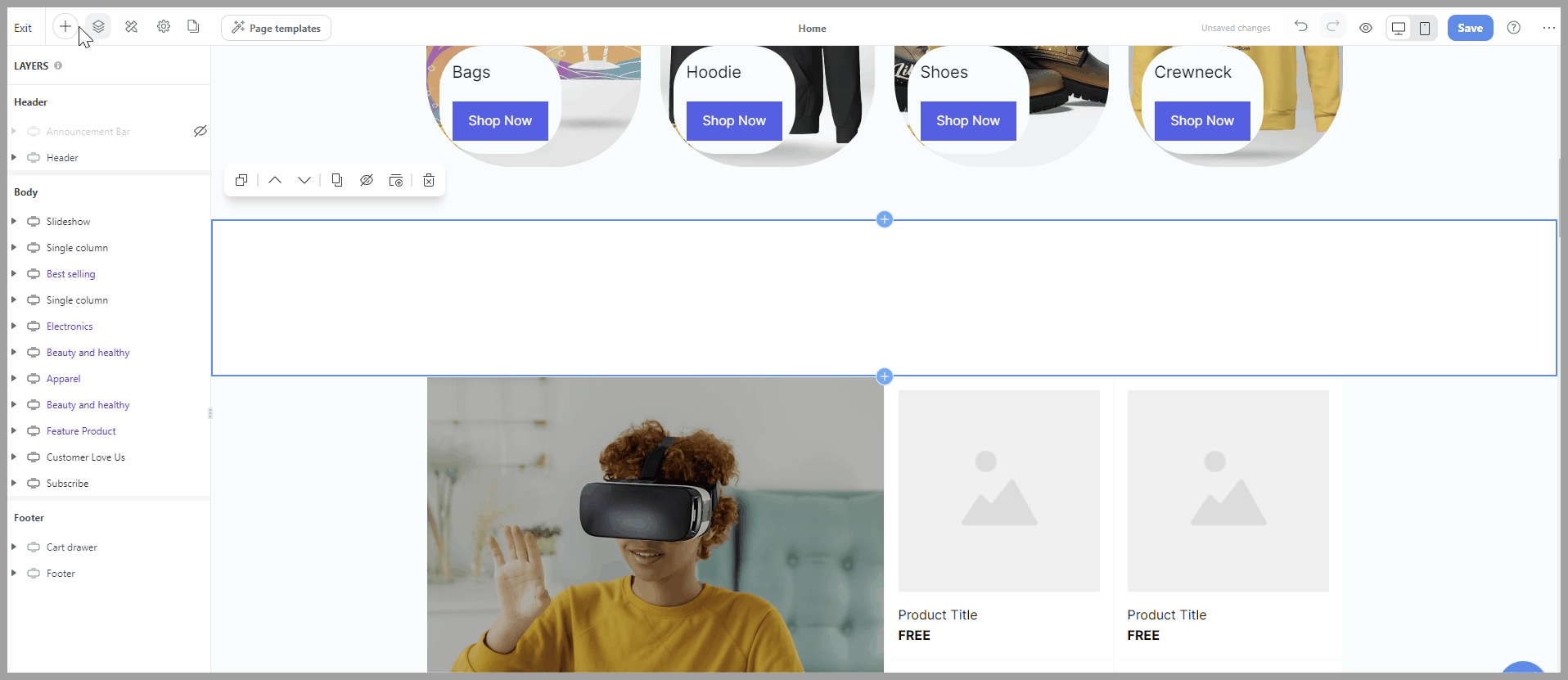
To add a new Product gallery block to your web page, from the Website Builder, open the Insert panel and drag your block into the desired position. Then, you can freely customize the Content and Design of each block in Website Builder.
B. Customize the content tab of Product gallery block
Select the Product gallery block > Content tab.
Data source: This setting allows you to select which product you would like to display in the gallery block. You can change the data source at any moment ensuring that the product visuals remain relevant and are easily updated to reflect your current offerings. If you add the gallery product block to the product page and wish to display each product on its corresponding product page, select 'current page product
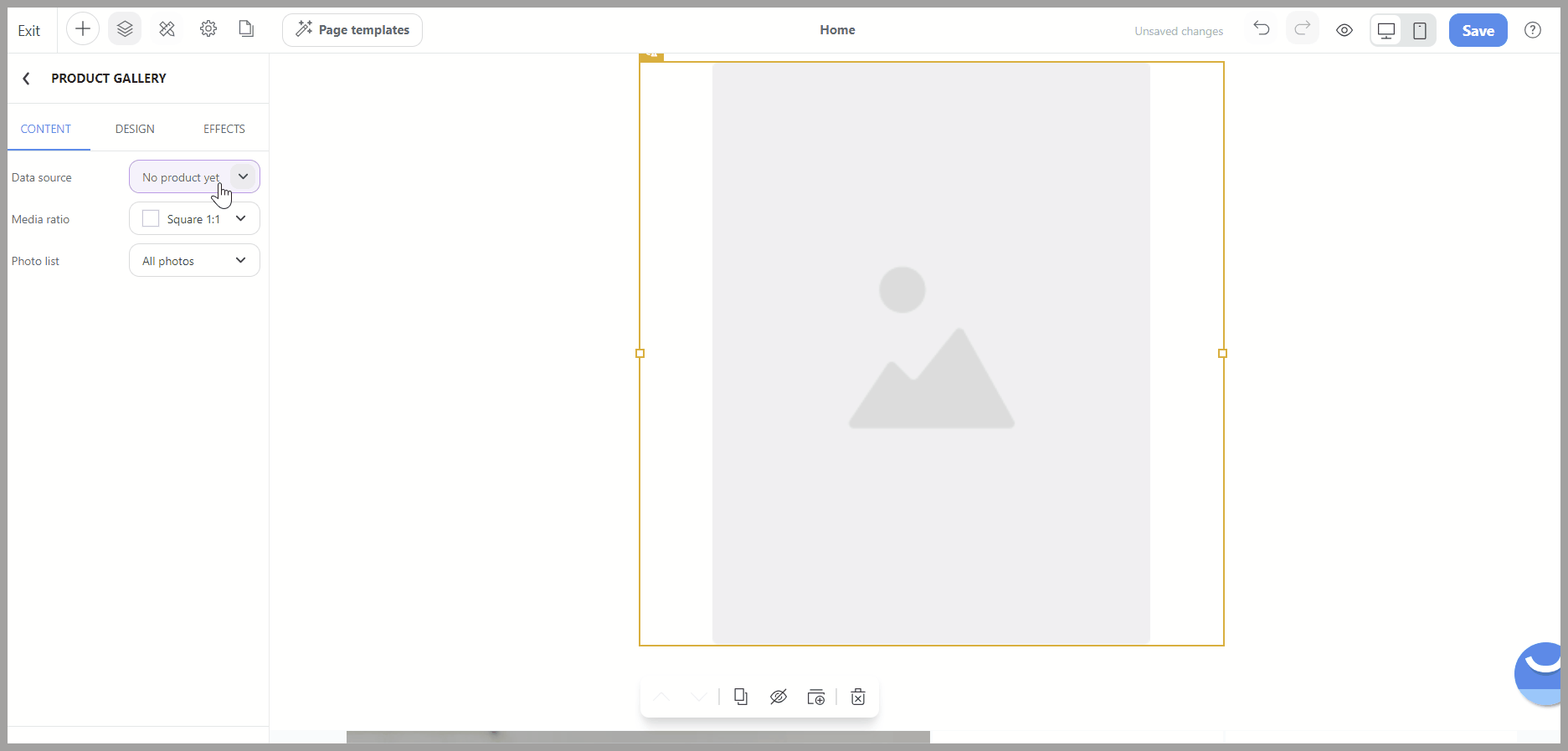
Media ratio: This option lets you change the aspect ratio of the images displayed in the gallery. There are 3 available choices: Square (1:1), Portrait (3:4), and Landscape (16:9) which provide flexibility in how your product photos are framed and presented, ensuring they fit seamlessly into your site’s design and layout.
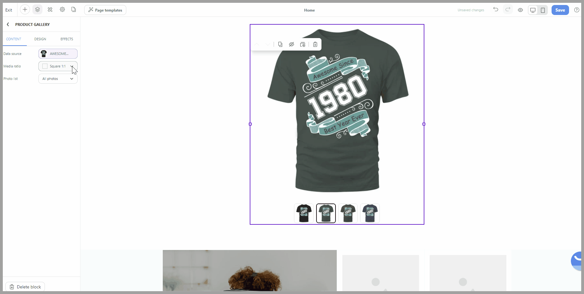
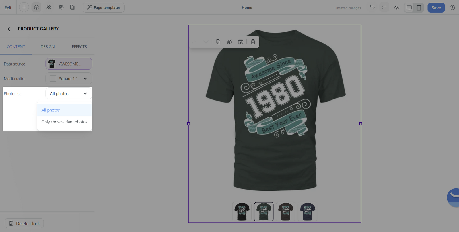
Photo list: Through this feature, you can specify whether to display all photos associated with a product or to limit the gallery to only show photos that are relevant to the selected product variant.
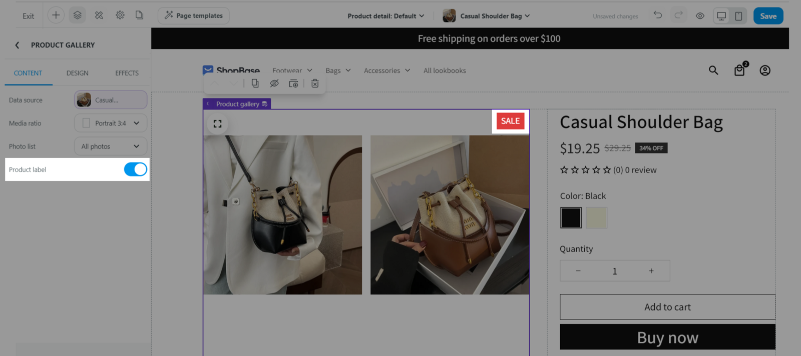
Product label
Toggle on to display the product label on the product gallery image.
C. Customize the design tab of Product gallery block
Items section:
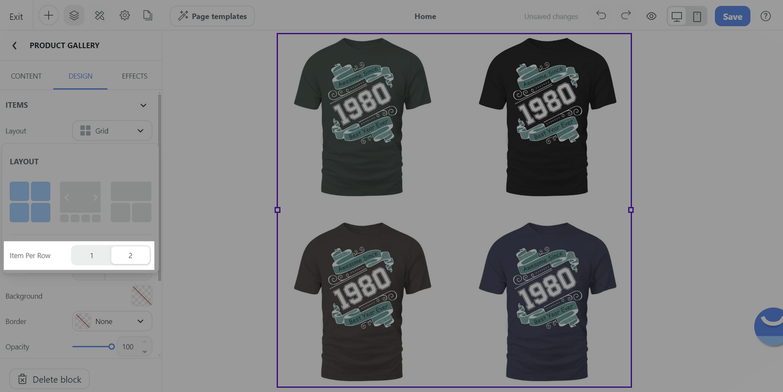
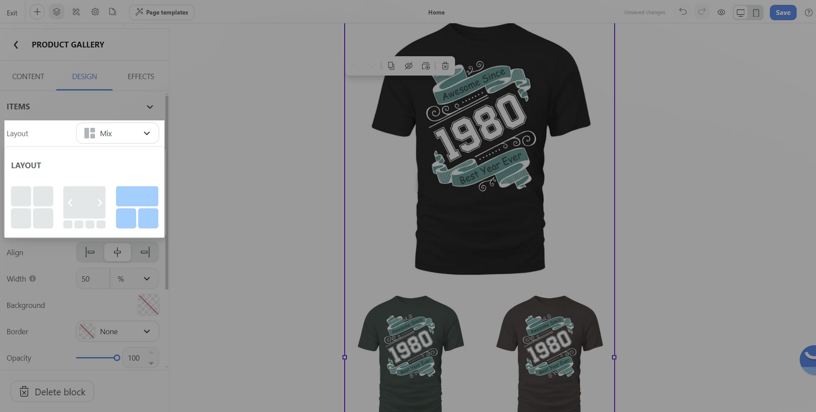
Layout: Select the overall arrangement style for the product images. There are three options:
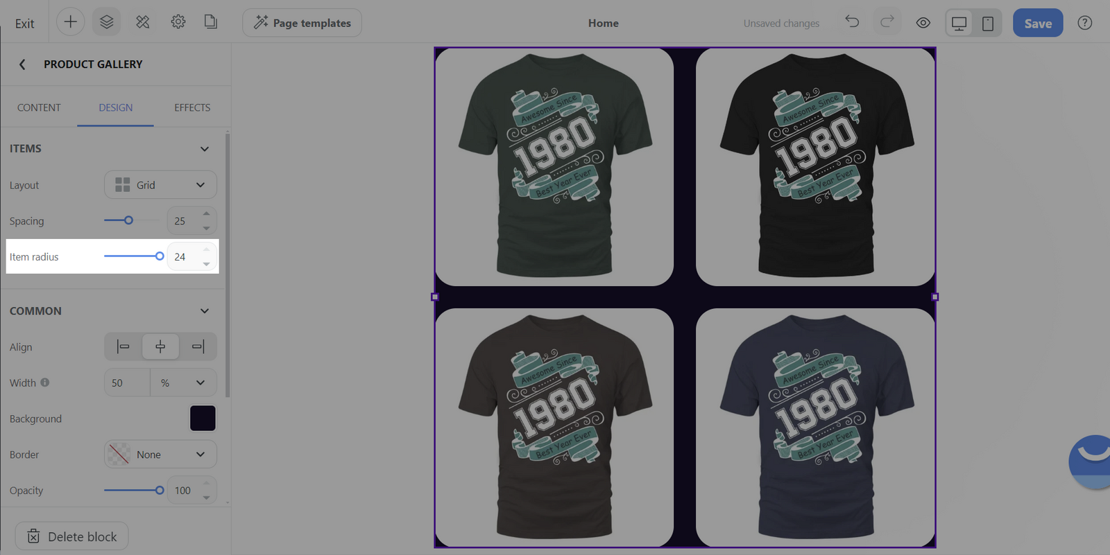
Grid: Displays images in a structured grid format.
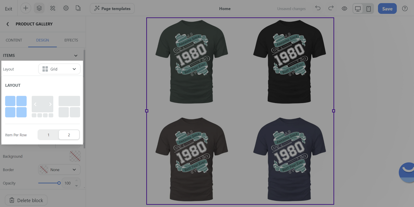
Item per row: You can specify the number of items per row, with the choice of setting it to 1 or 2, allowing control over the density and spacing of your product images.
Carousel: Presents your images in a slideshow-like sequence, one after the other.
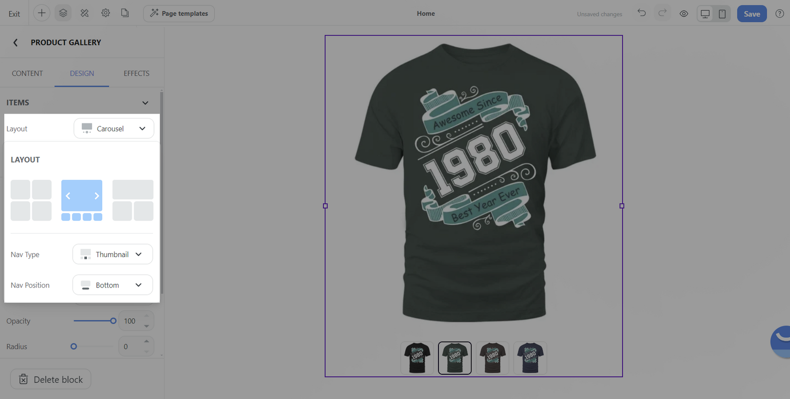
Nav type: This format allows you to choose between Thumbnail, Dots, or None for navigation through the gallery.
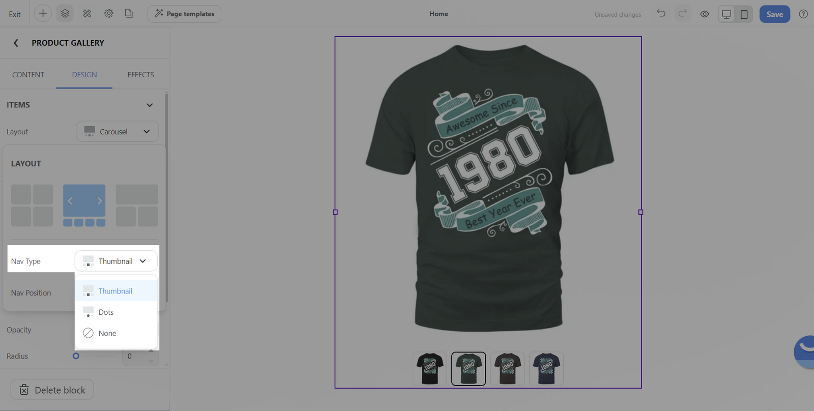
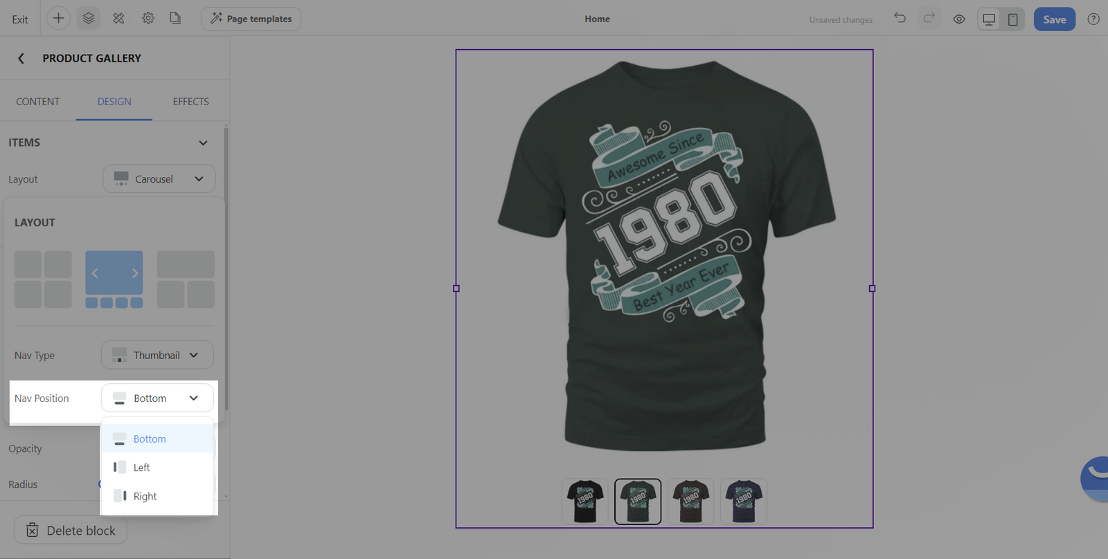
If choosing Thumbnail, additional customization is available by setting the navigation thumbnails' position to the left, right, or bottom of the main image.
Mix: Arrange product images in a grid formation that varies the position and presentation of each image.
For mobile devices, the Product Gallery block simplifies to a singular layout choice for optimal viewing – the Carousel layout. This streamlined presentation ensures a smooth and intuitive browsing experience on smaller screens.
Spacing: Adjusts the space between individual images. This helps to create a cleaner and more tailored look that fits with your website's design.
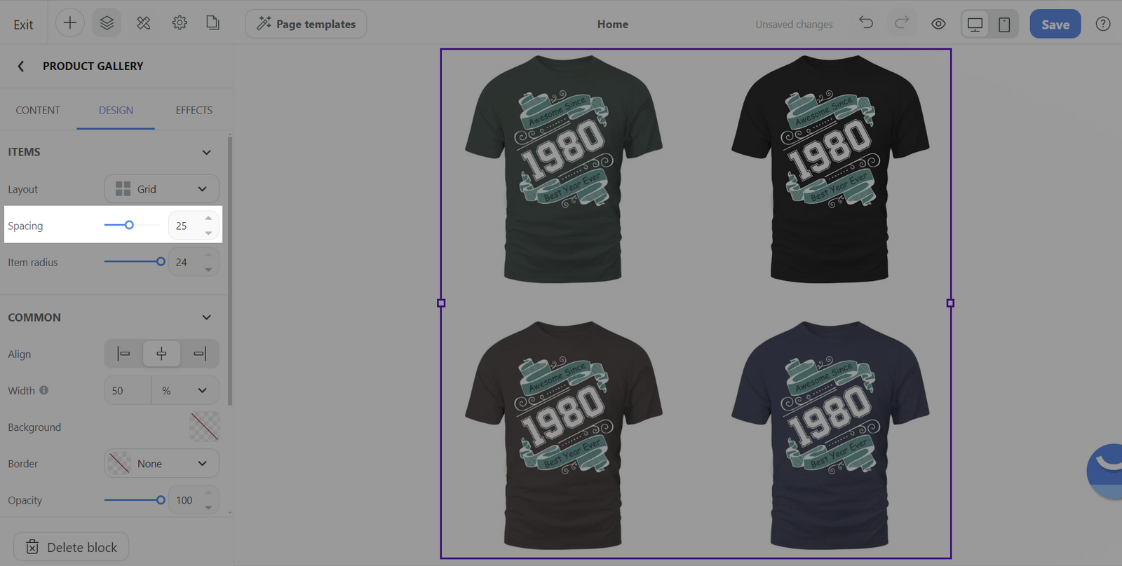
Item radius: Modifies the corner radius of the images. It can round the corners of your product images to varying degrees, giving the Gallery block a softer look or maintaining sharp edges, depending on your visual preference.
Common section:
You can design general settings for the block. Please visit this article for more information.
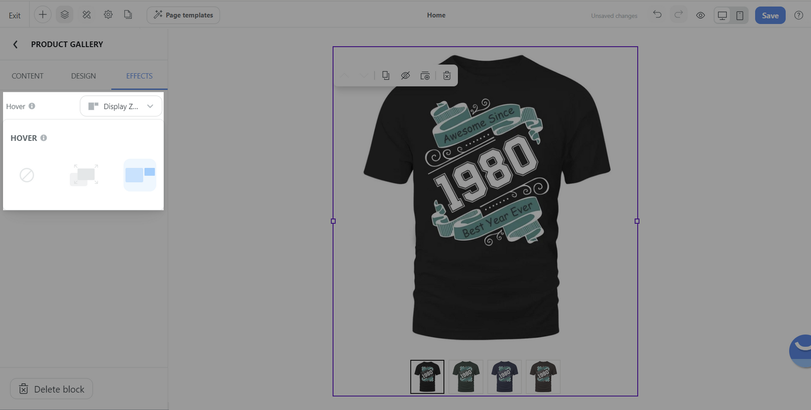
D. Customize the effect tab of Product gallery block
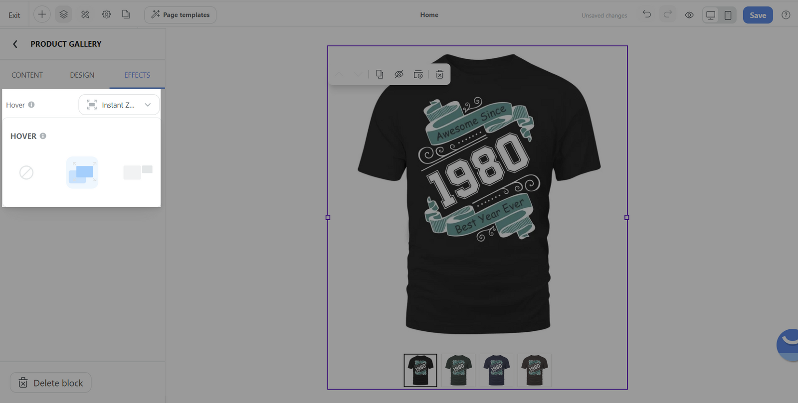
The Effect tab in a Product Gallery block offers you the ability to enhance the user's visual experience with different types of image-zoom effects. This is particularly useful for providing a closer look at the finer details of your products.
None: This option leaves your product images without any additional zoom-in effect. It's ideal if you prefer a clean and simple presentation without interactive image enlargement.

Instant zoom-in: When this effect is chosen, any area of an image that a user hovers over with their cursor will be magnified instantly to 250% of its original size. This immediate magnification allows customers to view details quickly as they navigate across different parts of the image.
Display zoom-in window: Selecting this effect brings up a small pop-up window when a user hovers over the image. The window displays the hovered area at an increased ratio of 300%, offering a detailed look at the product textures and features within that specific section of the image.
The zoom-in effects are tailored for desktop use only. On a mobile device, the gallery block behaves differently. After tapping an image to enter a focused view, customers can double-tap any point on the image to effectively zoom in and examine the product in greater detail.

Related articles