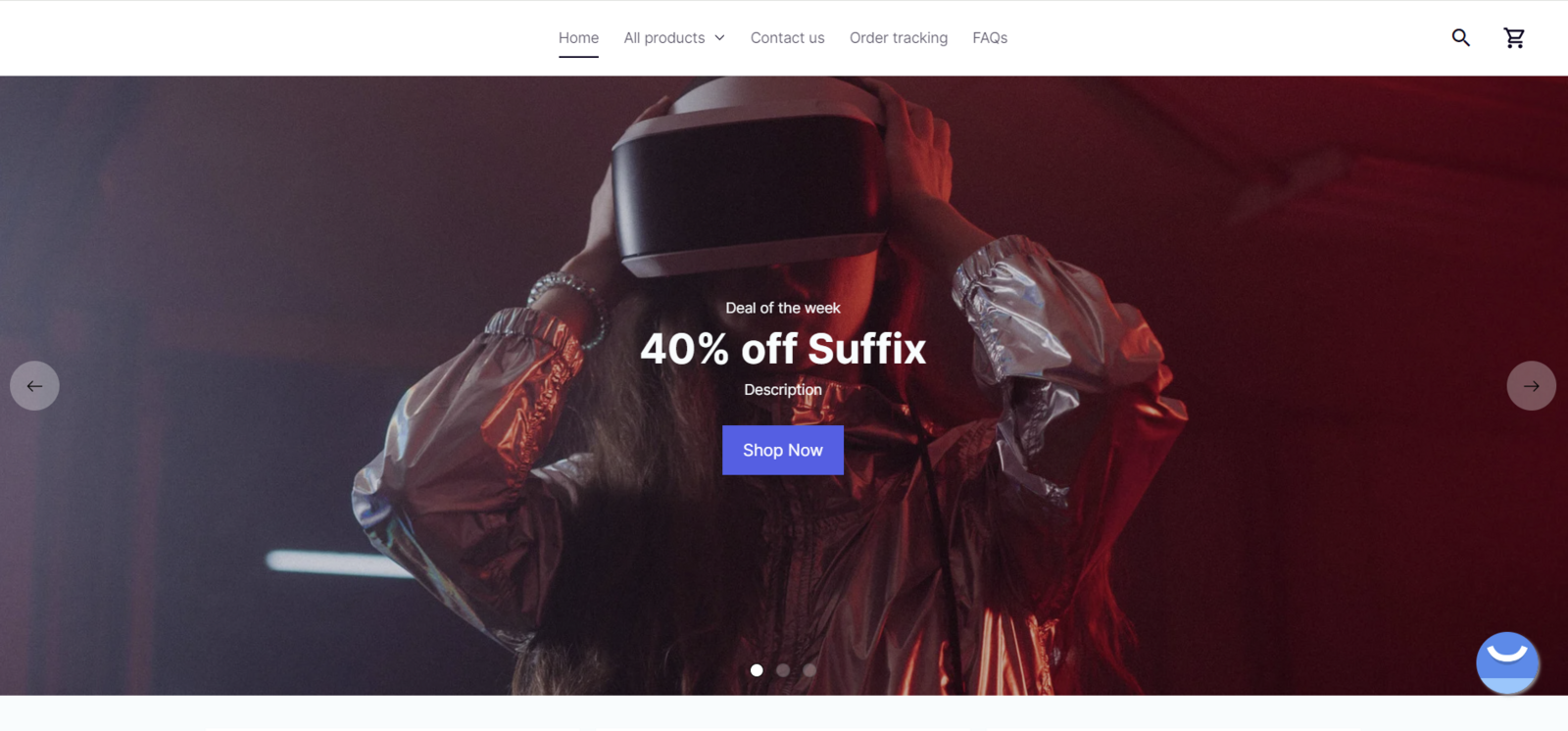
A slideshow on a website can serve several purposes:
Visual appeal: enhance website appeal by presenting images, graphics, or videos dynamically, capturing visitor attention and forming positive first impressions.
Highlighting featured content: spotlight featured content like products, promotions, or announcements, boosting user interaction and engagement by cycling through slides.
Seasonal themes: showcase holiday-themed content like special offers, decorations, or products, creating a festive atmosphere to attract visitors during specific times.
Promoting CTA (call-to-action): integrate call-to-action buttons or links within slides, prompting users to take actions like purchasing, subscribing, or exploring more content.
This article will guide you on setting up the slideshow for both desktop and mobile versions for your store.
In this article
B. Customize the content tab of Slideshow block
C. Customize the design tab of Slideshow block
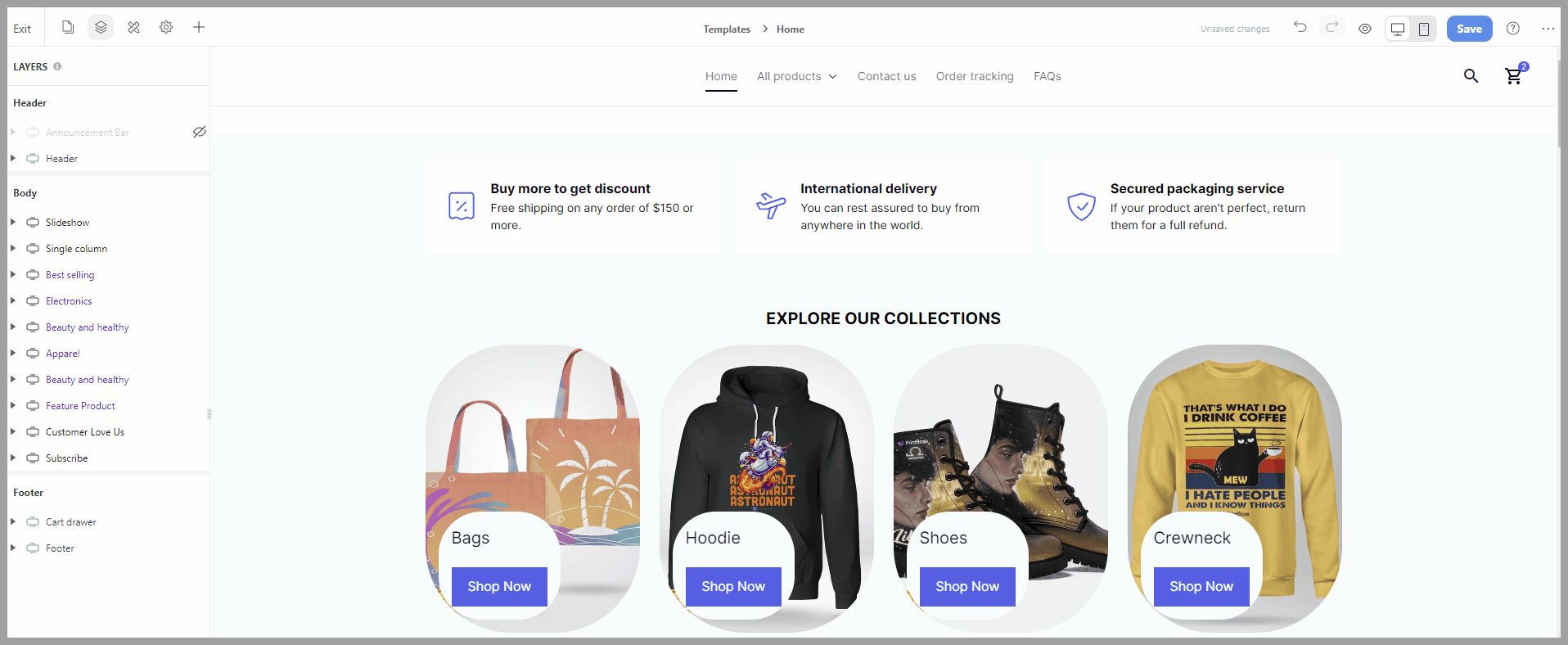
A. Add a Slideshow block
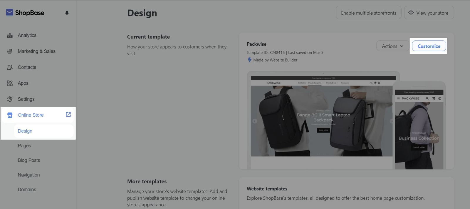
On admin dashboard, go to Online Store > Design > Customize.
To add a new Slideshow block to your web page, from the Website Builder, open the Insert panel and drag your block into the desired position. Then, you can freely customize the Content and Design of each block in Website Builder.
B. Customize the content tab of Slideshow block
Select the Slideshow block > Content tab.
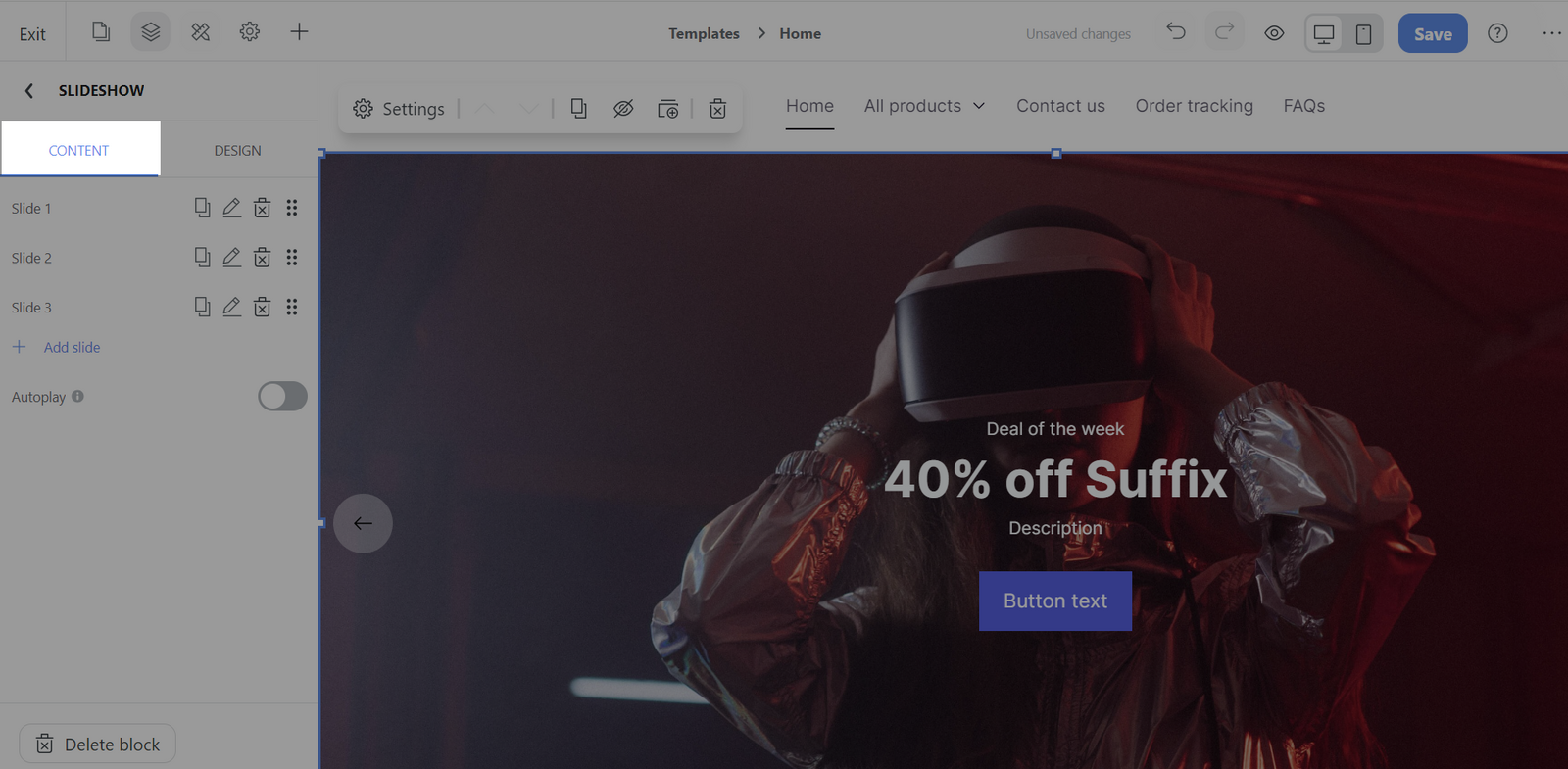
Click Add slide to create a slide that you want to display.
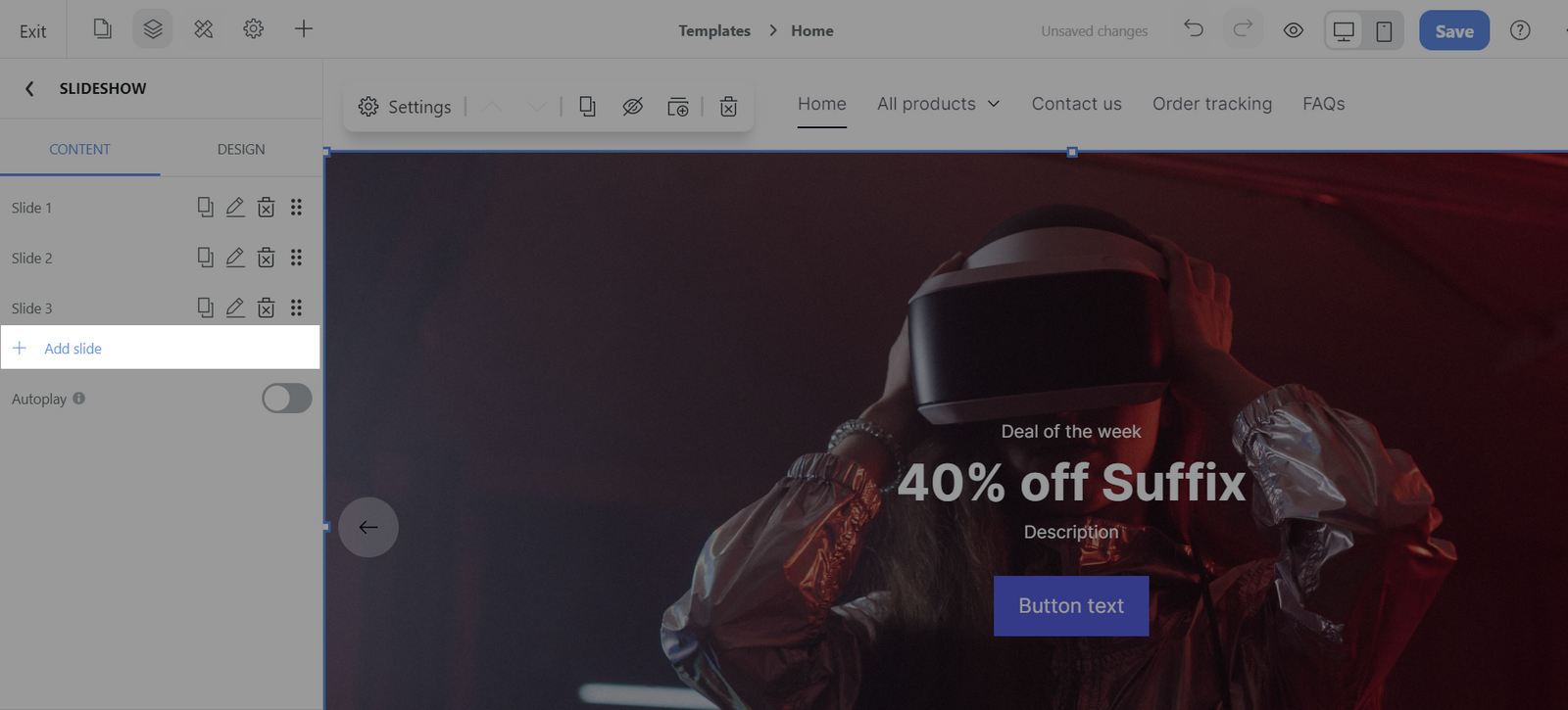
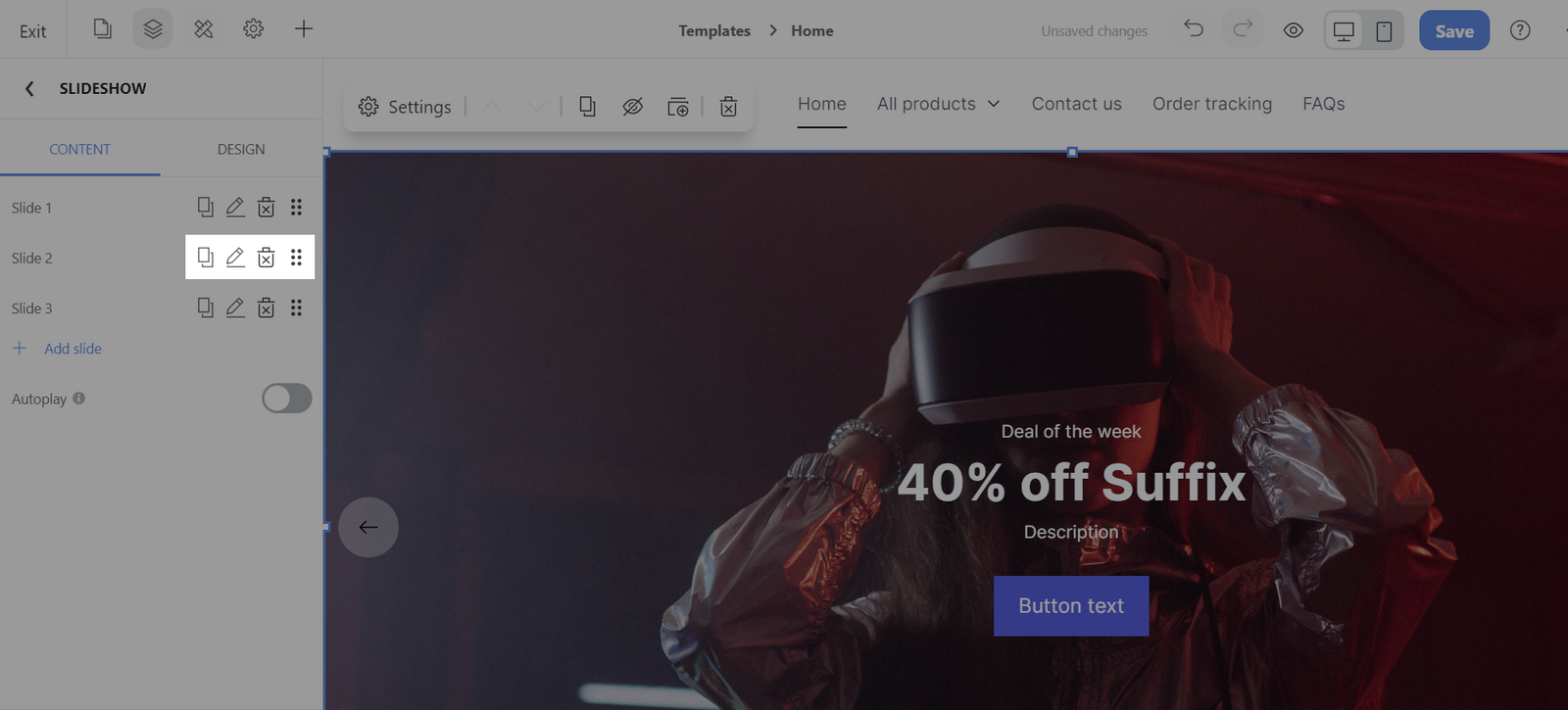
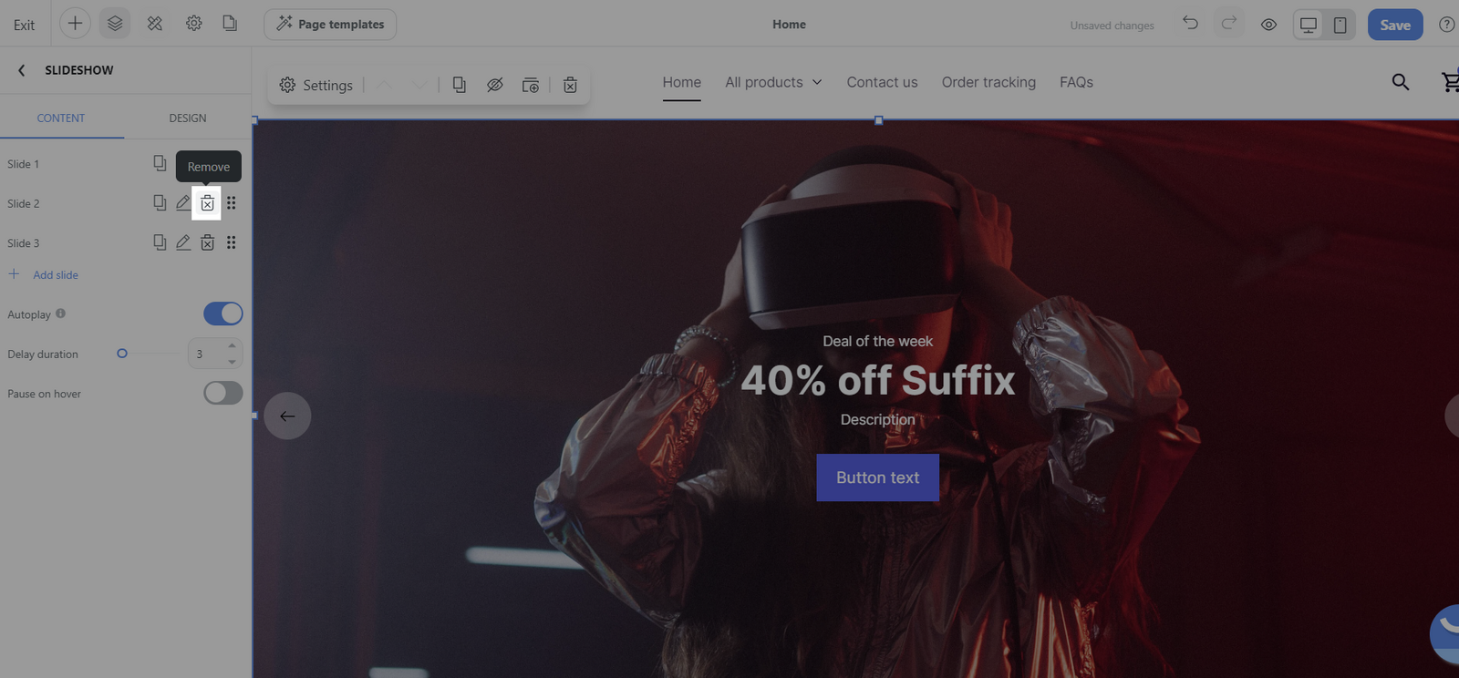
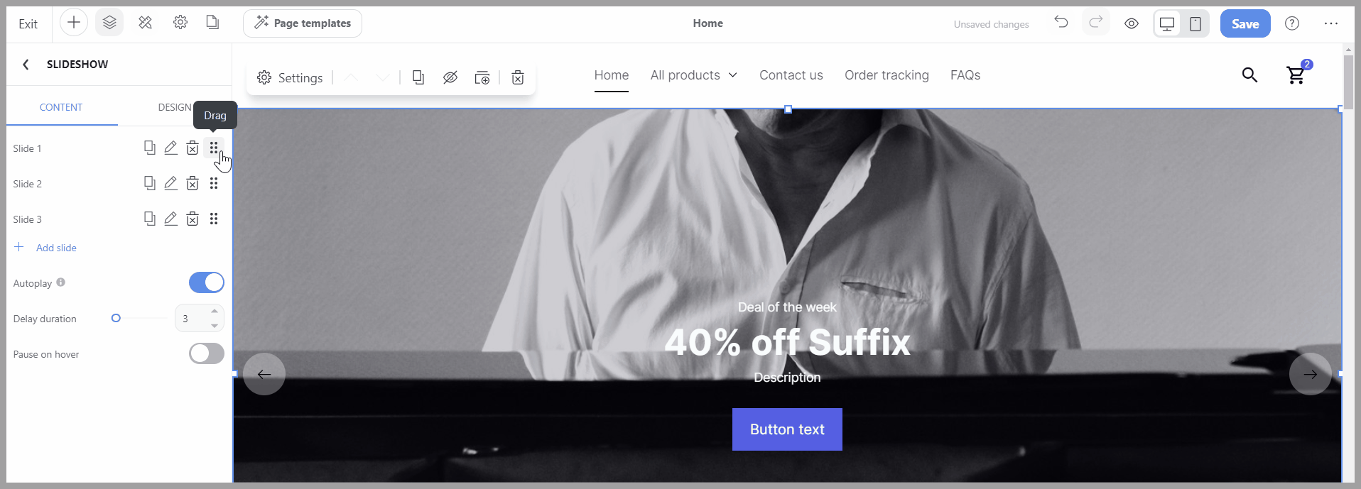
For each slide there are 4 specific editable actions, hover over each slide and click the icons:
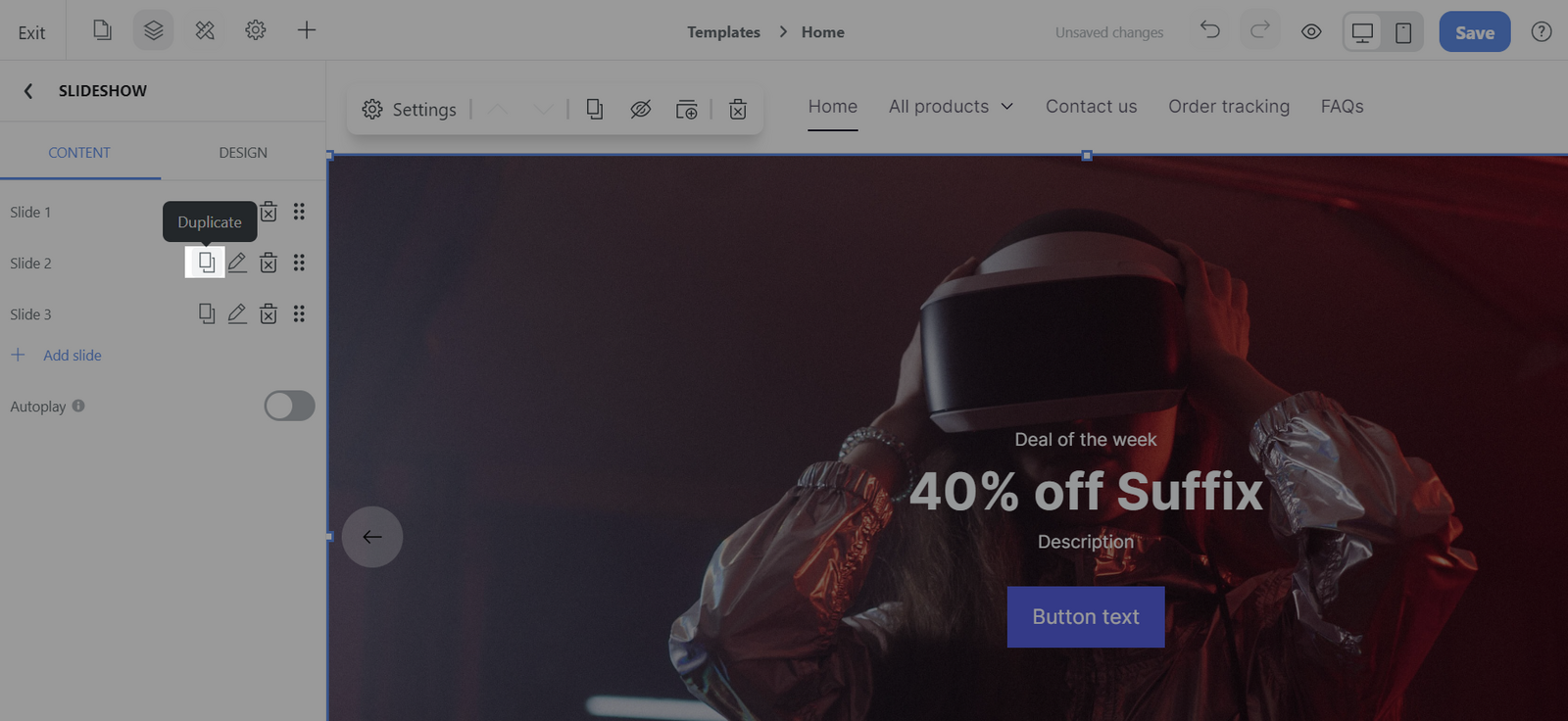
Duplicate: Make a copy of an existing slide, which can then be modified as needed, saving time when you want to create similar slides.
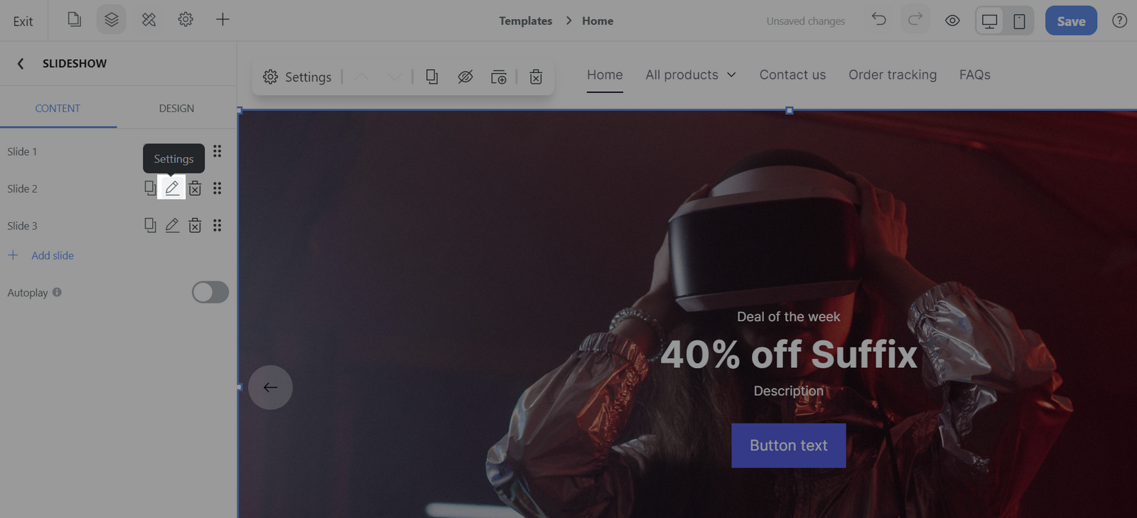
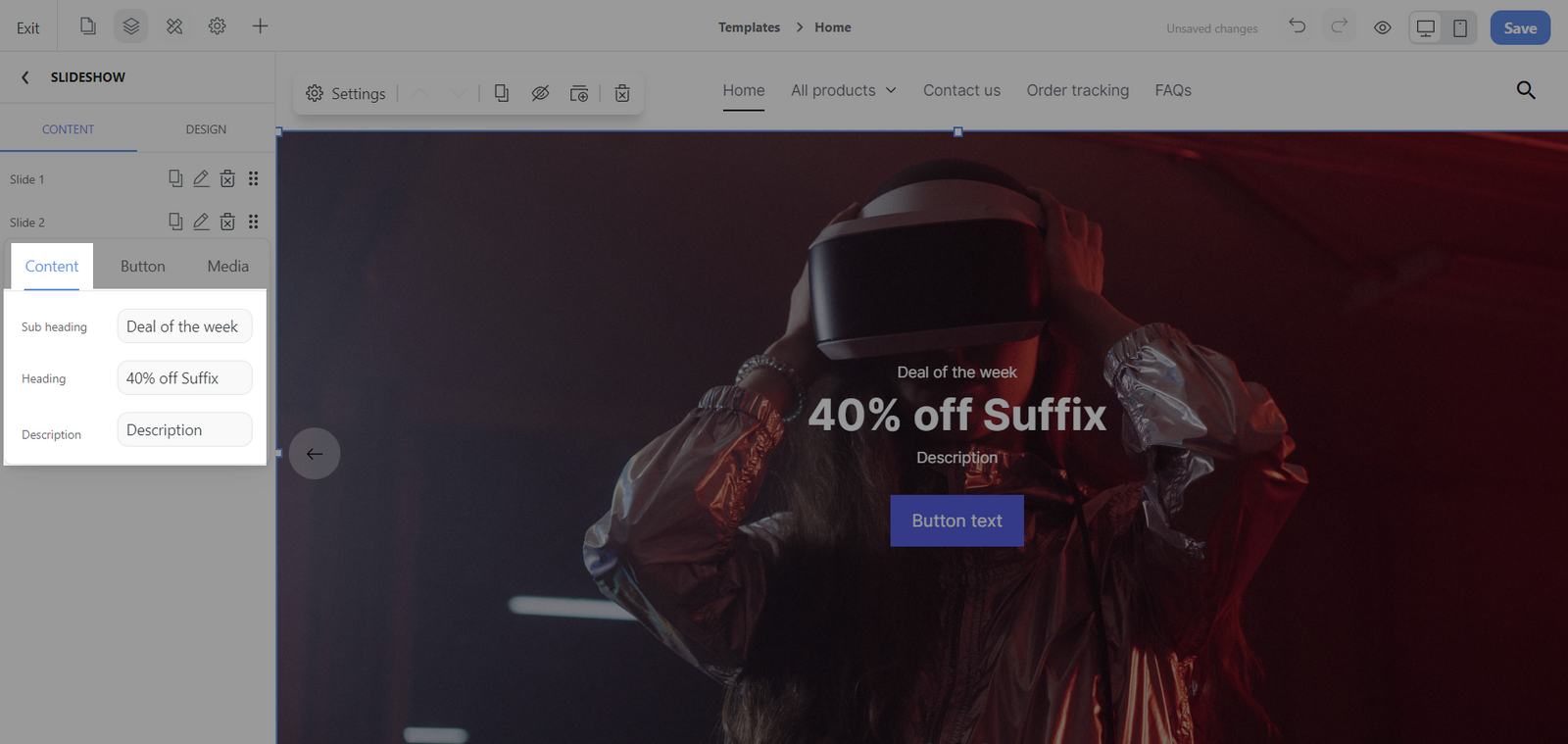
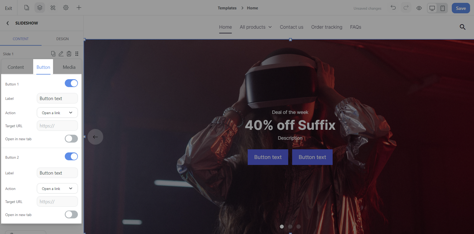
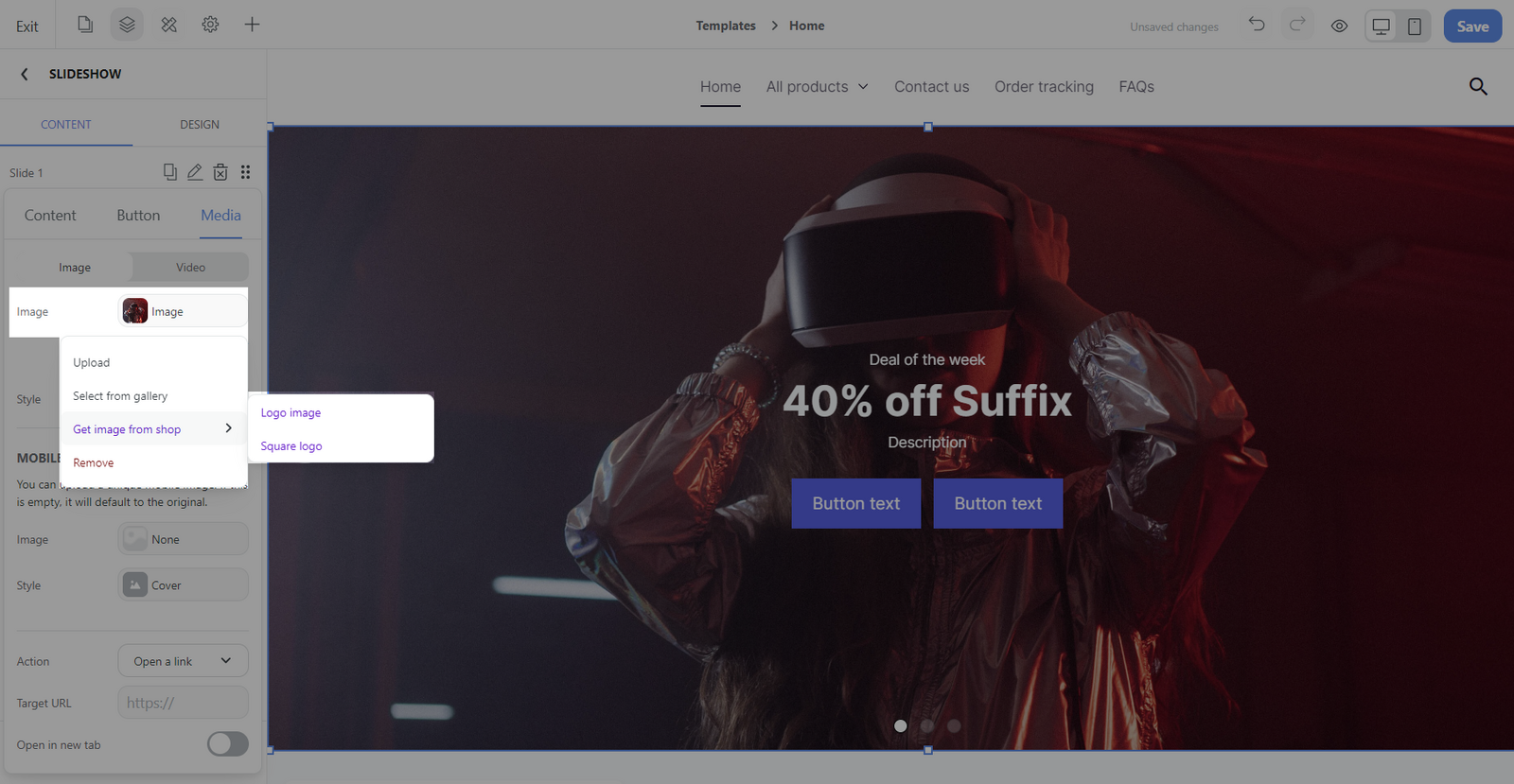
Settings: There are 3 specific editable sections Content, Button, Media.
Content: You can edit specific content elements including the Heading, Subheading, and Description, which providing structure and information in your slide.
Button: Each slide can feature up to two customizable buttons, allowing you to edit the text label, define the button's action, and choose whether it opens a link in a new browser tab.
Media: Media will be synced between desktop and mobile by default, but you have the option to configure image settings separately for each.
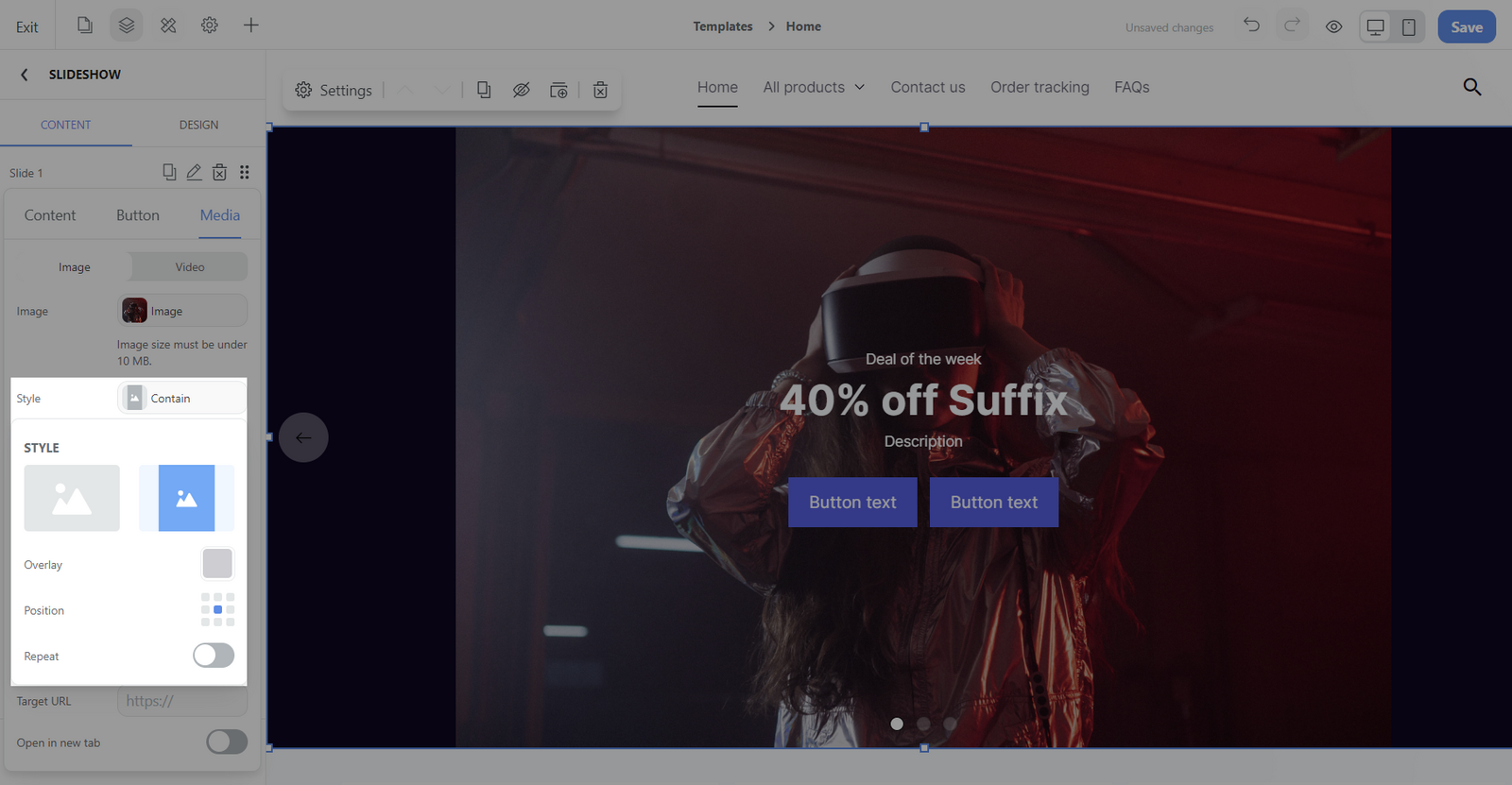
For Image section:
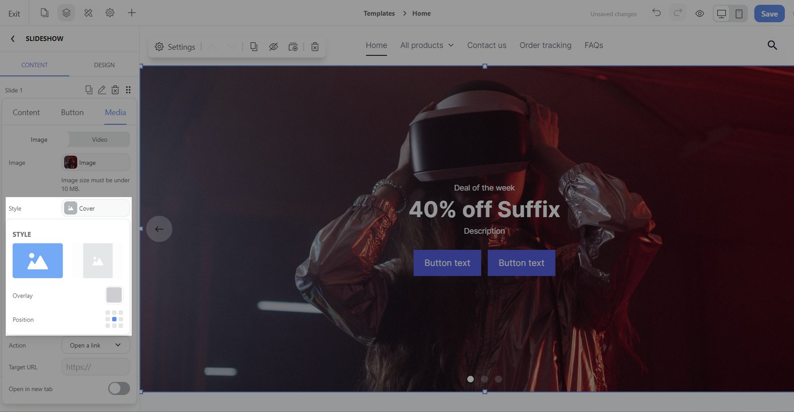
Image: Add an image by uploading, selecting from the gallery, or using shop logo images. You can also remove the image.
Style: Choose how the image fits within the slide (Cover or Contain).
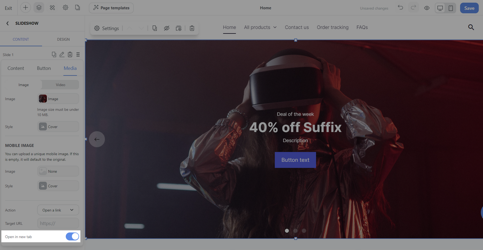
Mobile image: Set the different images for mobile devices.

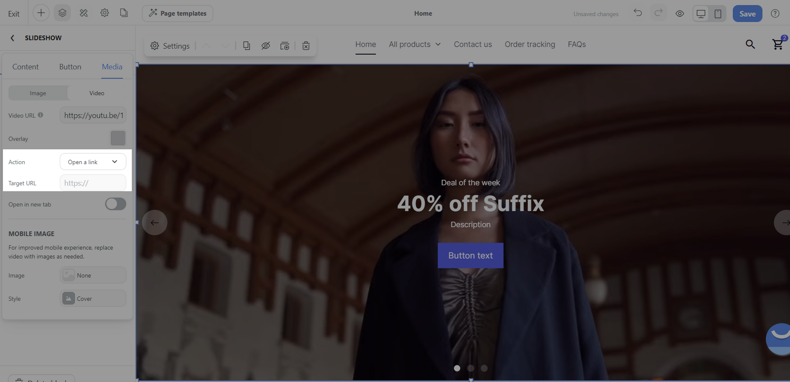
Action: Set what happens when the image is clicked, with 8 options available.
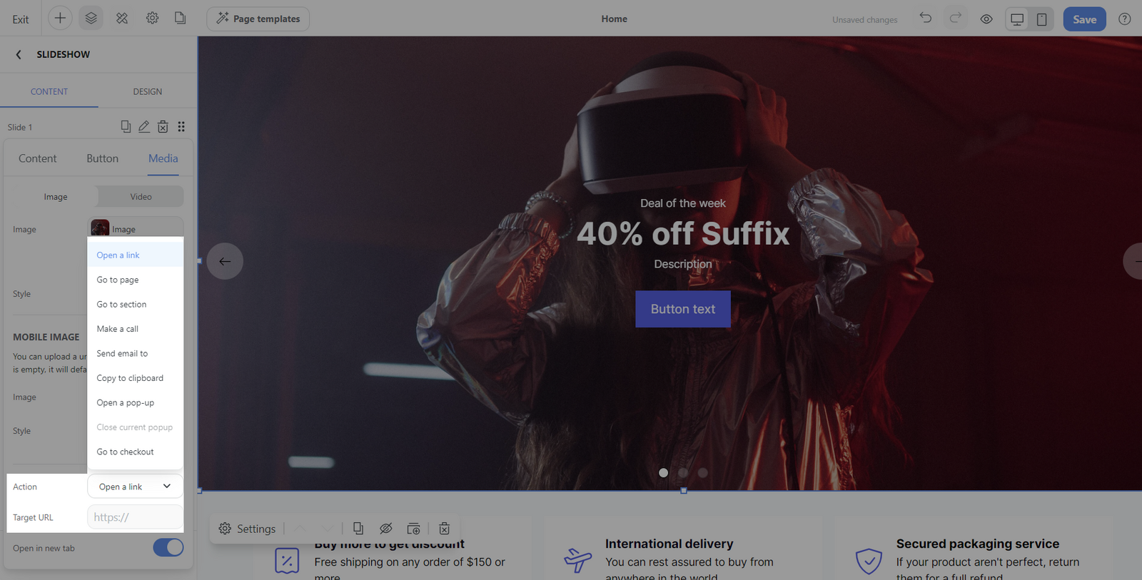
Open in new tab: Toggle if the image link should open in a new tab when clicked.
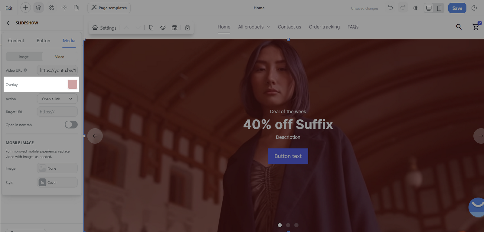
For video section:
Video URL: Input the URL for a video from YouTube or Vimeo.
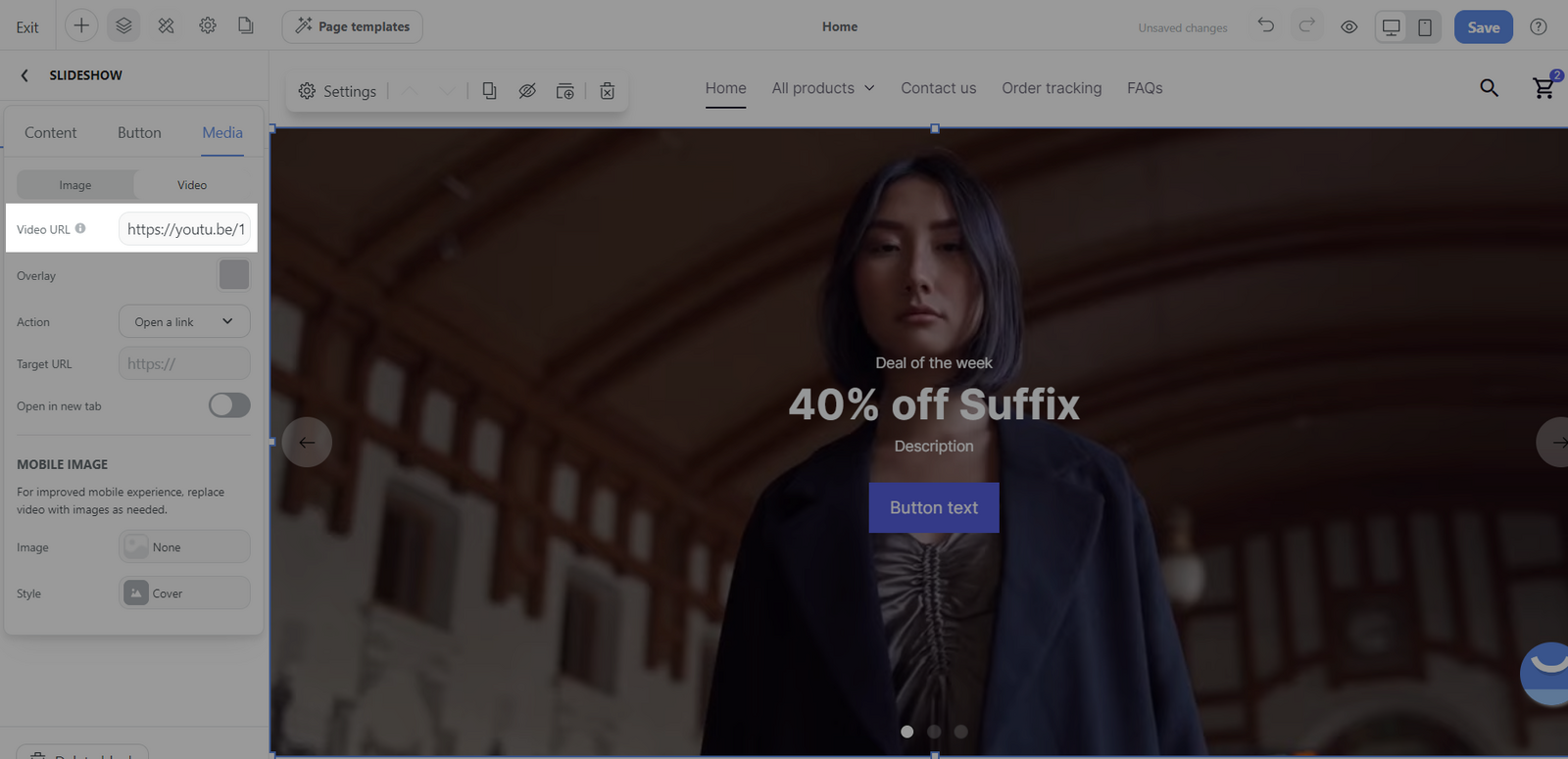
Overlay: Add an overlay color over the video.
Action: Define an action when the video is engaged with.
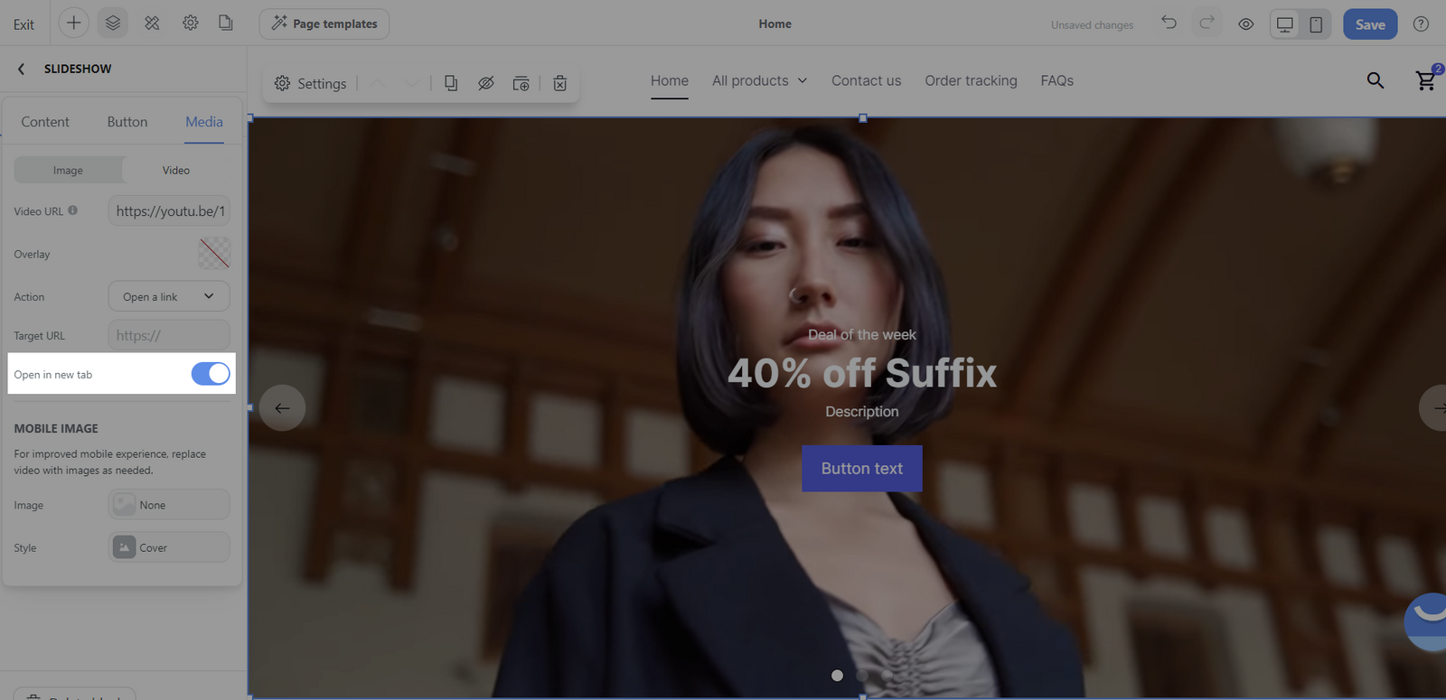
Open in new tab: Specify if the video should open in a new window or tab.
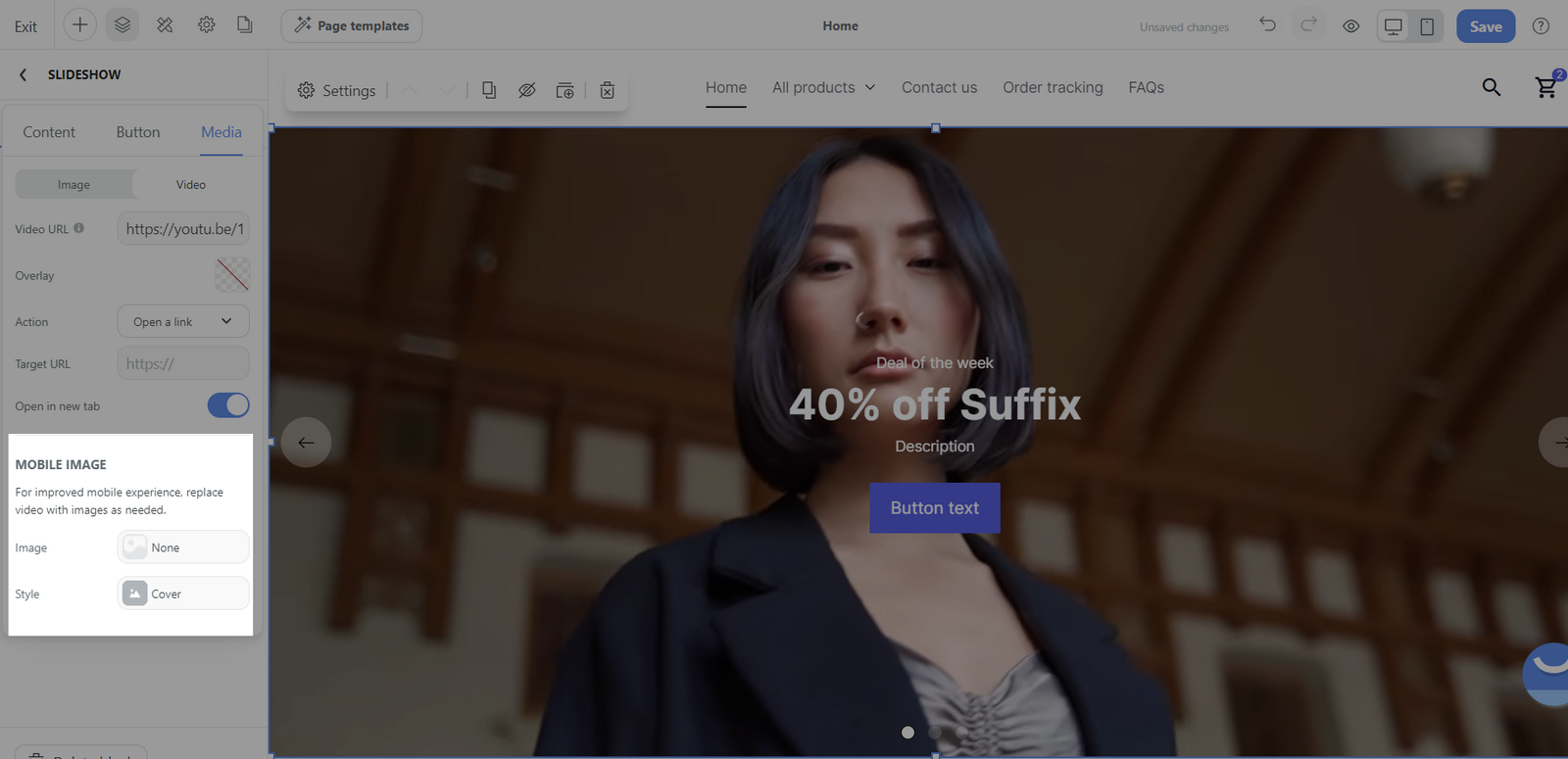
Mobile image: For an improved mobile experience, you can replace video with images as needed.
Remove: Delete a slide from the slide show.
Drag: Reorder slides within the slideshow through a click-and-drag action. This is useful for organizing the sequence of your slides.
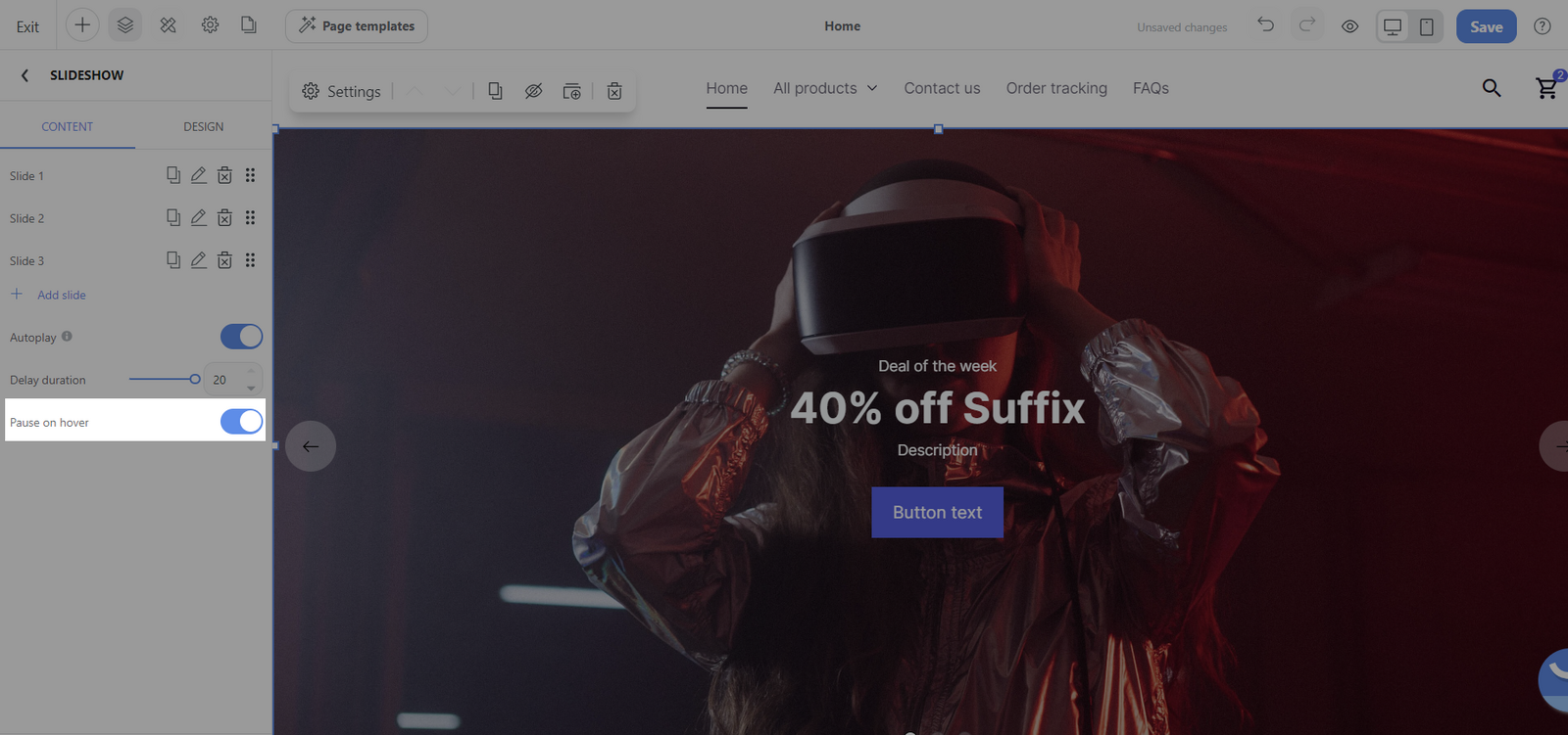
Autoplay: Toggle whether the slide show automatically plays or if the user manually controls slide progression.
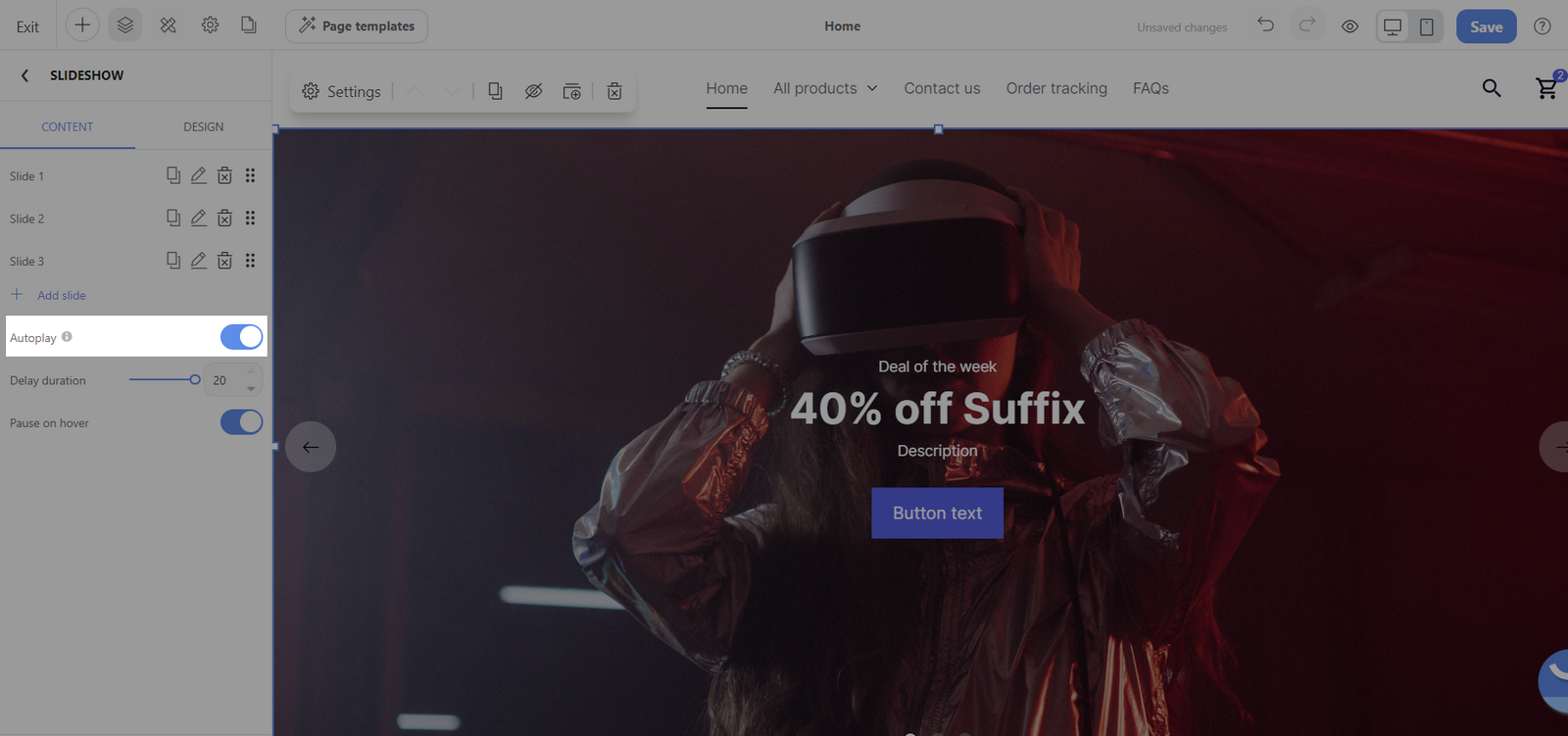
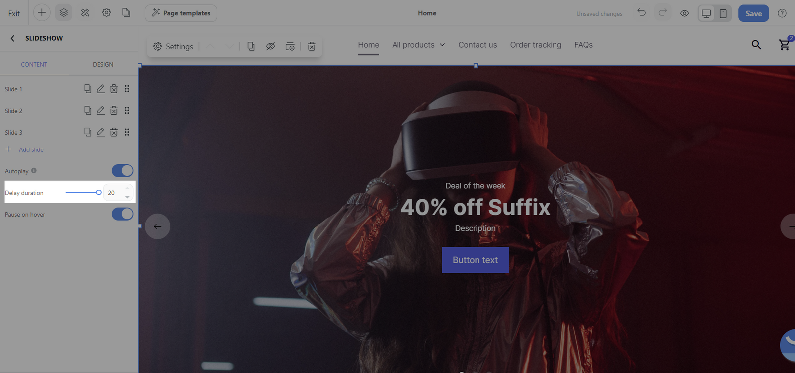
Delay duration: Set the amount of time each slide is displayed before transitioning to the next one. The maximum duration is 20 seconds.
Pause on hover: Decide whether the slide show should pause when the user moves the cursor over it, which helps allow users to have a longer look at a slide’s content.
C. Customize the design tab of Slideshow block
Slide section:
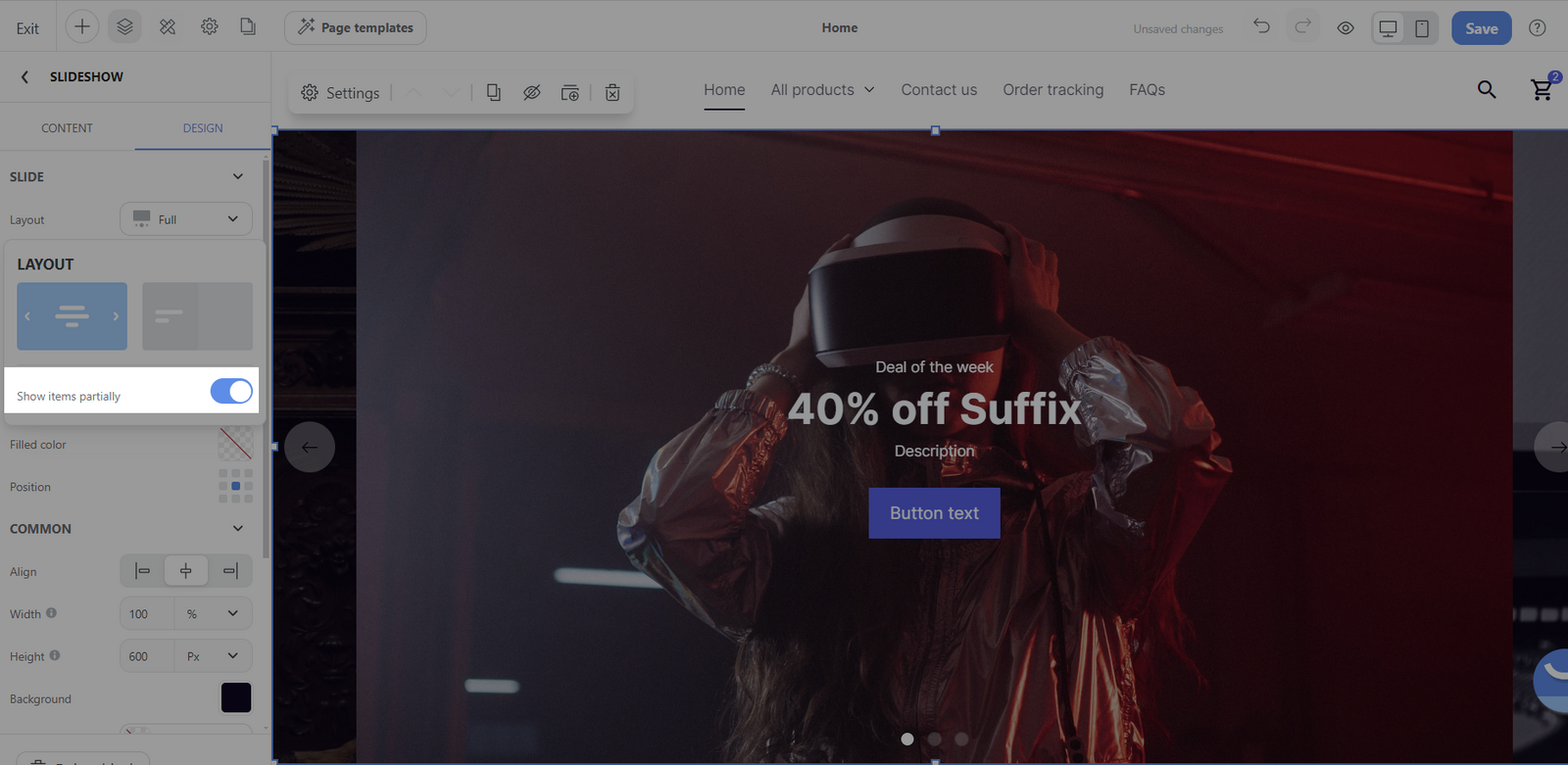
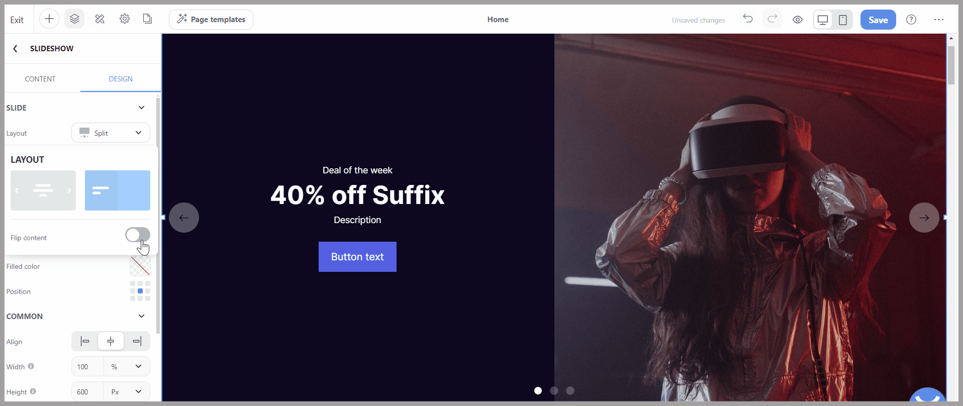
Layout: You can choose layout Full or Split.
Full: This layout option ensures that each slide takes up the entire area of the slideshow block.
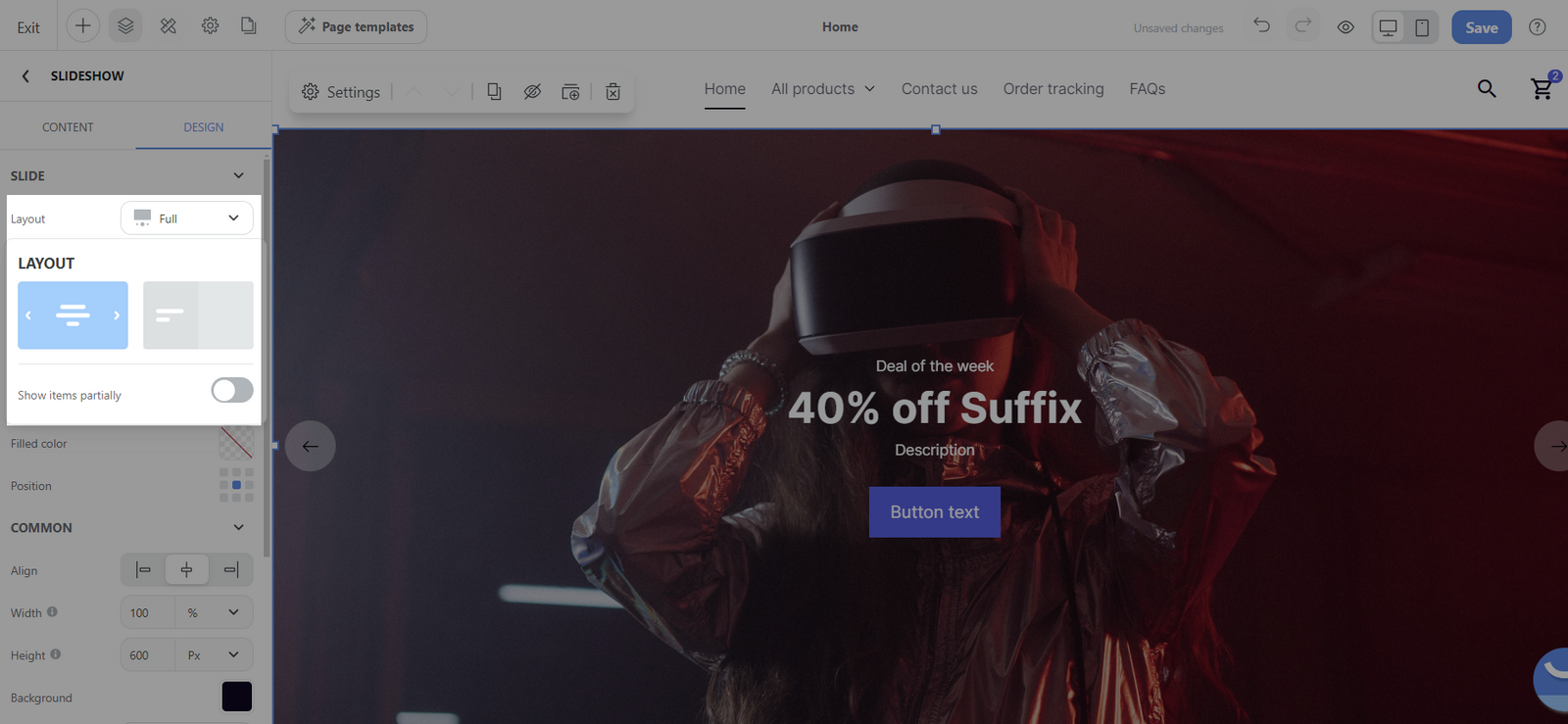
Show items partially: When this feature is enabled, it indicates that the adjacent slides will be partially visible on either side of the central slide, creating a carousel effect.
Split: Selecting the split layout divides the slide into 2 sections, typically allowing for the combination of both text and media.
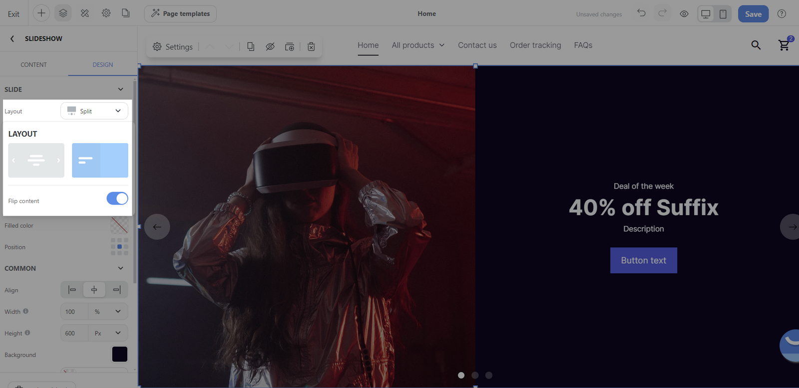
Flip content: When this option is activated, it flips or mirrors the content placement on the slides which making a change in the layout and adding visual interest to your slideshow.
Slide nav: This feature refers to the navigation dots under the slideshow that let users jump to a specific slide.
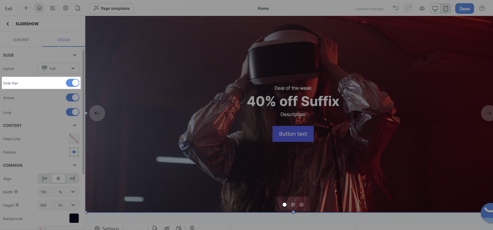
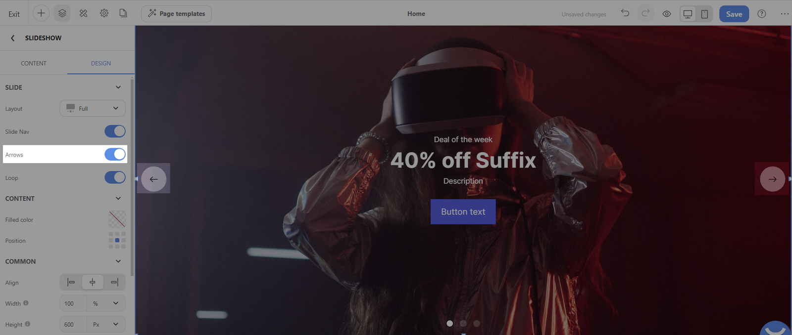
Arrows: These are often used to navigate between slides manually. You have the option to show or hide them.
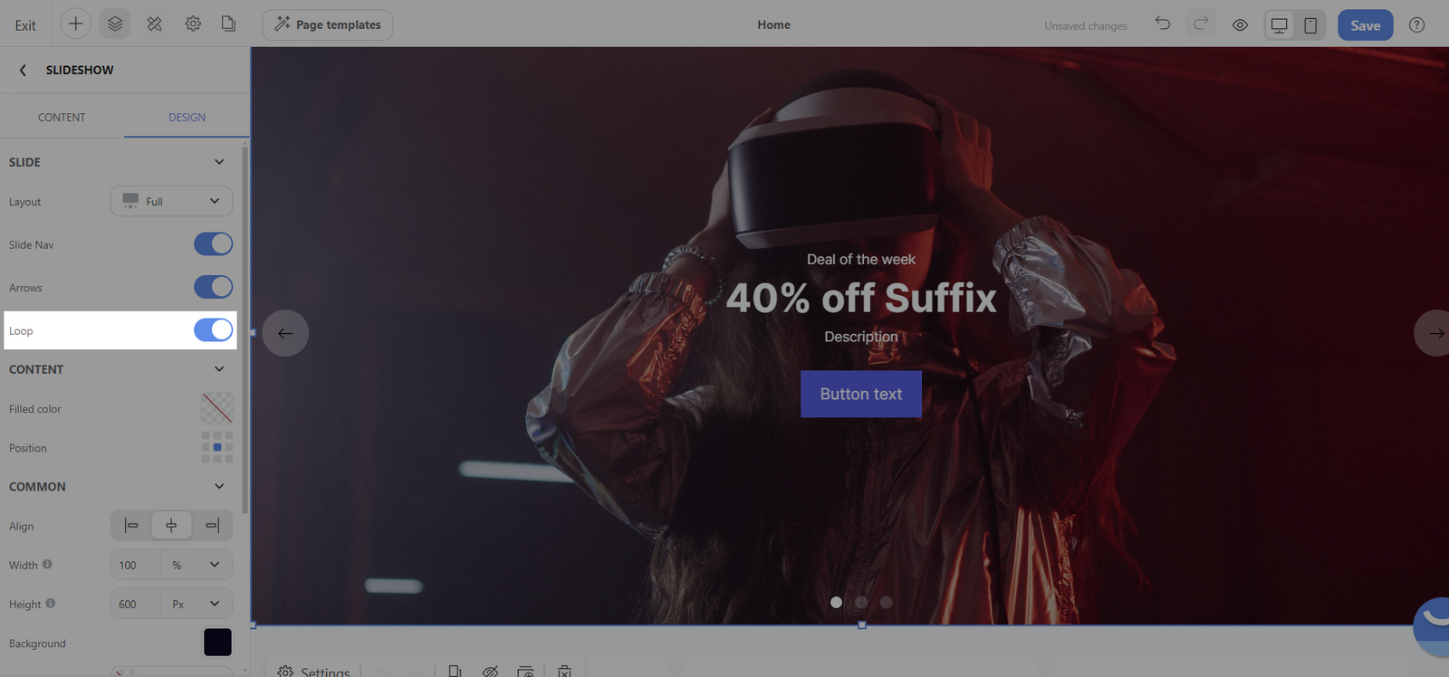
Loop: When enabled, the slideshow will loop back to the beginning after the last slide has been displayed, creating a continuous cycle of the slideshow content.
Content section:
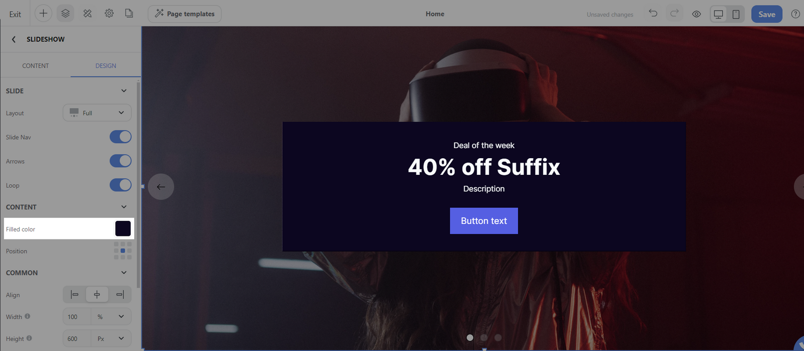
Filled color: This option allows you to select a background color for the content section of your slides. This could be useful for creating contrast against the slide's text and media elements or to complement the color scheme of your website.
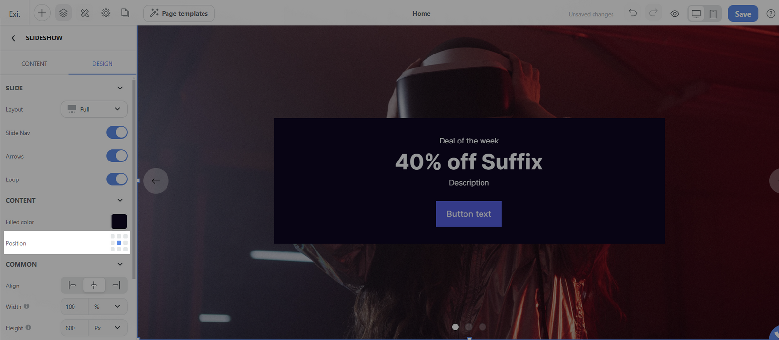
Position: This setting refers to the alignment and placement of the content within the slide.
Common section:
You can design general settings for the block. Please visit this article for more information.