This article is to help you optimize your custom options when creating personalized products.
In this article
A. Settings for each option type
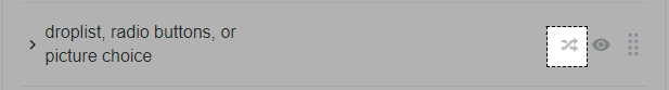
C. Conditional logic (for droplist, radio buttons, picture choice)
A. General settings for each option type
Name: set the name of your custom option stored on ShopBase and on the export order CSV file. Should be short and easy to identify on your end.
Label (display on storefront): text set above the custom form fields on your storefront. It should be short explanation or guidance that is easy for buyers to understand.
Type: custom form fields can be either Text field, Text Area, File, Radio buttons, Droplist, or Checkbox. For the last 3 options, you need to set values (separated by commas) for your custom options.
Required? Yes/No: set if custom option is a must to purchase your item.
Optional: your can set or keep the field blank. Blank value for optional fields won't show up on your product pages.
B. Types of custom options
Each option type allows your customers to provide necessary information for their order. They include:
Text field
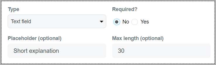
Placeholder (optional): a short grey text inside the text field to instruct your customers.
Max length (optional): maximum characters you allow your customers to fill in.
Text area
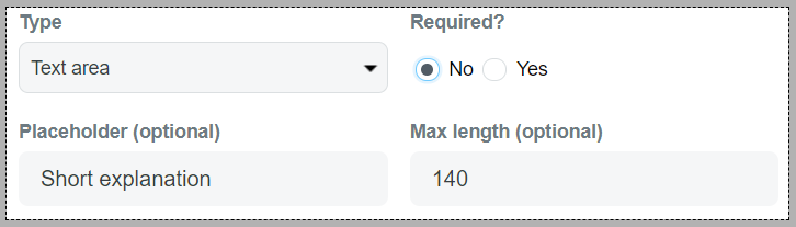
Placeholder (optional): a short grey text inside the text field to instruct your customers.
Max length (optional): maximum characters you allow your customers to fill in.
Image
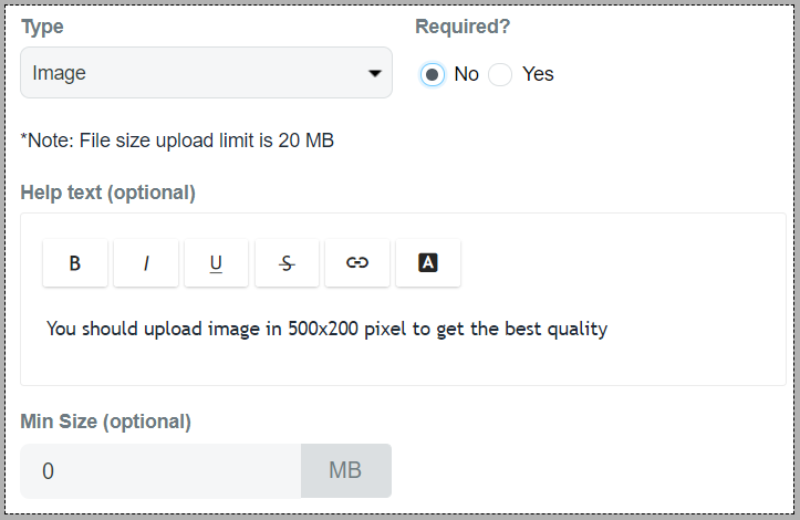
Help text (optional): short instruction below the upload button to guide your customers.
Min Size (optional): minimum size of the image uploaded.
Radio buttons
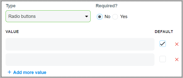
Value: options that customers can choose for their product.
Default: The value that will be chosen by default. If no value is ticked as Default, no option will be chosen beforehand.
Droplist
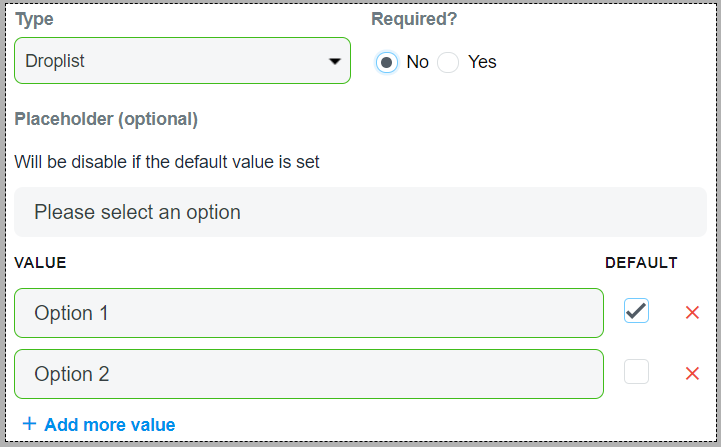
Value: options that customers can choose for their product.
Default: The value that will be chosen by default. If no value is ticked as Default, no option will be chosen beforehand and customers see the Placeholder.
Checkbox
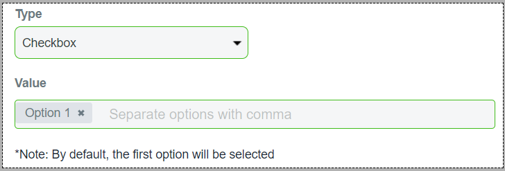
Value: options that customers can choose for their product. Options that you insert must be separated by commas.
Picture choice
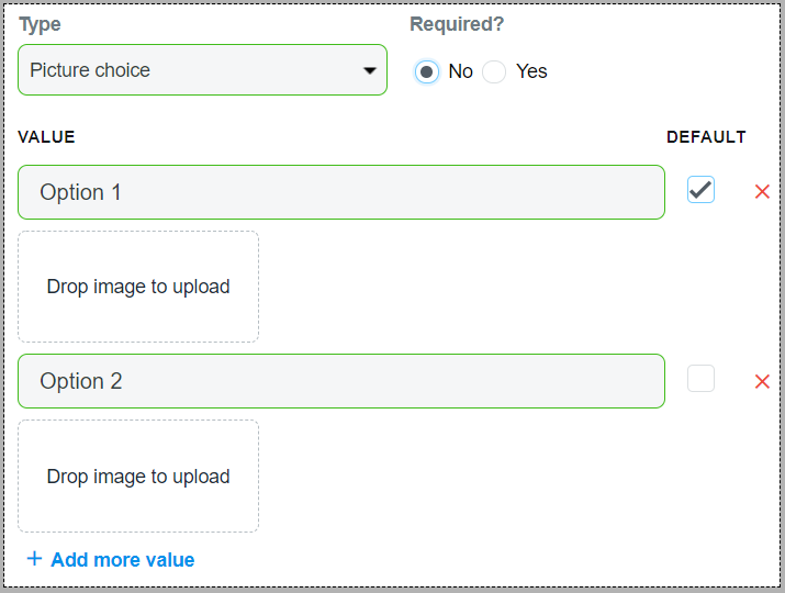
Value: options that customers can choose for their product. You must fill in the option names and upload their images.
Default: The value that will be chosen by default. If no value is ticked as Default, no option will be chosen beforehand and customers see the Placeholder.
C. Conditional logic (for droplist, radio buttons, picture choice)
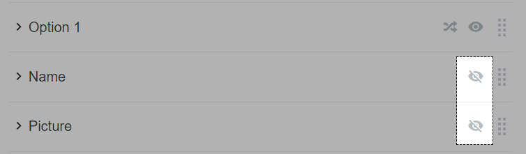
You can setup 3 types to display options according to your condition(s) and order. The settings are displayed in the two-arrow icon:
Find out all possible answers of your customers when they select a custom option.
A condition must be set as either is equal to or is not equal to an option value (that you have created in the Edit Product page). You can set multiple conditions for each answer.
Select the option that will show up based on the condition(s).
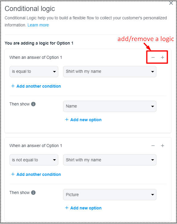
To shorten the custom option list on your product pages, you should hide all options that can be triggered by conditions. For example, choices in Option 1 can trigger option Name and Picture, then you should hide the 2 latter options (by clicking on the eye icon).